Many of our clients have a deep interest in art, which is captured in their striking art collections. They’ve often acquired very diverse and personal pieces over time and appreciate being surrounded by beautiful objects and artworks that have meaning and expression that resonates with them.
When approaching a new, unique interior design project, we aim to create a personal space for our clients; drawing inspiration from their art collections and interests. By fully understanding their artistic preferences, we can produce more creative interior design ideas that serve to amplify the beauty and eclecticism of their art pieces in interesting ways.
With our clients’ art collections serving as a starting point to our conversations and design process, our architect and interior designers gain valuable insight into our clients’ personalities and tastes; allowing us to collaborate more meaningfully and explore a design that is as personal to them as their collection.
In this article, we’ll introduce you to four eclectic architecture projects in which we’ve embraced our clients’ relationship with art, leading to joyful and unexpected homes.
Mazarine
Gautham and Sreeja have an expressive and evocative art collection that reflects their time in Bombay and travels to Southern India, Seychelles and Brazil. Acquired over two decades, the artworks tell a story, with many pieces having vibrant and uplifting colours that transport them to places and festivals they’ve visited throughout their lives. The couple wanted their home to do the same, evoking the warm climate and rich culture of India, particularly on cold winter days.
We were struck by Gautham and Sreeja’s artworks the moment we walked into their house. They were a key part of their identity and became pivotal to our initial conversations. They also became the foundation for selecting the colours throughout their home, as we took pictures of the artworks and created a mood board, with groups of artworks inspiring the colour palette of each room.
With this focus on thoughtful, colourful interior design, the external walls were painted a warm tone to create a bright and light backdrop for the art, while internal walls and joinery were painted in colours drawn from particular pieces, often resulting in surprising colour combinations.
Blues, greens and reds have been taken from the work of artists Michael Adams from Seychelles and Murali Nagapuzha from Kerala. Whilst the reds, greens and earthy tones in the entry are influenced by an artwork by Indian painter Thota Vaikuntum. By blending architecture, design and art, every element in Mazarine’s design plays off each other in an integrated composition.


It may seem counter-intuitive but carrying the strong colour of the artworks into the architecture gives Gautham and Sreeja a variety of options for where they hang each piece of their collection. They regularly move their art around, changing and personalising their home even more.
The Judd
Patricia and Gwen had lived in their Victorian terrace for more than 20 years. While they had renovated it a few years prior to engaging us, the house lacked colour and character. Patricia and Gwen love design, colour and pattern and wanted to create something beautiful. To do this, we needed to define what ‘beautiful’ meant to them.
In our early conversations, their interest in art and architecture became a portal to understanding their personalities, tastes and aspirations for their home and enabled us to forge a much deeper connection.
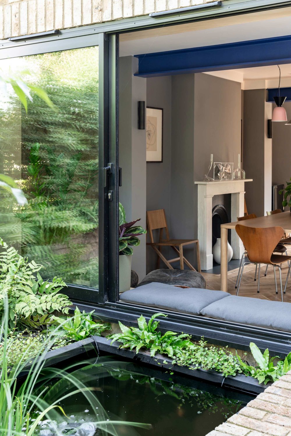
Buildings, artworks, architects and designers discussed in these conversations became references that helped inform the unique interior design and process. The unique and unexpected curved ceiling over the ground-floor extension of The Judd is a reinterpretation of repeated arched strips in artist Donald Judd’s sculpture ‘Untitled’ from 1963. The bold, simple, coloured forms in Judd’s work also became the guiding benchmark for other colours, patterns and textures, while the pink staircase with a green handrail was influenced by the colours used by architect Luis Barragán.

Patricia and Gwen also had an art collection acquired over many years, often from their travels. We drew inspiration from some of their treasured pieces, including African artist Ato Delaquis’s paintings of Kumasi’s open-air market, and we curated colours to complement the artworks. The blue for the wall panelling and desk in the loft comes from the blue frame of a piece by Andreas Gursky. We also used the same blue on the ground floor to tie different spaces and elements together.
Their collection and interest in art and architecture became a way of unlocking the unique interior design aspirations that they could relate to; elevating the process and outcome to a highly personal and unexpected result.
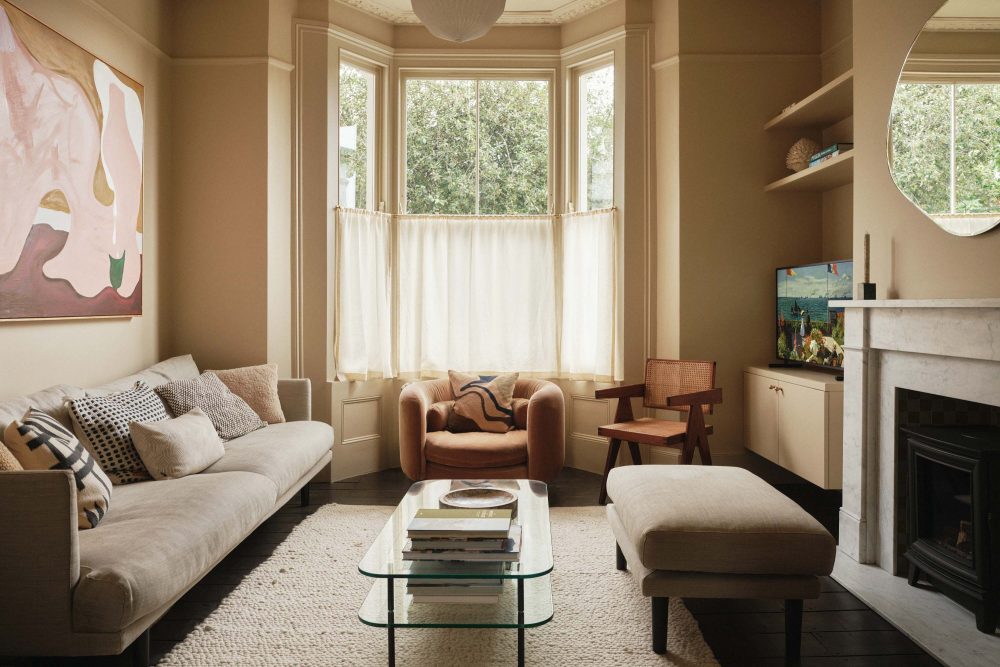
Tonal Terrace
Zoe and Benedict asked us to reimagine their four-storey townhouse and transform it into a bold and bohemian sanctuary. They had a fun and expressive art collection that ranged from high art paintings and photography to playful and intriguing pieces, including a plastic bag they had kept from a trip to New York and framed.
The couple’s artworks and furniture provided a starting point for the home, and colour became key to creating an eclectic yet cohesive backdrop for their collection of art, furniture and other pieces. As Zoe and Benedict showed us a selection of their artworks, and Zoe sent through references for colour inspiration, the townhouse evolved into an immersive palette with each room painted a different hue influenced by their artworks.
Unlike the other approaches, in the Tonal Terrace there were no designated artworks for each room. Rather the pieces provided inspiration, and now Zoe and Benedict display, acquire and move their artworks to suit the colour and desired mood for the room. Creating a home that allows for personal expression, instead of imprinting a prescribed aesthetic, allows for versatility and change, and means that Zoe and Benedict’s home and art collection can continue to evolve together.

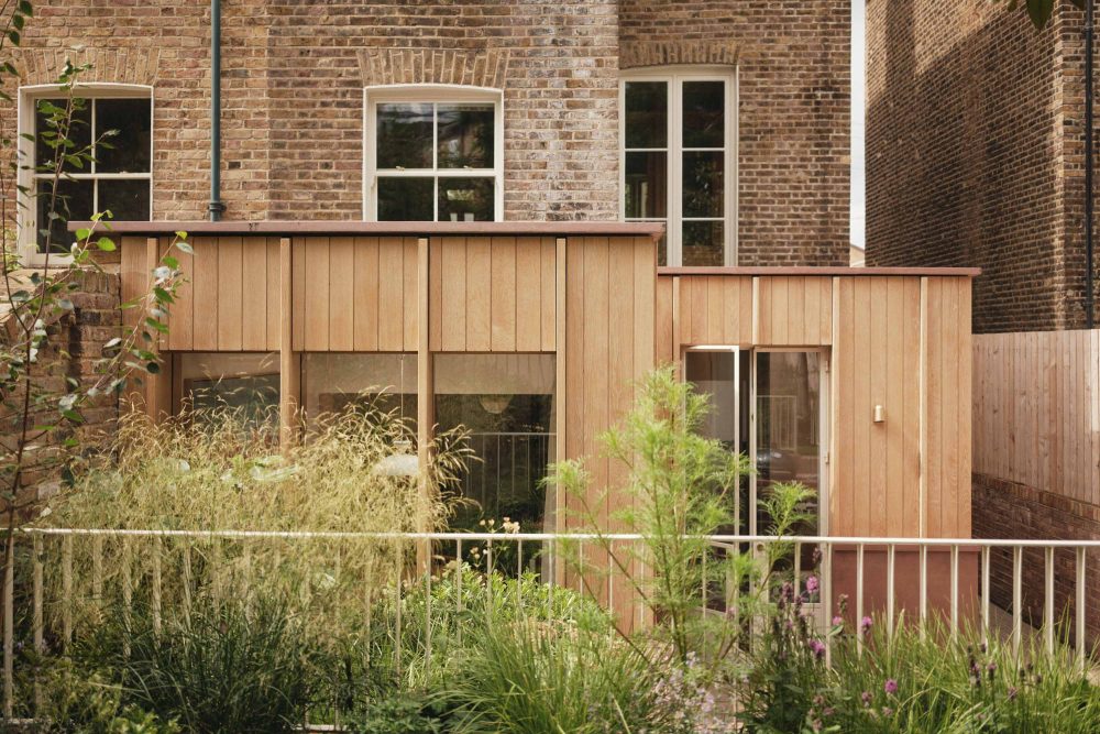
Hawthorn House
Gareth and Richard have a fantastic collection of art and books, and a serious eye for design. When they approached us with their brief to transform their home and merge it with their garden, they also provided extensive reference images of artworks, sculptures, furniture pieces and other designs that interested them; beyond what they owned.
It was clear from this wide source of design influences that Gareth and Richard were intrigued by sculptural forms and how things were built and put together. The images also provided insight into their favourite colours and materials, their taste, and vision for their home.
These ideas helped inform and inspire a highly crafted design and the palette of raw materials, including brick, concrete and copper. The exposed steel beams painted Yves Klein blue in Hawthorne House create a visual link with a sculpture on the mantelpiece, and timber and glass shelving provides a gallery-like showcase for Gareth and Richard to display many of their other pieces.

Everyone at our interior architecture studio loved creating unique and unexpected homes for all of these incredible clients. They were highly interested and knowledgeable about art, design, architecture and furniture and had impressive collections and life stories. We believe the homes we create should be an expression of our clients’ interests and experiences, and a window into their personalities. This allows us to create a highly individual and personal home that’s a true representation of the individuals who live there.
Words by Rebecca Gross
Photography by Jim Stephenson (Mazarine) and French and Tye (The Judd, Tonal Terrace, Hawthorne House)
Watch a video with our Mazarine clients Gautham and Sreeja
Contact
If you would like to talk to us about your home, contact us by clicking here.
You can subscribe to our mailing list by filling your details below: