Colour at Home with Jessica Williamson
Colour can bring moments of joy, intimacy and personality to a home – many of our clients are now choosing to add vibrancy to the place they spend most of their days. I am associate at Bradley Van Der Straeten and one of things I love most about the work I do, is designing with colour. In this article, I want to share that passion with you, give you a little insight into how I work and hopefully inspire you to work with colour on your home and not be afraid to make bold and personal choices.
Colour and I
Since I was a kid, I wanted to be an architect and since I was a kid I’ve been attracted, like a moth, to individual colours and colour combinations. At BVDS, the promotion of joyful spaces is paramount and I love the encouragement of this studio to combine architecture and colour, particularly around the home. The use of colour can change moods, create specific vibes and be an expression of personality, joy and humour.
For me, colour spans the realms of art, fashion and design. My own colour attraction began with random objects. A trip to a gallery in Nice, France one Summer when I was hiding from the midday sun saw me first experience the joys of Yves Klein blue, a pigmented colour so bold, it jumps out of the gallery space screaming for attention. I couldn’t take my eyes off it.
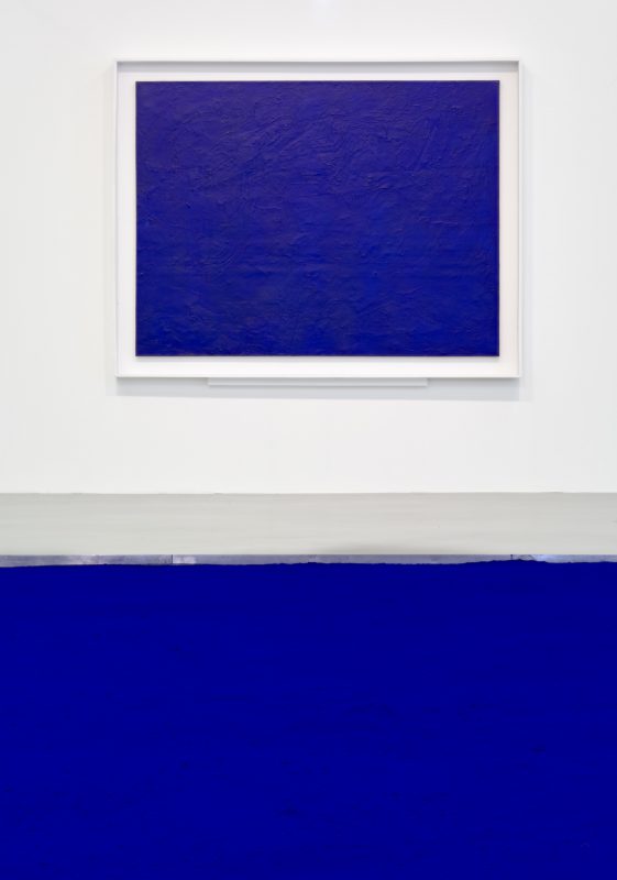
Yves Klein Blue
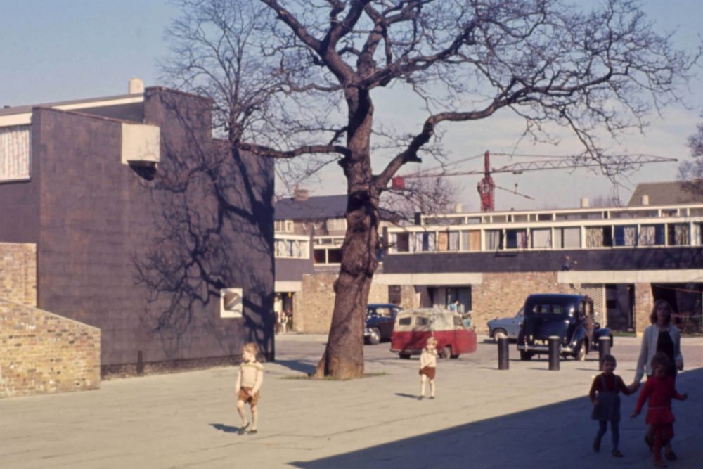
My own fashion choices reflect my architectural colour ideas. It’s become a bit of a joke, director, Ewald, always guessing what colour I’m going to propose next for upcoming projects, because I’m usually wearing it. When I was small, figuring out my own personality and how to express myself, for almost a year I thought I was the bees knees in my burgundy tracksuit, expressing the perfect balance of tomboy and sulkiness. Years later and I see my tomboy colour everywhere – in English heritage palettes, in one of my favourite exteriors, Oak Tree House by Kennedy Nolan and one of my favourite interiors the Bentwood Cafe by Ritz & Ghougassian.
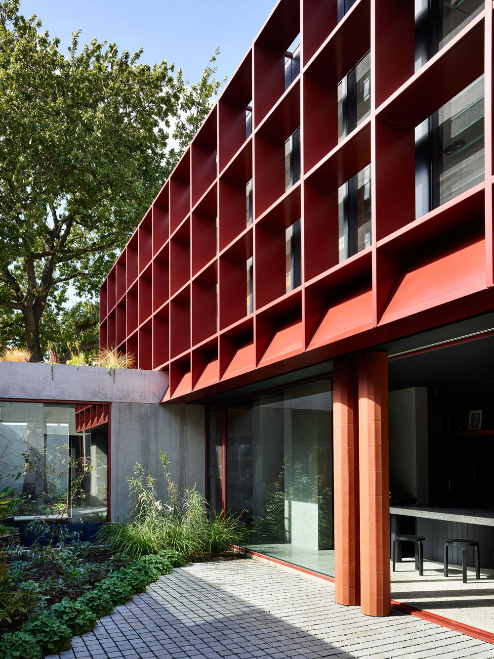
Oak Tree House by Kennedy Nolan
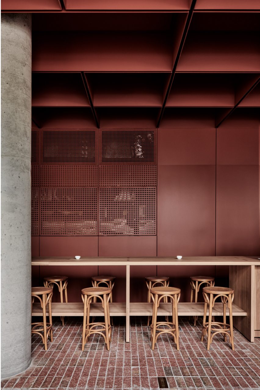
The Bentwood Cafe by Ritz & Ghougassian
Why choose colour in the home?
Adopting colour in building is a superbly economical way to make a seriously fun statement, be that a little one or a really big, bold one. It’s a flexible means that doesn’t add to the cost of a project and is one of the things most easily changed and updated down the line – all it takes is some consideration, inspiration, an eye (or someone else’s!) and a bit of confidence.
When it comes to colour in architecture and buildings, especially within the home, a lot of it is about being brave and jumping in. And when you do, while you can’t expect everyone to necessarily enjoy a bold choice, it’ll be an expression of your personality and bring out expression in those around you.
I convinced my very trusting live-in landlord to paint her beautiful Grade II listed dining room in ‘Blazer’ red – the first time her partner walked into the space he looked around and said thoughtfully ‘It’s like being in the womb of a whale – but not in a bad way’. We all laughed and she matched her next birthday outfit to the walls.
How do you put together a colour scheme?
Putting together a colour palette for a home is incredibly fun.
Inspiration can come from clients themselves, whether it be a piece of art, clothing or homeware they already own or love – or items and colours they simply engage with. My own process is definitely about looking all around me, at a combination of fashion, art and other designers’ experiments in architecture and interiors.
When I’m working on a project (and even when I’m not!) I notice colour combinations everywhere. I was sat at my desk working through a colour proposal for a full house renovation for a client who wanted a journey of unique colours throughout the house. I took a little walk halfway through to post a parcel and on my way to the post office, there was a man sitting having a coffee in the window of my local café wearing a blush pink t-shirt with a bold, emerald green bag strap across his chest. I’d been looking for a colour for a ‘wormhole stair’ up to the new loft and something loud to offset a feature handrail. The t-shirt became the walls and the bag strap became the metal handrail. For me, it’s about taking notice and translating colour into the architectural scenario.
Ways to use colour at home…
There are many ways to incorporate colour within a home – whether it be highlighted elements or enveloping solid colours.
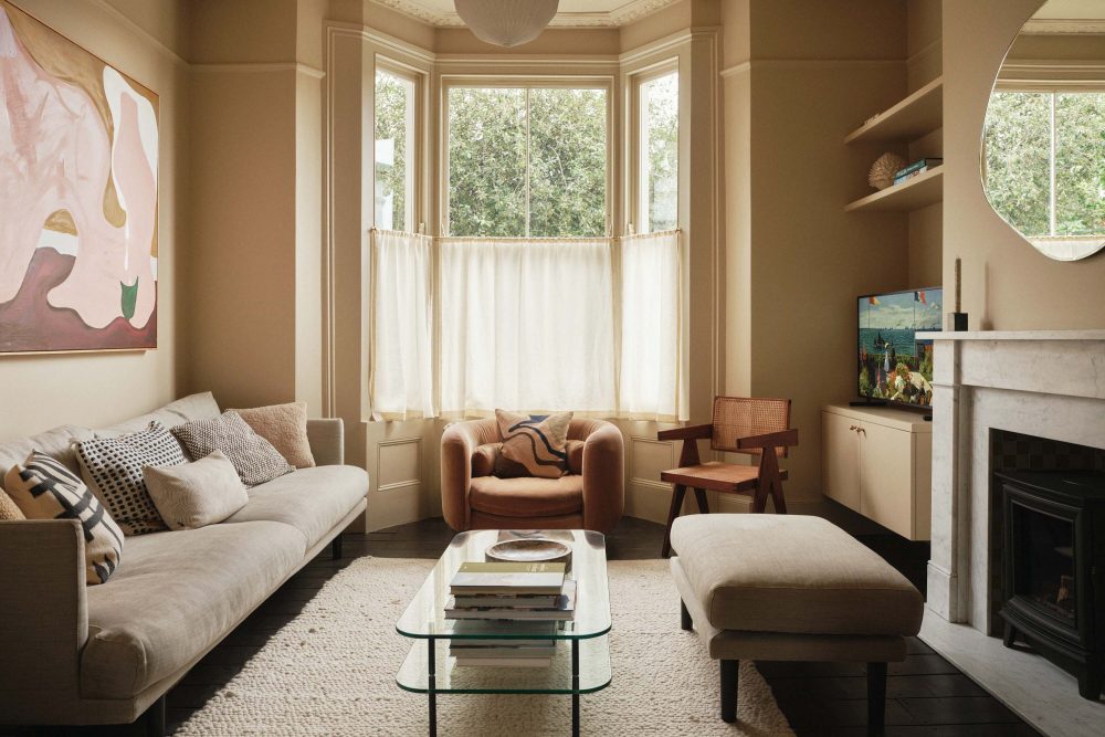
A simple way to use colour is choosing a single bold colour and going all out with it in one room. A favourite of mine is a room of traditional period proportions, with a single, well selected pendant light fitting, a chimney breast and fireplace surround and then a single bold colour on the walls, ceilings and woodwork. If you happen to have some textured, original floor boards to offset the colour, even better. This method celebrates the traditional textures and dimensions of a room and makes a big, enveloping impact.
This method can be used repeatedly throughout a floor plan so that the whole property can be a journey of adjacent, enveloping colours. Each room colour then acts as a frame for the next and a sneaky glimpse of the next colour can be seen at the door or threshold to the next room. Danish surface and colour company ‘File Under Pop’ (https://www.fileunderpop.com/) provide beautiful examples of this journey of colour.
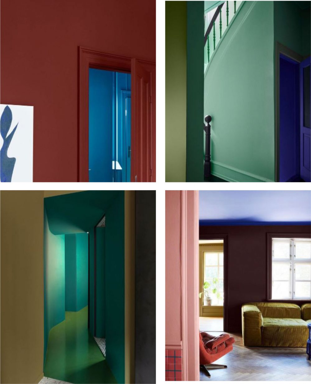
Interiors by File Under Pop
Another method for incorporating colour through a space is to highlight specific areas and items. This method creates focus on different elements in a room and breaks it up to give it a new character. Architraves, skirtings, doors, window frames and ceilings are all different elements that can be highlighted to create a fun, unified but unique space.
Highlighting woodwork changes the character of a room, for example a deep coloured skirting can serve as a continuous line around a room, punctuating and separating the floors and walls and highlighting door frames – Little Greene do it particularly well with their selection of blue hues, broken up with Jack Black trims. London studio, Collective Works adopts a similar method in their Upside Down House, this time highlighting the traditional bay sash windows in a powder blue against pastel pink walls. This highlights the traditional features in soft colours – a powerful collaboration with colour specialists KOI Colour Studio.
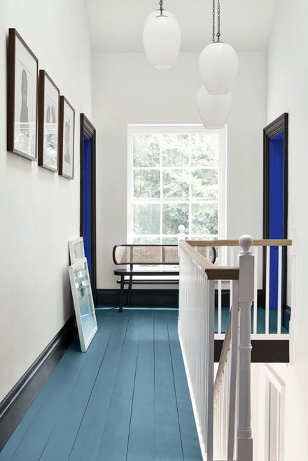
Little Green, blue hues and black trim
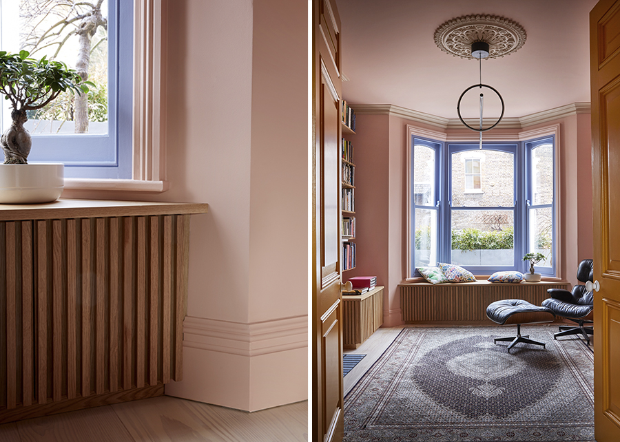
Collective Works UpSideDown House
Notoriously, a ceiling is expected to be white. It’s true that a light, white surface overhead can help to bounce light around a room and retain the feeling of volume. For an unexpected and playful shift, you can switch it around for white walls and a coloured ceiling for a more moody, cosy and slightly more surprising room. If you have ornate coving, even better!
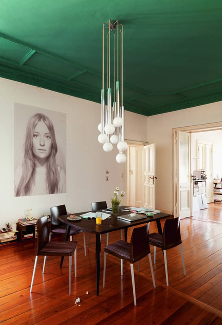
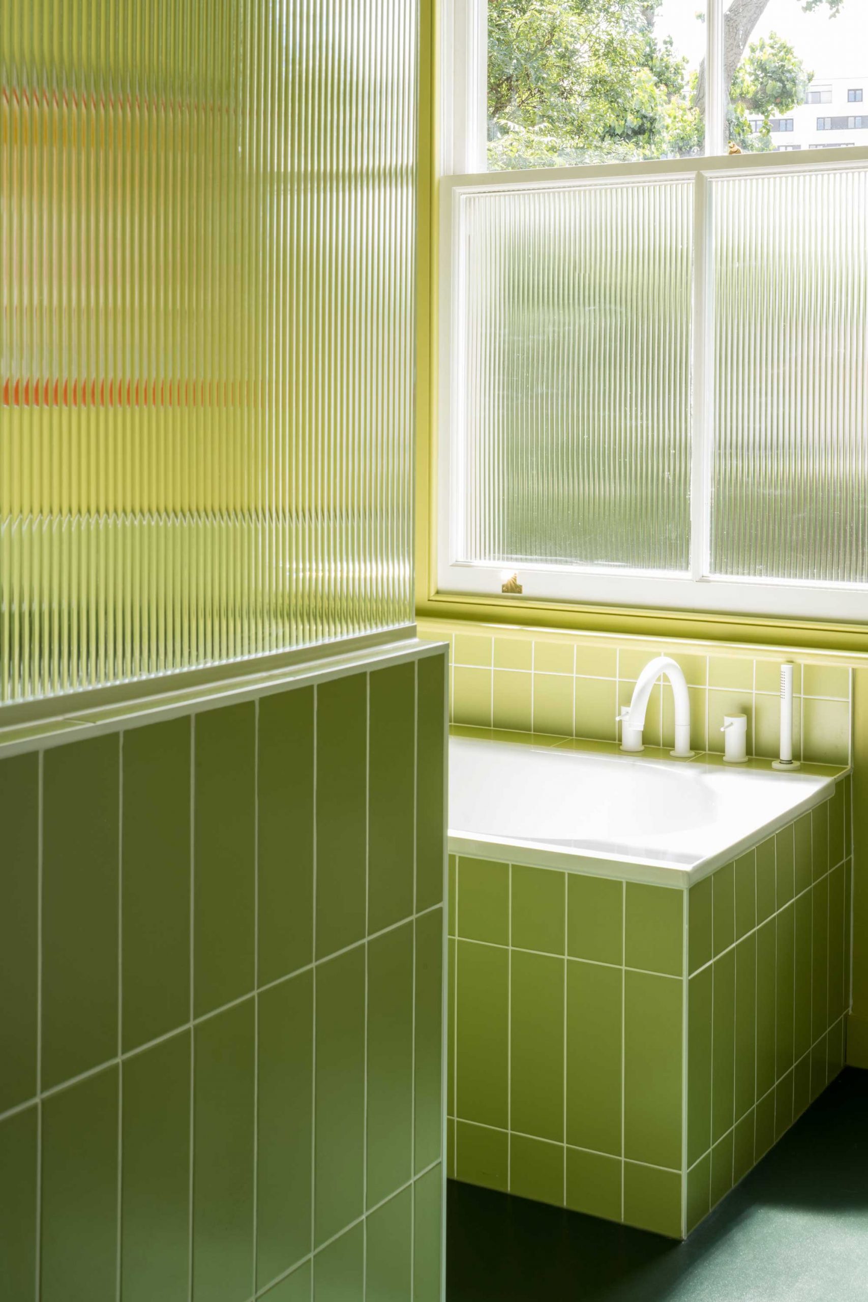
Using natural daylight as a guide to the colours and tones that are selected for each room can really embrace the orientation of a property and exaggerate the drama and sunlight. Where the thinking could be to keep colours light to brighten North facing rooms and embracing darker colours where light is already available on the South facing elevation, the opposite can also be incorporated. At our Tonal Terrace project – the front facing North rooms really drew on quiet moodiness, like the deep grey bedroom that absorbs the sound and street and the cool, blue spare bedroom upstairs. In contrast, South facing living spaces and bathrooms were white, yellow or lime green to create light ‘beacons’ that radiate throughout each floor’s plan.
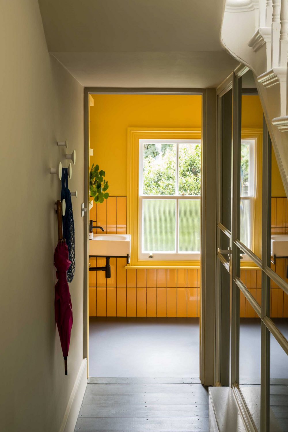
Tonal Terrace by BVDS
So hopefully this article has inspired you to embrace that bit of silliness lurking behind the urge to paint everything white. Ignore the rules, go bold, live within colours that you love and empower you personally – for me, every boring choice is a missed opportunity!
For further exploration, paint suppliers provide great inspiration and combinations or just visit an art gallery or peek into your wardrobe at your favourite item of clothing!
https://www.farrow-ball.com/room-inspiration
https://www.littlegreene.com/paint
https://www.fileunderpop.com/gallery
article written by Jessica Williamson, associate at Bradley Van Der Straeten Architects.
About us
Bradley Van Der Straeten is an award winning architecture studio that specialises in refurbishing, extending and building homes for private clients. Established by friends George Bradley and Ewald Van Der Straeten in 2010 the studio loves creating colourful, fun and liveable spaces. To get in touch with us about a project Click here to Contact Us.

For more articles like this, subscribe to our monthly newsletter by filling your details below:
