Ewald’s House
Cheshunt, 2025
By Ewald Van Der Straeten, co-founder at BVDS
As architects, we spend much of our working lives helping clients make decisions about their homes. We guide them on how they want to live, what they value, and where to invest. Designing your own house, while living in it with your family, is a very different kind of education.
Our journey started in central London, in a two-bedroom apartment in a Brutalist tower block, Trevelyan House (read about that project by clicking here). It was compact, functional, and suited to a young couple, but as our family grew, it became clear we needed space, light, and flexibility. When we moved to Cheshunt, we weren’t chasing a perfect house. We were looking for potential. A 20th-century semi with a generous garden. Space to grow into. Just enough quirks to justify rethinking how it worked.
This project became an opportunity to design around everyday life — how we live now, and how that might evolve. Alongside layout and light, performance quietly underpinned many of our decisions. We didn’t chase a larger extension. Instead, we focused on improving how the house works every day. Reducing heat loss. Improving airtightness. Making spaces more comfortable to live in. Many of these changes aren’t immediately visible, but they have a significant impact on energy use, comfort, and long-term running costs.
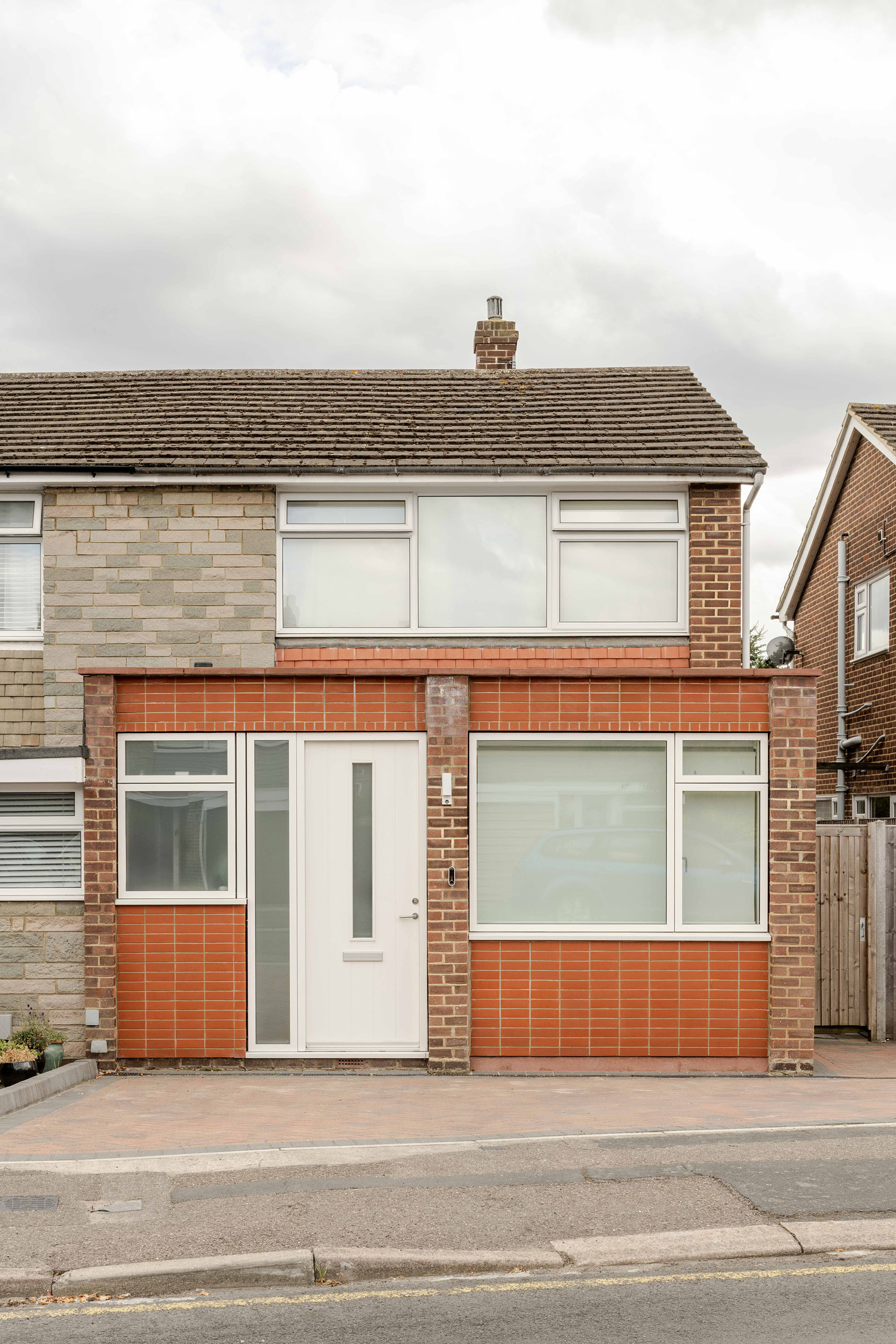
Front elevation
The original front of the house was very typical of its time. PVC windows, a PVC front door, stonework throughout, and a low, compressed entrance. On the right-hand side was a garage. It has now become the study. That moment of arrival felt particularly underwhelming.
The work at the front focused on making the former garage fully habitable and raising the roof so it no longer felt confined. Wherever elements were renewed or added, they were given new materials to clearly distinguish the new from the old. The aim was to turn a weak point of arrival into something more generous and confident.
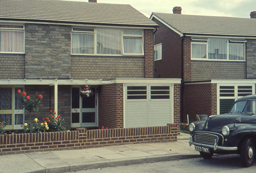
All the houses on the street have been adapted over time. I love the below image of the property as it originally was in the 1960’s shortly after construction.
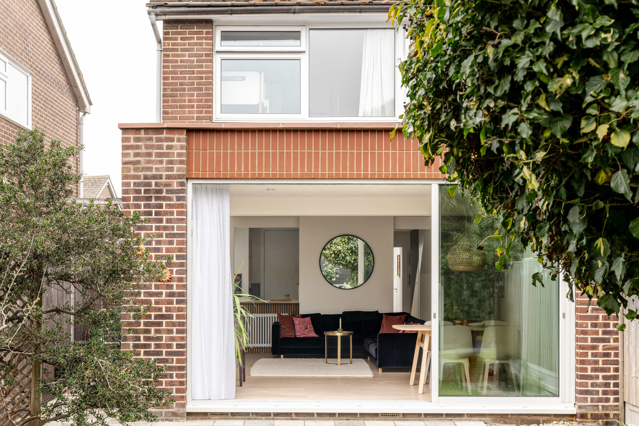
Hallway to garden
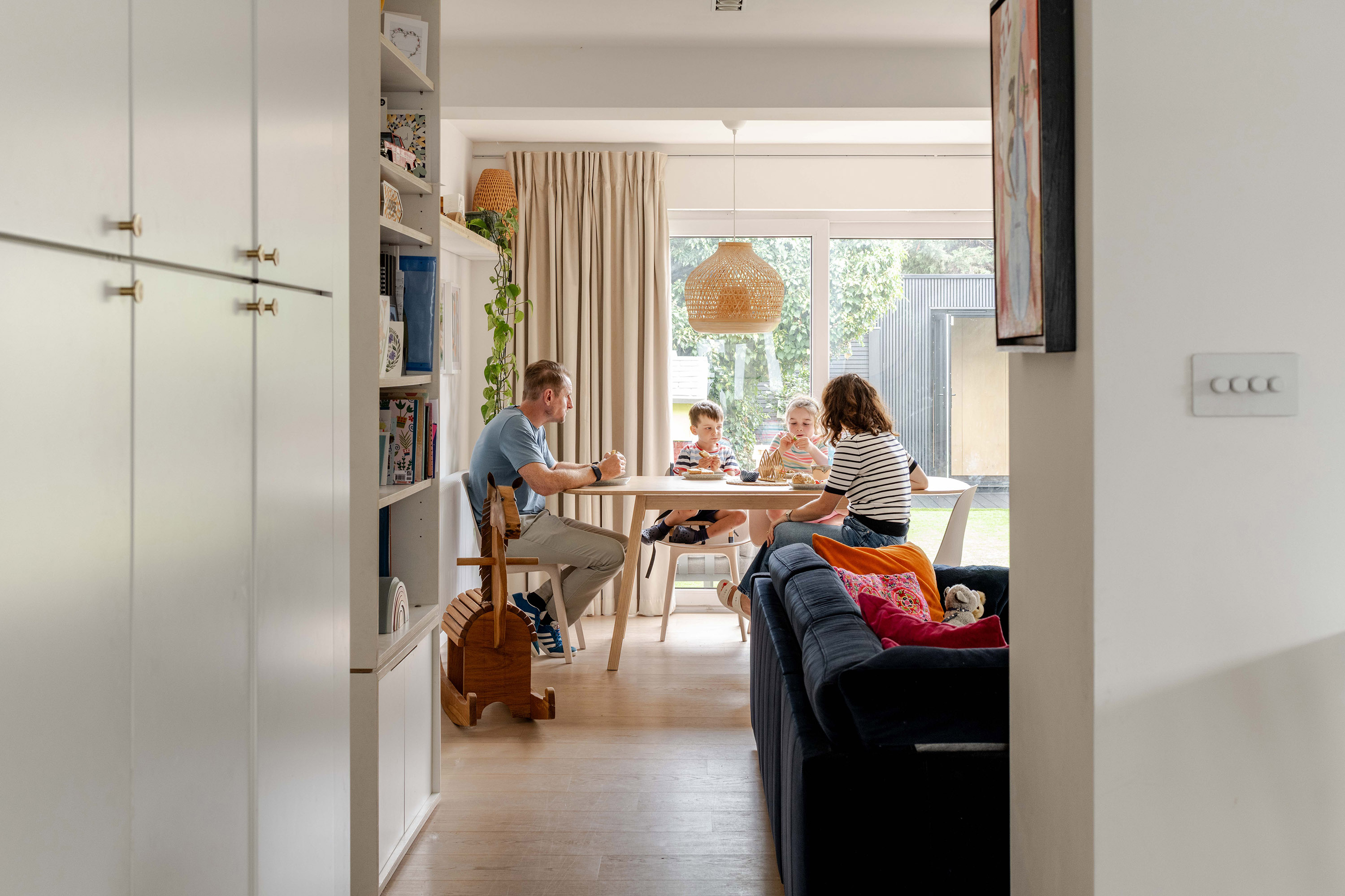
Where the bar stools and joinery sit now was originally the dining room, tucked into the darkest part of the house beside the hallway. It was tight and awkward. You had to pass through it to reach the lounge. The lounge was oversized and pushed to the back, with furniture lining the walls. The kitchen was also closed off, separated by a door, so there was no daylight moving across the plan from the side window into the dining area, lounge or hallway.
The key change was relocating the dining space to the back of the house beside the garden and allowing the kitchen to push slightly into the former dining room to gain usable space. What was once the most compromised part of the plan is now where we naturally gather, with light, outlook and a direct connection to the garden.
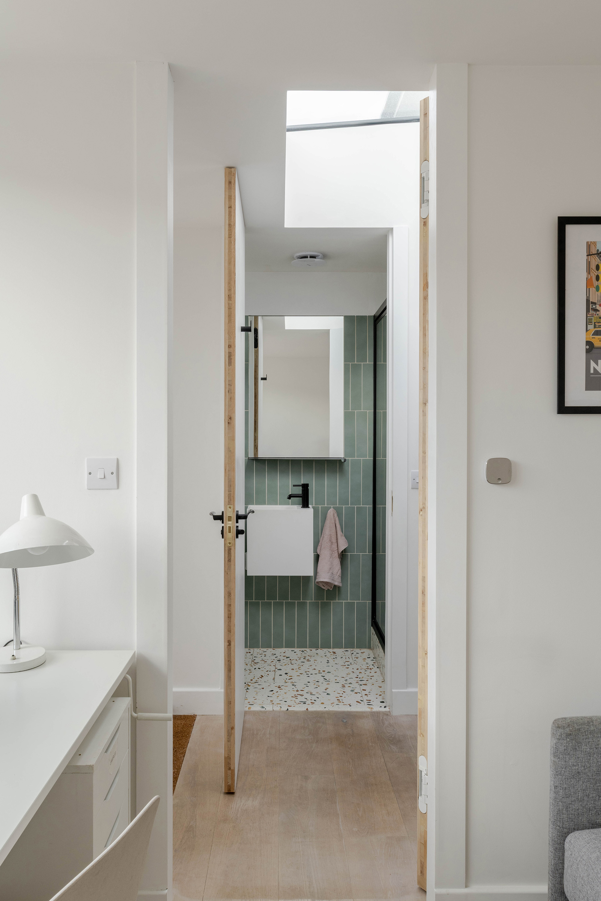
Taller entrance
The success of this space comes from continuity of height. There are no down stands between the hallway, study and shower room, allowing the verticality to read clearly. A central rooflight brings daylight into all three spaces at once.
The hallway was always generous in width; it simply needed light and height to be appreciated.
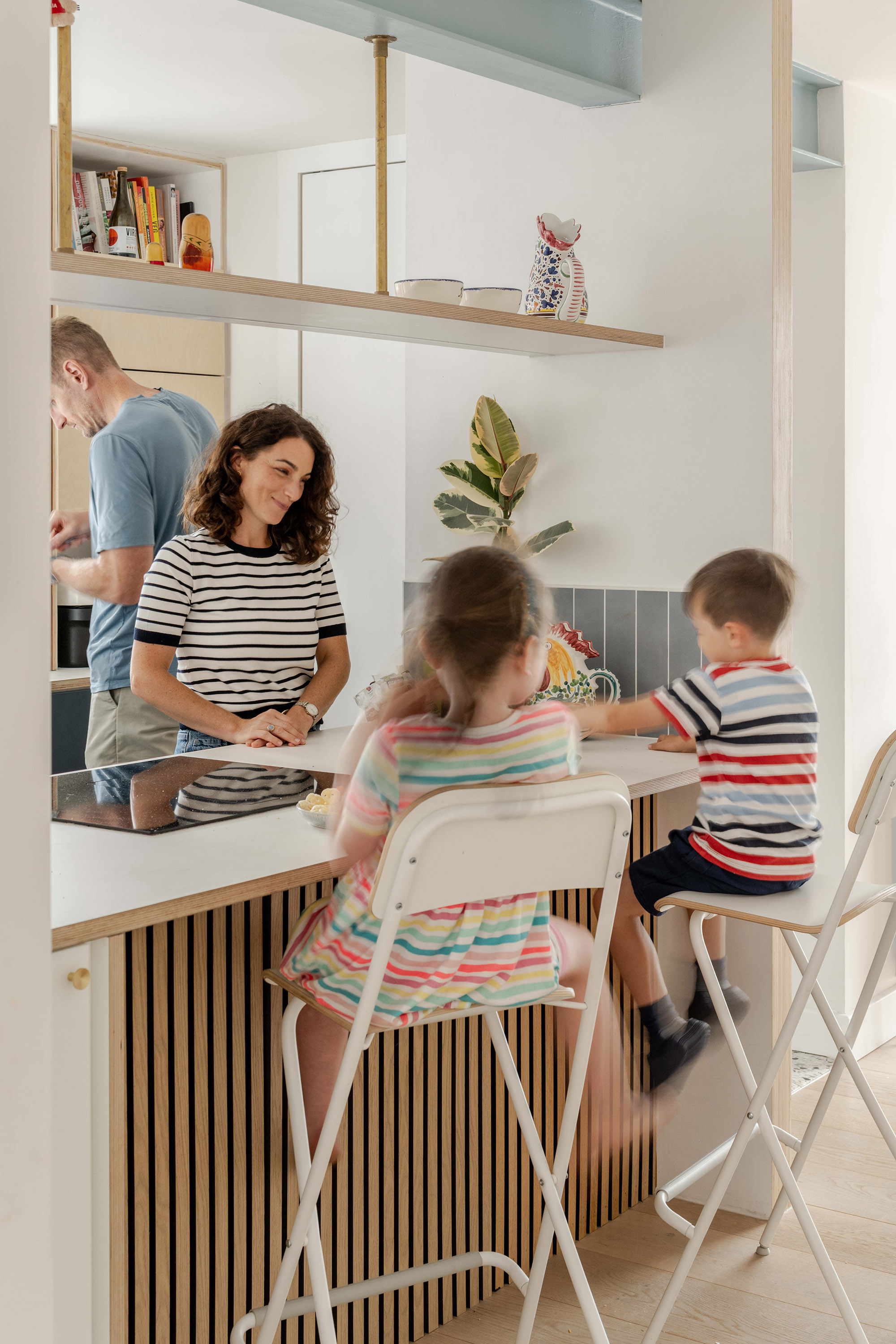
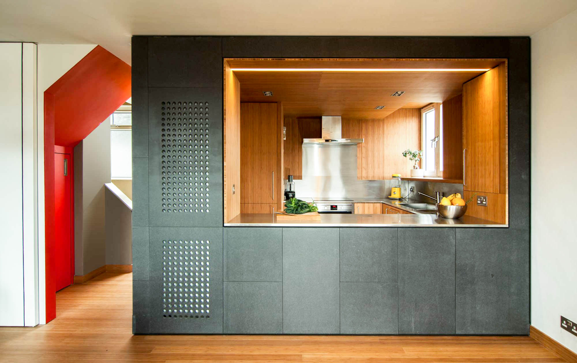
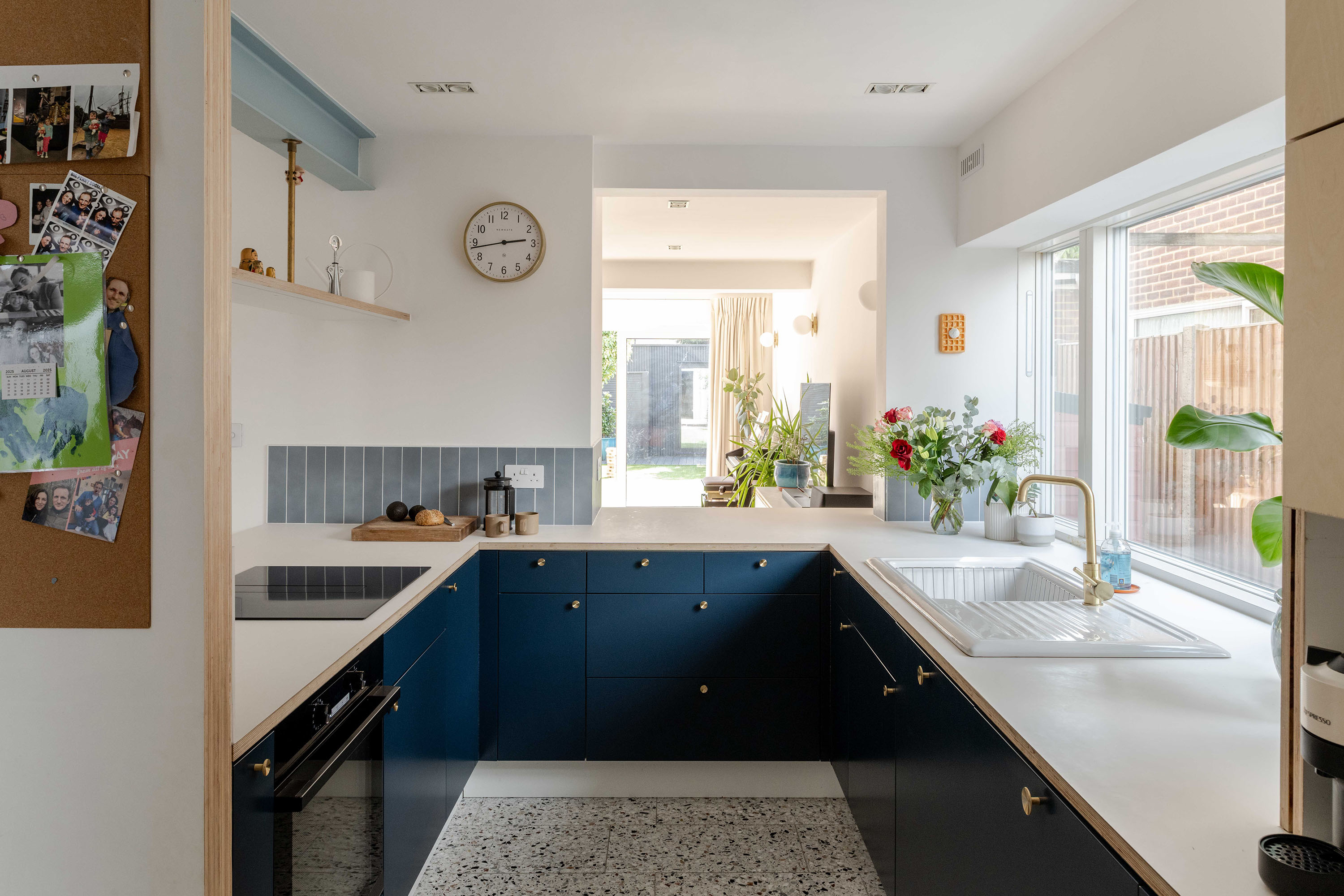
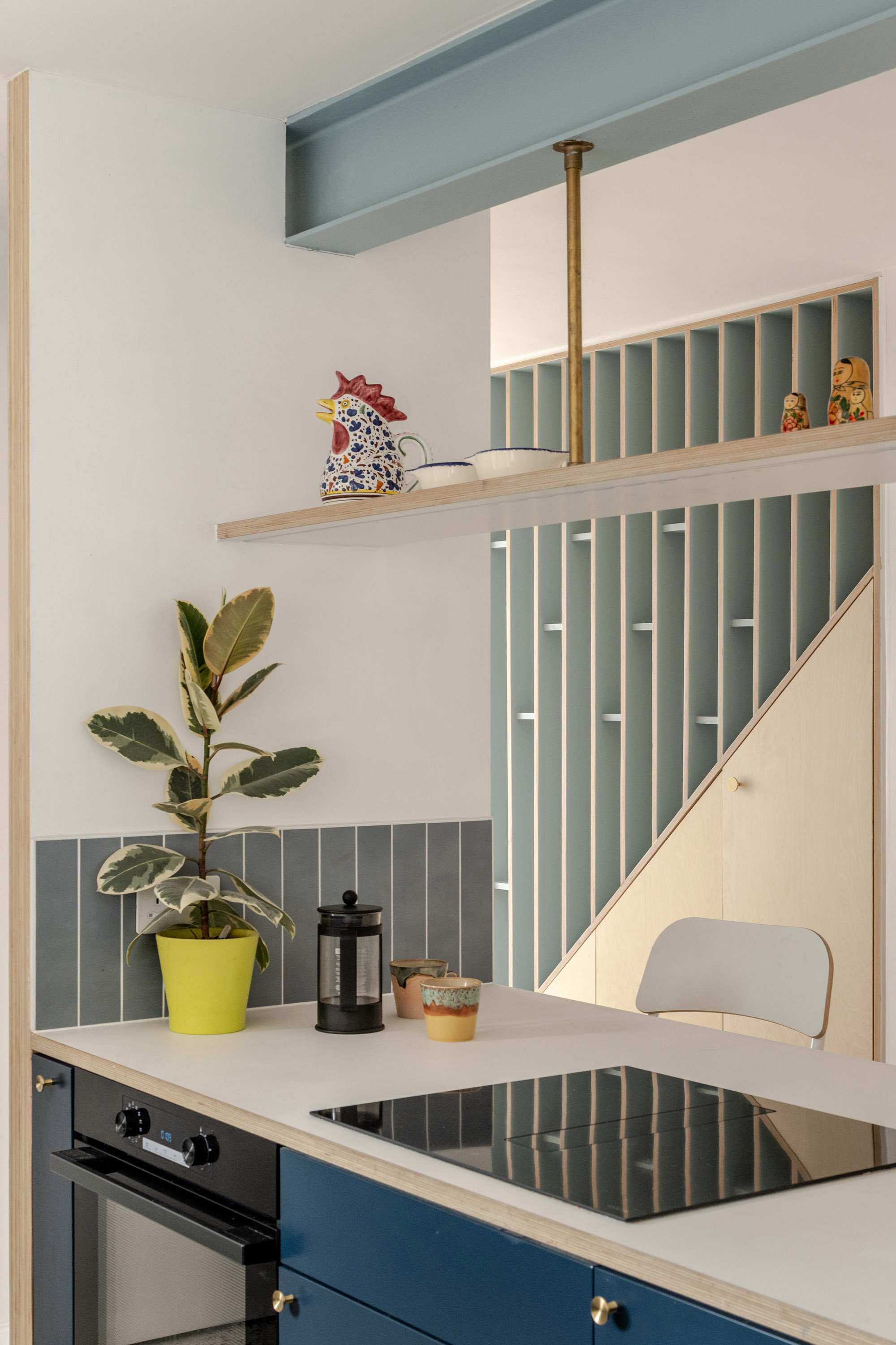
Breakfast bar
Removing the wall here transformed the kitchen from an isolated room into a social space. This is where mornings happen: breakfast, homework, conversations. Friends gather here while food is being prepared.
What was once the darkest part of the house has become one of its most active spaces.
The new opening required a steel beam to carry the loads above. Leaving it exposed allowed us to integrate a hanging shelf beneath it, reducing clutter on the worktop and keeping everyday items close at hand.
It’s a practical move, but one that has a big effect on how calm and usable the kitchen feels.
Kitchen ‘Bookend’
The short stud wall at the end of the island controls views from the hallway and prevents the kitchen being revealed all at once. It masks clutter at the point of arrival, frames views in and out, and incorporates a noticeboard on the hallway side.
The space remains open, but more ordered.
The background finishes are deliberately neutral. This was a fast build, carried out during a busy period with young children and a wedding being planned.
We didn’t have the capacity to fully explore colour at that stage. The house is designed to evolve, rather than be finished in one moment and colour is something I plan to re-visit at a later date.
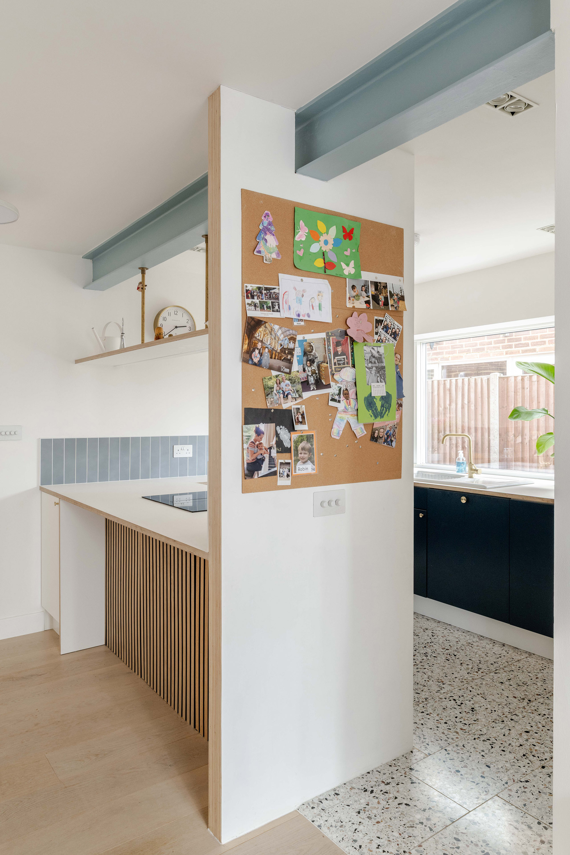

The ceramic waffle is by a Belgian cartoon artist who makes food objects as wall pieces. Being by a Belgian and being a waffle it felt like an apt personal, playful addition to the kitchen.
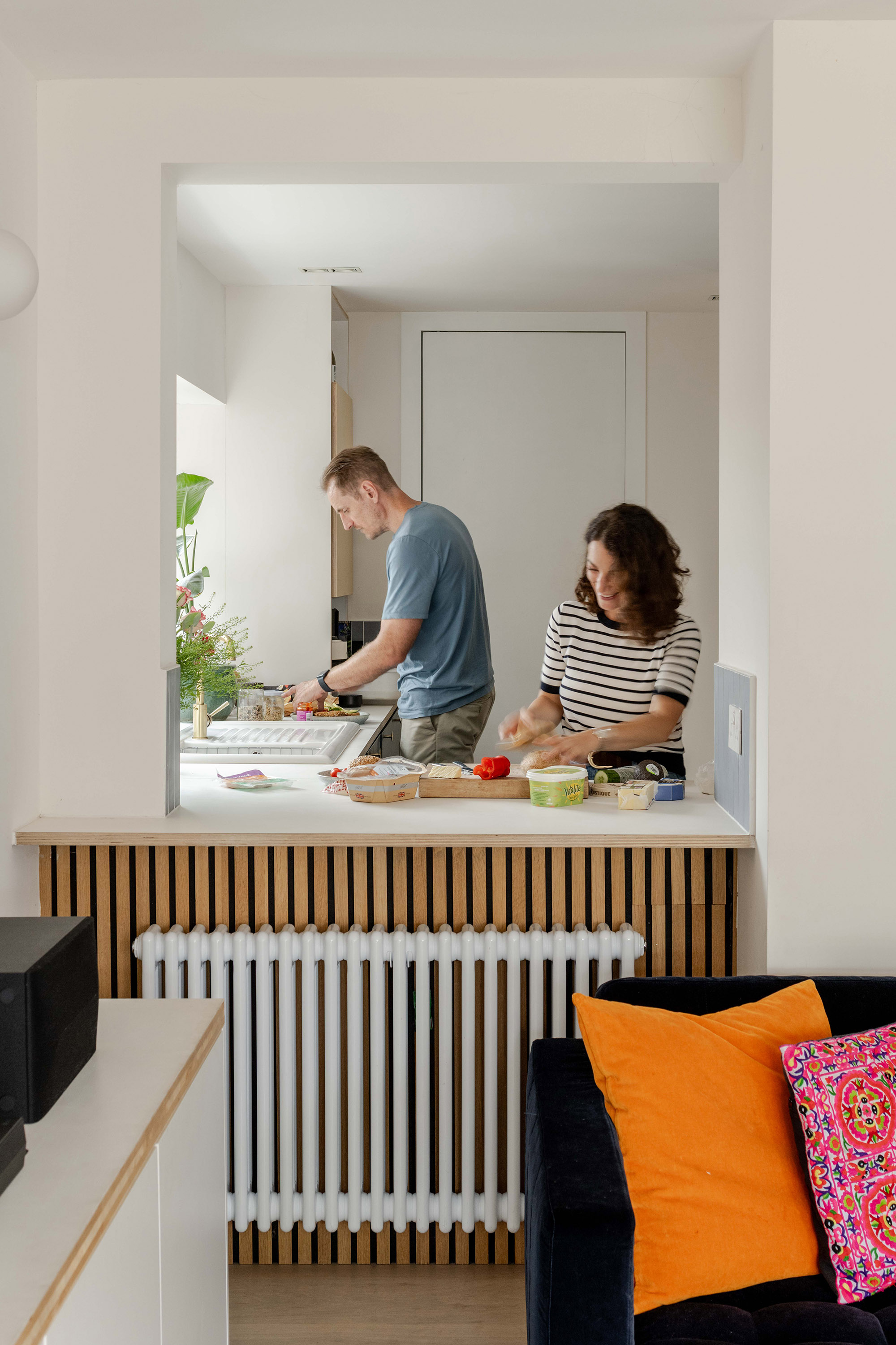
This view through the kitchen is important because it opens the space without revealing everything at once.
Opening up the house has created moments like this: piano practice drifting into the kitchen while someone is cooking.
These small, everyday overlaps are a direct result of how the spaces now connect.
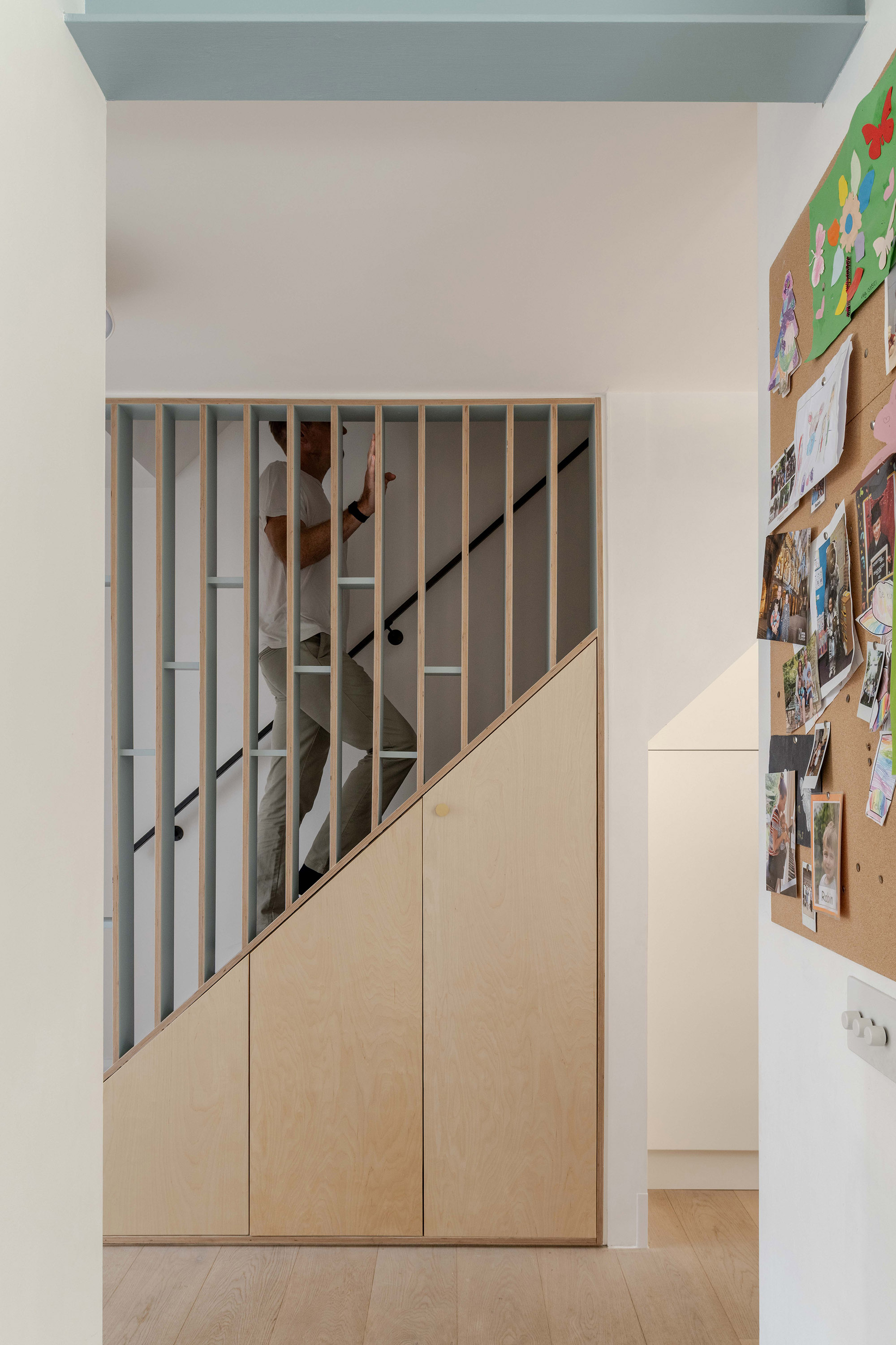
Stair with plywood fins
Originally there was no balustrade here, making the stair feel unsafe and unresolved. Vertical plywood fins now define the edge, accentuating the height of the space.
The blue picks up on the exposed steel elsewhere, while the plywood keeps the material language warm and grounded.
Envelope upgrades
Originally, this part of the house had a PVC window and a side door leading to the side passage. We removed both to prioritise worktop space and simplify the plan — the door was mainly used for bins and wasn’t essential.
In their place, we introduced high-performance, triple-glazed windows with deep frames. This was part of a wider approach to improving the building envelope, alongside additional insulation and improved airtightness elsewhere in the house. These changes aren’t particularly visible, but they’ve transformed how the house feels to live in: more stable temperatures, fewer draughts, and a noticeable improvement in comfort throughout the year.
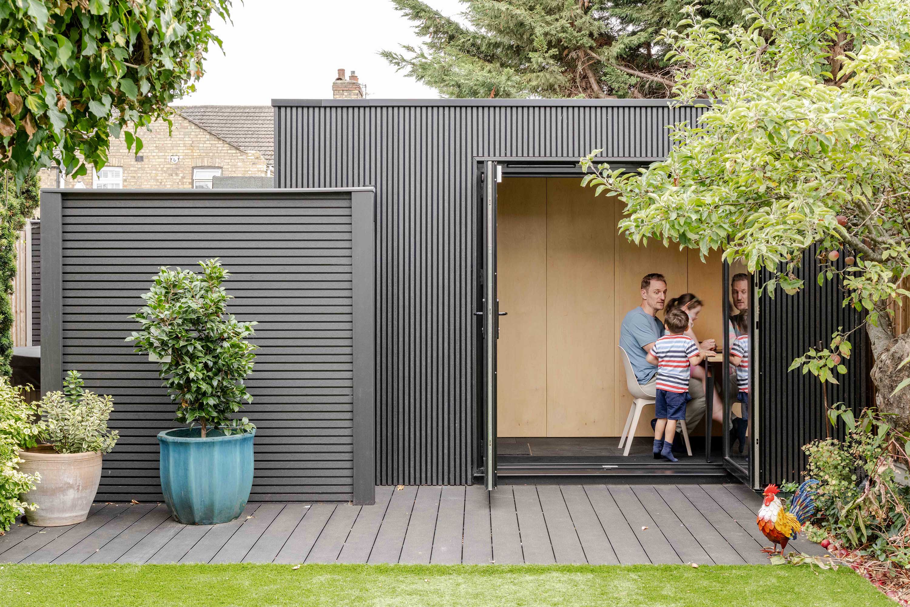
Garden studio
The garden is organised into three clear zones. Closest to the house is the patio, used for sitting and dining directly off the kitchen. The middle zone is lawn, and at the back is a more contained leisure zone where everything is black — floor, walls and fencing — to give it a distinct identity.
This is where the garden studio sits, housing a study, storage and a sauna. A screen partially conceals a more private corner containing the hot tub, which connects visually to the sauna through a window. The intention was to give each part of the garden its own character without fragmenting it.
Flush garden
One detail that mattered a lot was keeping the decking and grass completely flush. There’s no step or obvious threshold between them, which helps the garden feel longer and calmer.
We dug down at the back of the garden and introduced a small retaining wall beneath the decking so the grass could meet it directly. It’s a subtle move, but it makes a noticeable difference to how the garden is perceived.
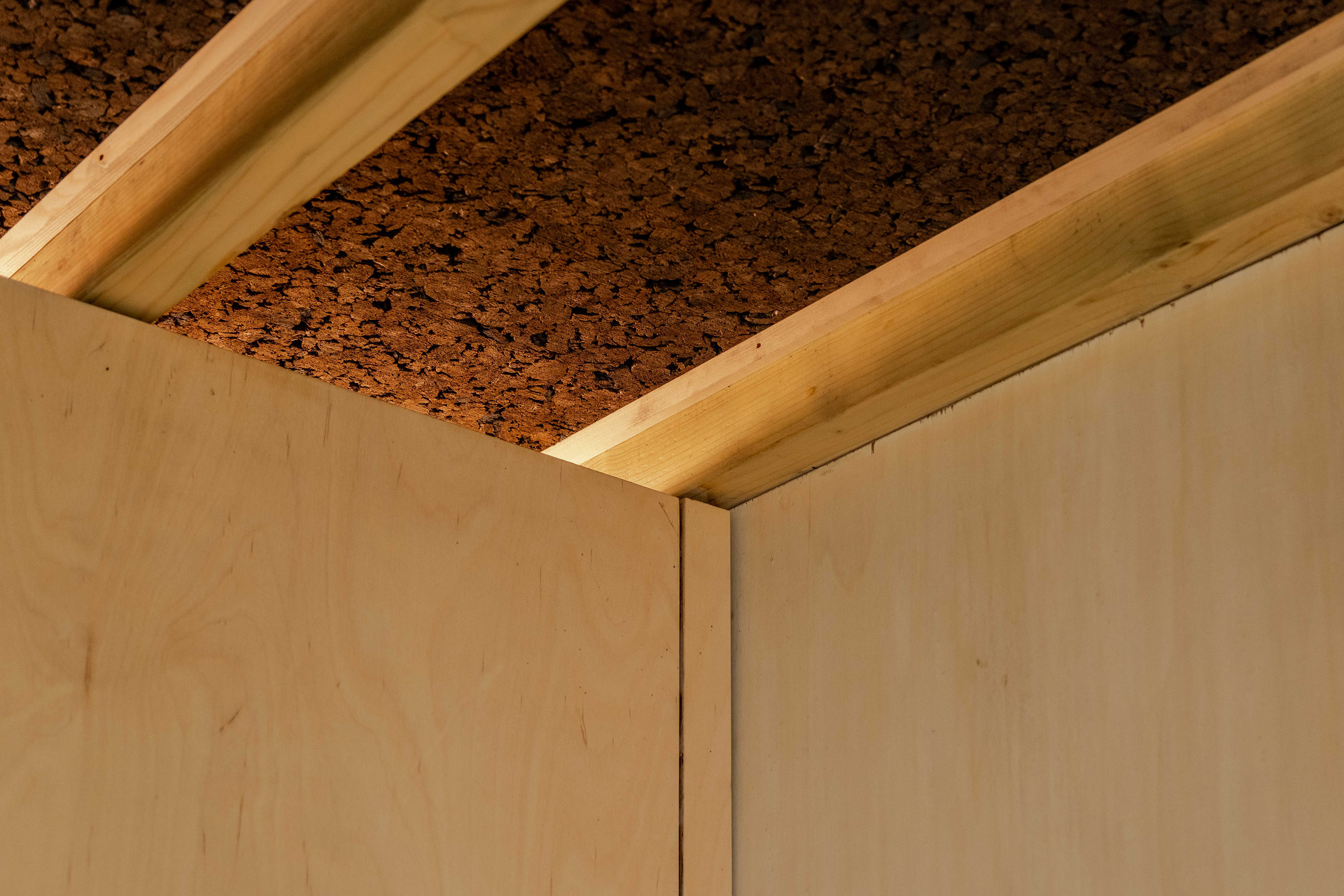
Garden studio ceiling
The exposed joists came from a technical decision as much as an aesthetic one. We used a warm roof construction, with insulation sitting above the structure, which improves thermal performance and reduces condensation risk. That allowed the joists to remain visible internally, creating height and rhythm across the ceiling.
Cork insulation sits between the joists, adding warmth, texture and acoustic softness, with concealed lighting washing gently across the surface. Beyond the visual qualities, this build-up means the studio warms quickly, holds heat well, and can be used comfortably year-round without excessive energy use.
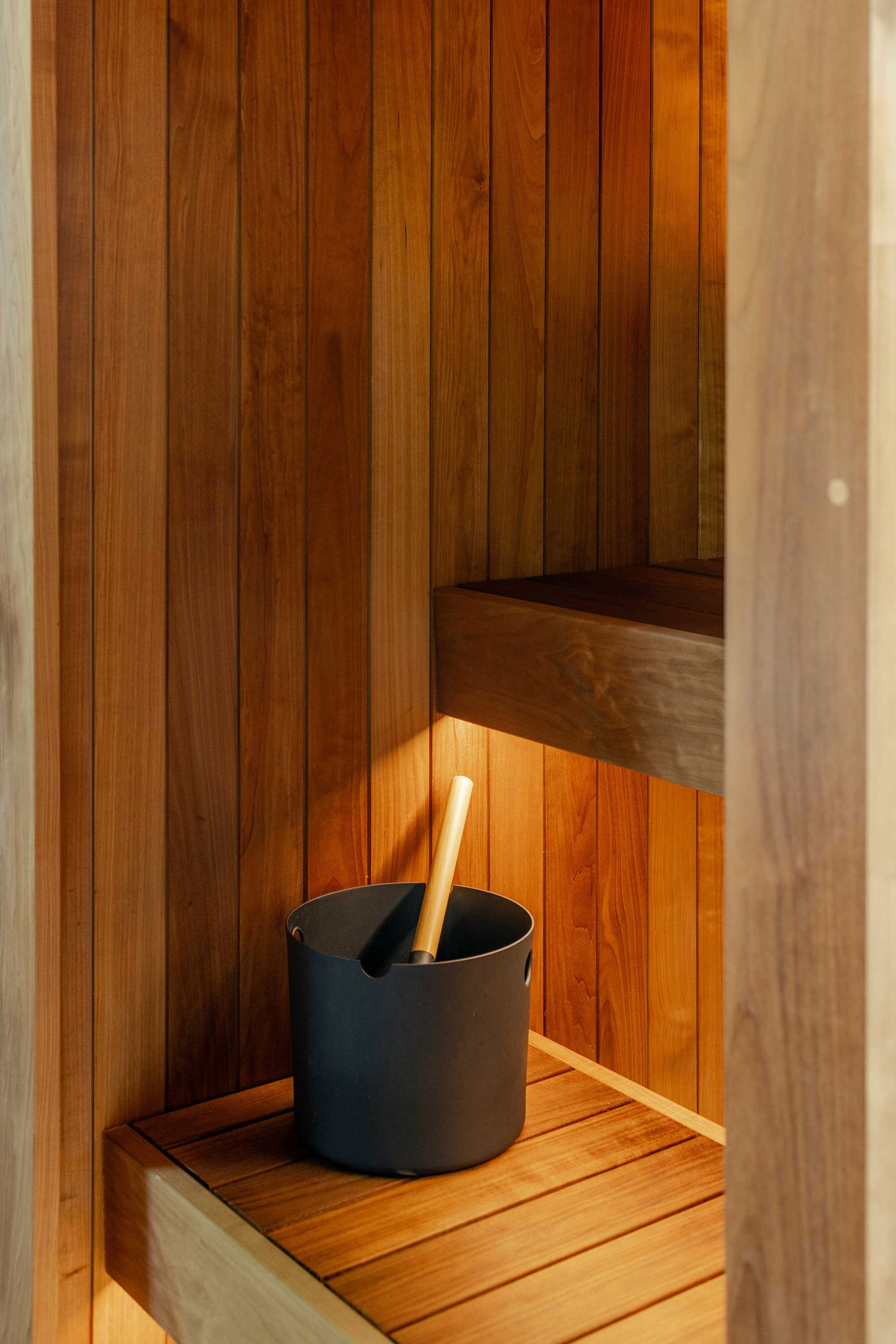
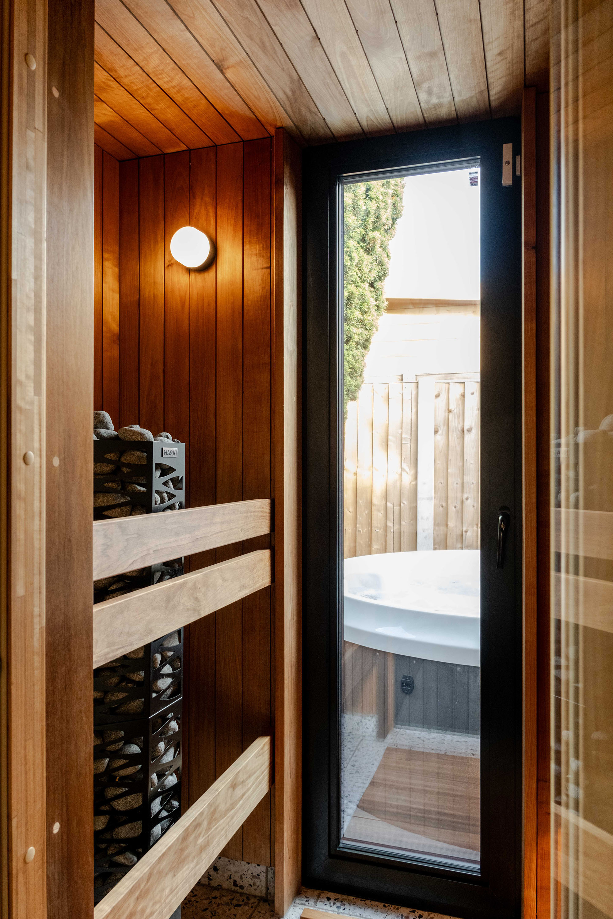
Sauna interior
The sauna wasn’t part of the original brief. It began as a simple garden shed, then evolved into an insulated structure with flexibility for future use, and eventually into a study and sauna combined.
It’s compact but carefully planned, fitting storage, workspace and a two-person sauna into a very small footprint. I built it myself, learning the principles of ventilation, insulation and airtightness along the way.
Ventilation, insulation, and airtightness were key considerations in the sauna. Air enters and exits in a controlled way. This creates good airflow. Meanwhile, the rest of the structure remains airtight to retain heat. We used PIR insulation rather than natural materials because of the limited space.
Internally, heat-treated aspen was chosen for its tone, texture and smell — more refined than pine, but less costly than something like cedar.
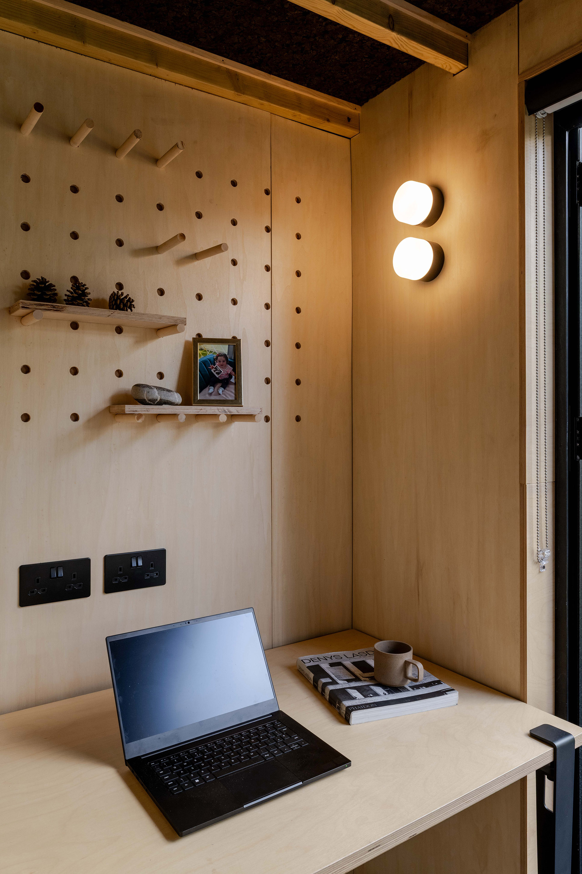
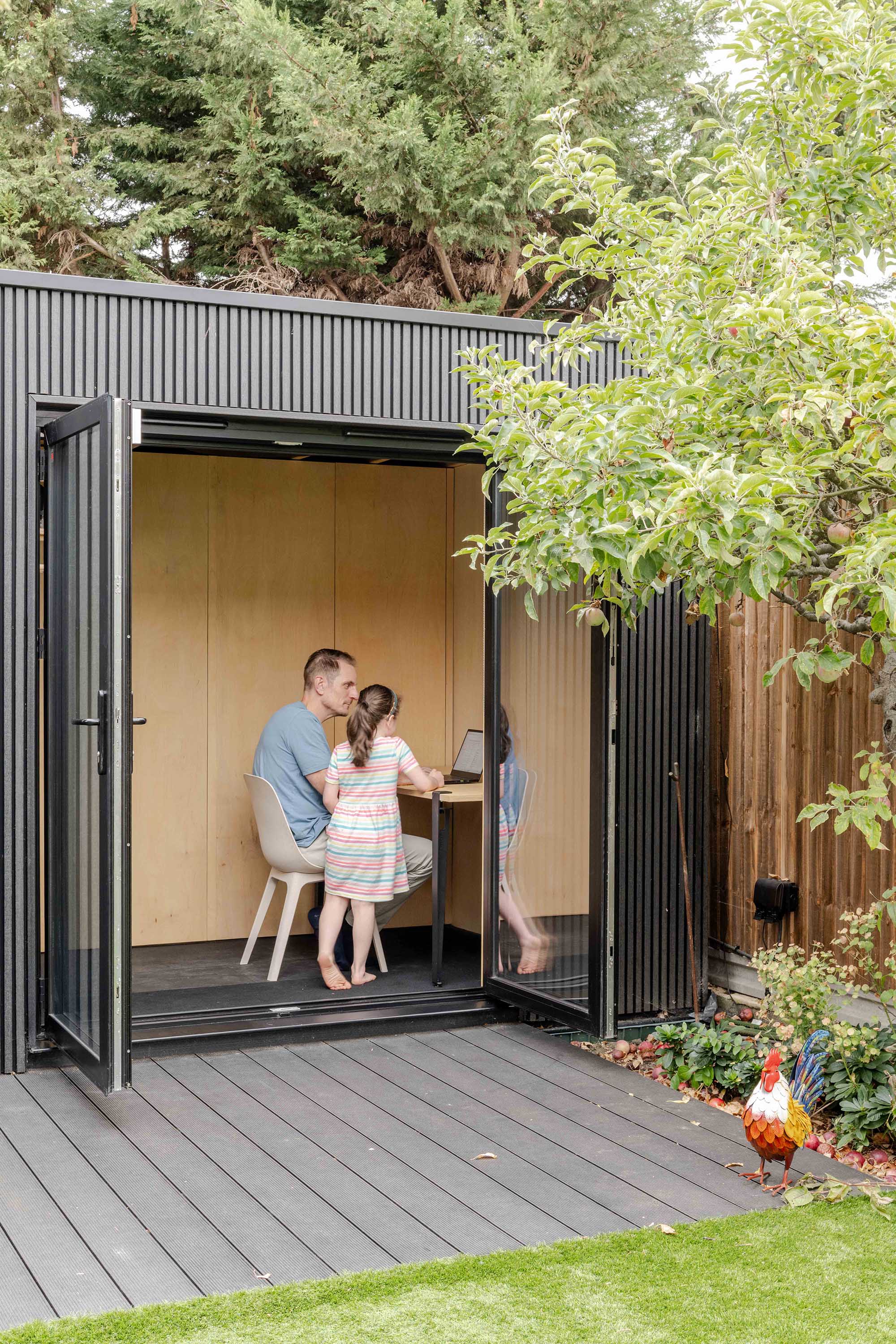
Study space
The studio is used as a study when I need quiet or when the house is busy. In summer, the doors open fully and the garden becomes an extension of the workspace.
Heating is provided by an infrared panel in the ceiling, which heats people rather than air and responds quickly, making it well suited to a space that’s used intermittently rather than constantly.
Meticulous planning
Living in the house has reinforced the value of thorough planning. This is especially true for performance and construction decisions. Almost everything was decided upfront. That allowed the build to move quickly and with far less stress.
Not having to make constant decisions on site fundamentally changed the experience and confirmed how much value there is in thinking carefully before building.
Still evolving
The house isn’t finished, and it probably never will be. There are plans to replace the rear doors with higher-performance glazing, raise the rear roof, and rework the upper floor as the children grow.
The house isn’t a showpiece. It’s a home shaped by careful decisions, a few spontaneous ones, and an ongoing conversation between architect, partner and family. And for me, that’s exactly the point.
Thanks You’s!
Contractor – Optimal
Engineer – Constant SD
Photographer – French and Tye
Architect – really?

Contact us for your project
If you’re thinking about starting a project and want architects confident enough to test their ideas on themselves first, we’d love to hear from you. Get in touch to start a conversation. Contact us here.
Trevelyan House
Before moving to Cheshunt, our family lived in Trevelyan House, a compact two-bedroom apartment in a central London Brutalist tower block. It taught us a lot about efficient layouts, light, and adaptability.
Moving from Trevelyan House to Cheshunt marked a shift from making the most of limited space to designing for growth, connection, and everyday comfort.
Read more about Trevelyan House by clicking here.