Mazarine
Belsize Park, 2023
The colourful joining of two mansion apartments in Belsize Park to create a two-storey family home amongst the tree tops. With a design brief that focused on maximising daylight and a client passionate about travel, art and natural materials, Mazarine unfolds as an expression of colour, light and flow.
‘BVDS brought a refreshing perspective by simply looking at the possibilities, which is a rarity, they encouraged us to explore ‘what if’ scenarios, opening up a world of creative potential.’ Sreeja
The Client
Gautham and Sreeja just returned to London after 10 years living in Bombay. They returned to their flat in London with their family and knew they needed more space, both for their immediate family with two teenage daughters but also with a lot of family and friends passing through to be able to accommodate visitors comfortably for periods of time.
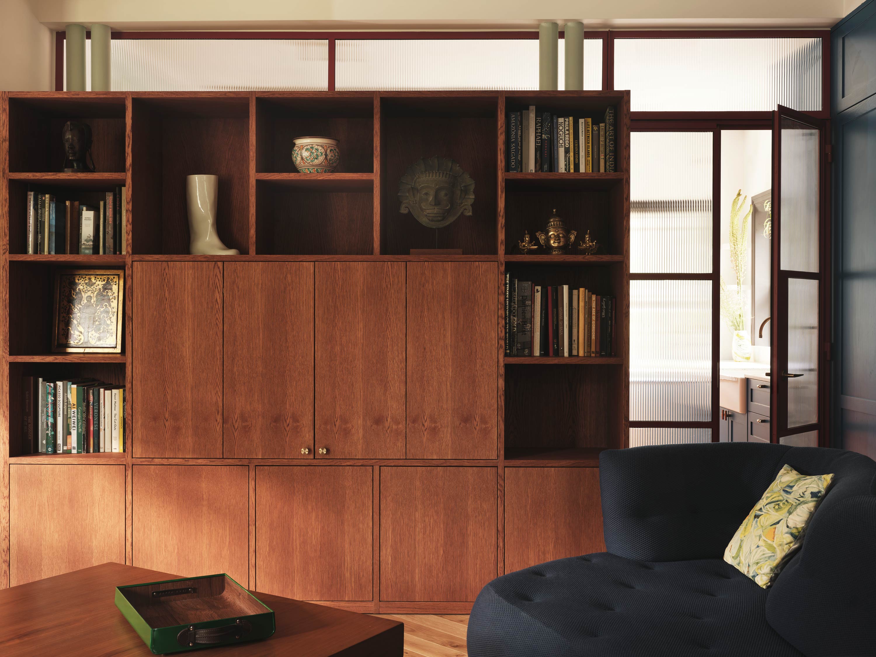
With an art collection that spans their time in Bombay and their travels in between, Gautham and Sreeja have a serious and varied eye for art and furniture. Their main interest lies in pieces that transport them to festive memories and lively atmospheres of the places they’ve lived and visited.
They wanted their renewed, duplex family home to provide a light filled, joyful backdrop for new memories and their artistic pieces of joyful nostalgia.
The Original Property
The original properties consisted of two separate mansion flats, each accessible via a communal foyer and stacked on top of each other. While the layout within each of the flats was nearly identical, they had distinctly different interior atmospheres. The lower flat featured impressively tall ceilings, while the upper flat provided secluded views of the trees in the shared garden. Both flats benefited from ample daylight exposure on the street frontage, facing south.
The flats had a classic mansion layout, being very wide and with a traditional central corridor, surrounded by cellular rooms accessed from standard sized door openings. Gautham and Sreeja were always attracted to the width of the property, reminding them of the spaces they lived in Bombay – wide, connected and all on one level. The property differed from the typical ‘vertical’ terrace in London.
The Brief
‘We wanted colour to be vibrant and uplifting, which is the exact feeling we get when we enter our new kitchen each morning.’ Gautham
Gautham and Sreeja approached Bradley Van Der Straeten to assist them in introducing light, colour, and natural materials into their living space. They were explicit about their desire for an open and contemporary design that mirrored the layout of their previous flat in Bombay. While their former residence had featured predominantly white surfaces and natural timbers, they were equally clear that they were open to incorporating colour into the interior architecture of their new home.
They were determined to create an open and inviting atmosphere in the property, and they were willing to consider alterations to the existing layout, even though their flats were sandwiched between other units both above and below. Simultaneously, they placed great importance on optimizing daylight and the orientation of spaces to make the most of the sunlight and the views of the treetops.

Design Ideas
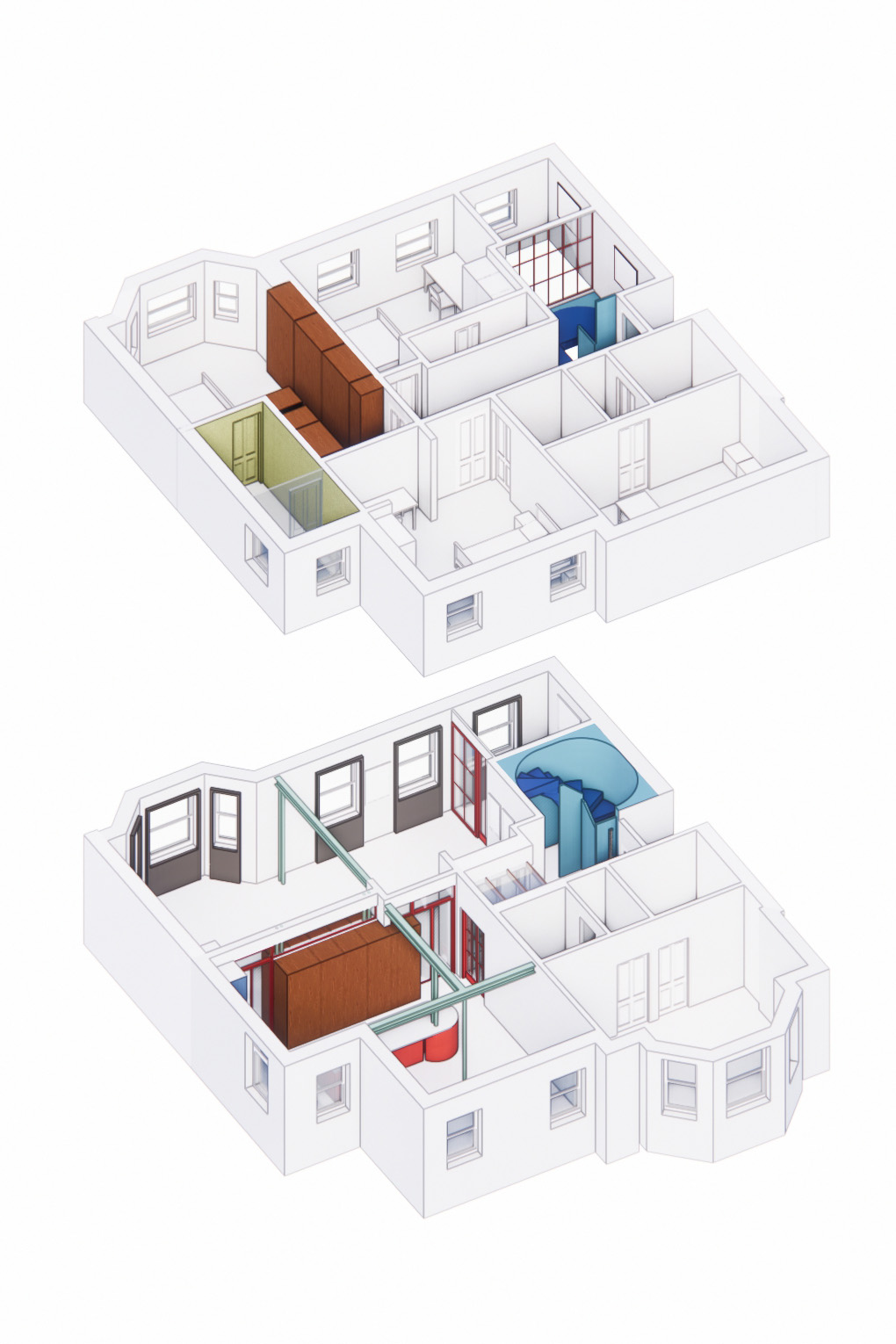
The initial layouts for combining the two apartments were determined by the most practical and advantageous placement for the staircase. Numerous iterations were considered and sketched, exploring options such as having the staircase at the end of the plan or positioned in the middle to enhance the sense of double-height space and light in the central area of the apartment.
Design Solution
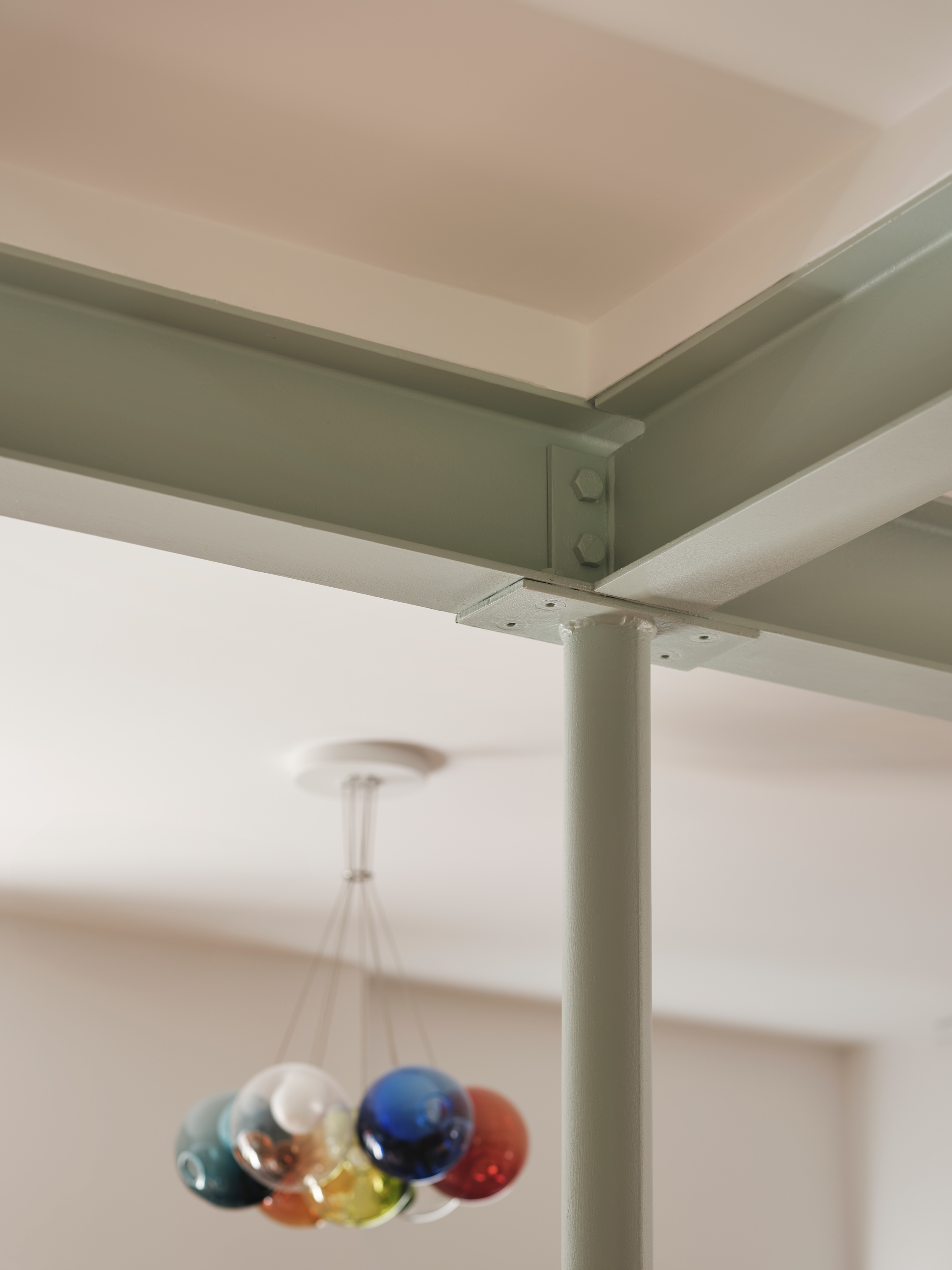
The resulting design positions the staircase right next to the entry, offering several advantages. It not only simplifies the required fire strategy but also creates a striking double-height stair void. Situated near the entry, the staircase serves as a conduit for a stream of natural light from the top floor down to the main entry on the lower floor. The dramatic effect continues behind the staircase, where a double-height study space is created for Sreeja. As Gautham notes, “Sreeja is not accustomed to UK winters,” so this space provides year-round brightness with two windows and a five-metre-high ceiling to capture the light.
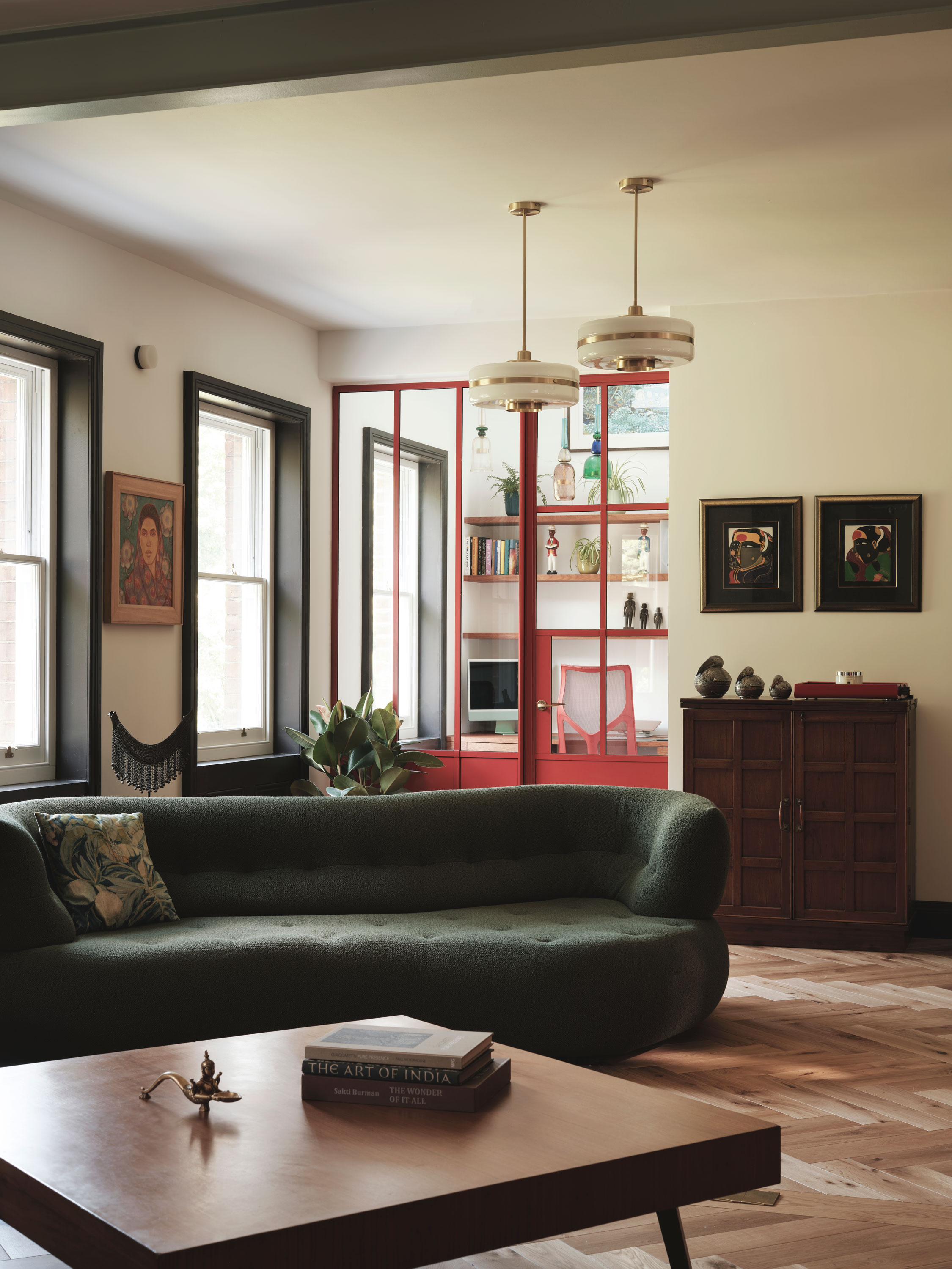
The lower flat, with its generous ceiling heights, has been utilised for the more social family spaces, including the living room, kitchen, and dining area. It is opened up across the plan, while the upper flat is transformed into a series of bedrooms, making use of the existing layout whenever possible.
The kitchen space held significant importance in the brief and is positioned with a south-facing frontage, along with the dining room.
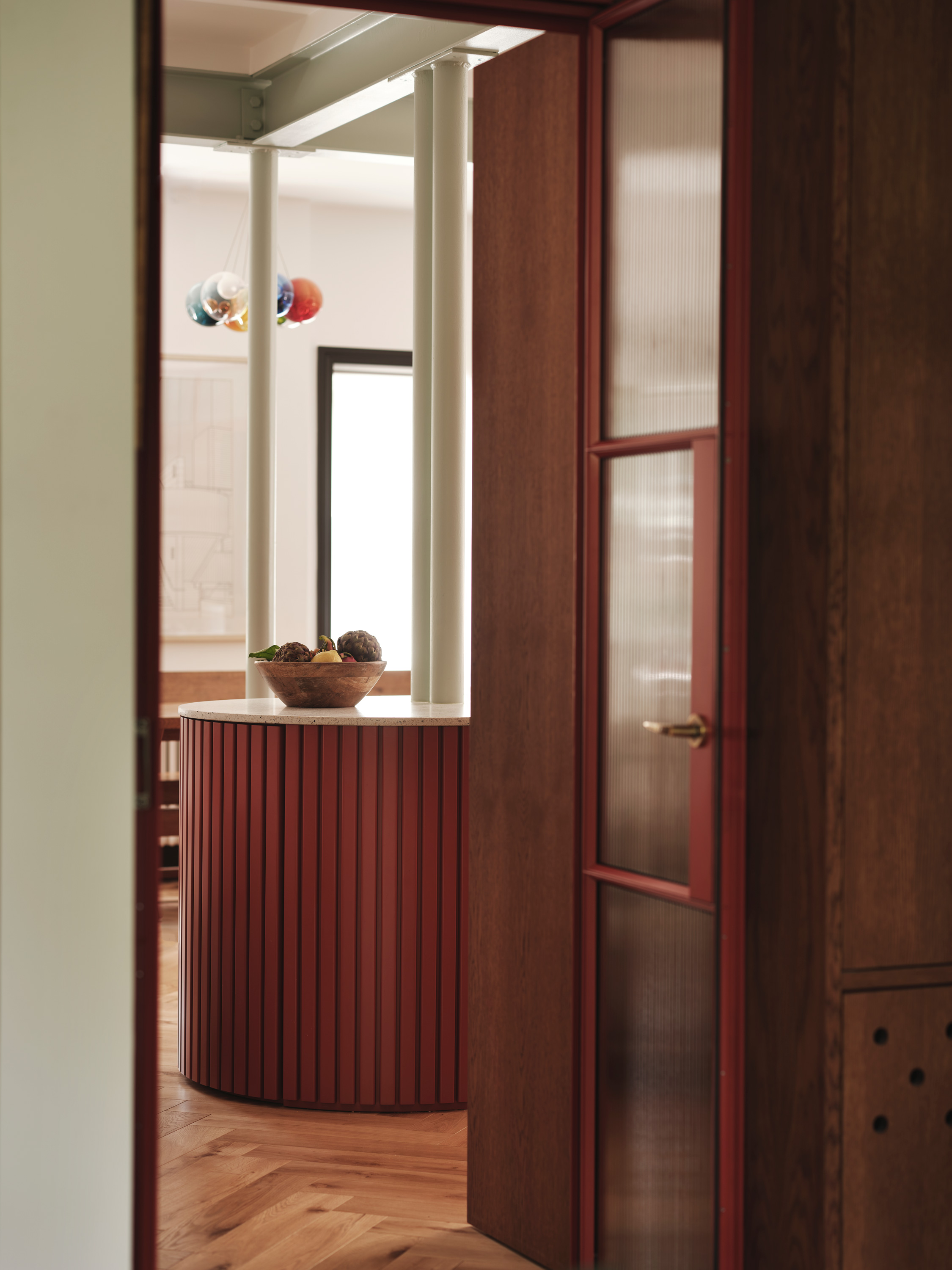
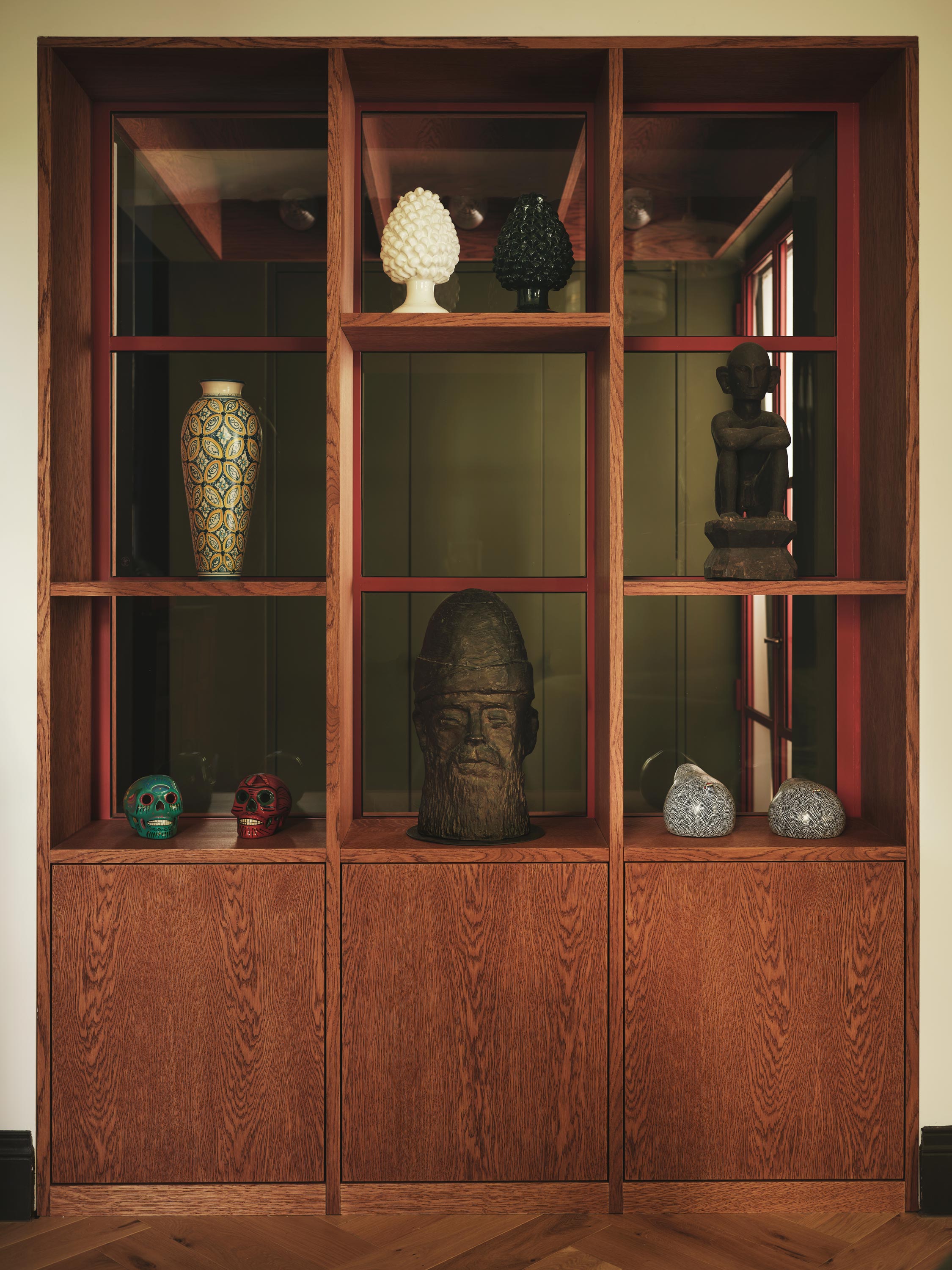
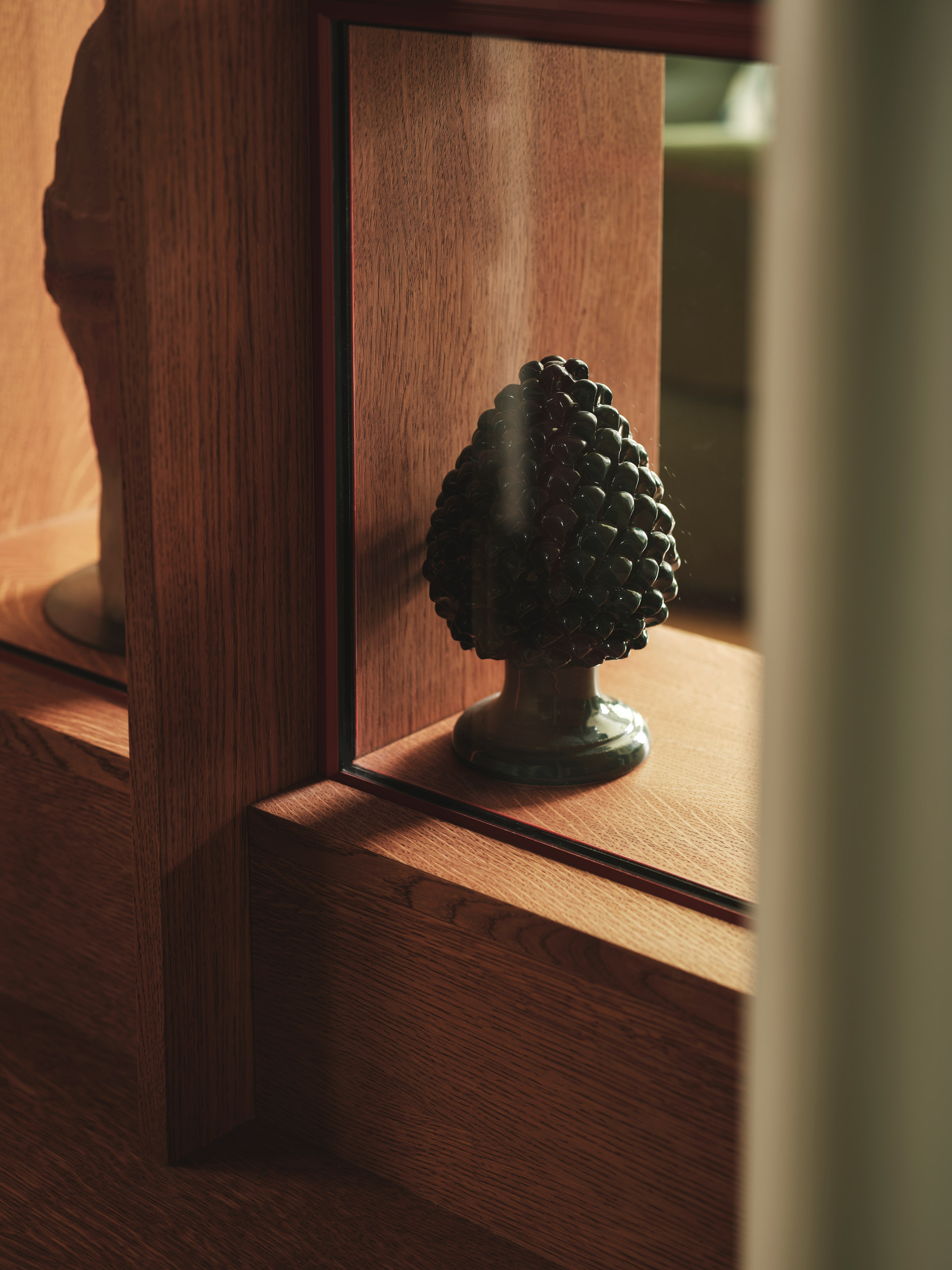
The approach to opening up the lower flat revolved around the concept of ‘objects within a space.’ Joinery ‘objects’ have been strategically placed between spaces to both conceal and highlight structural elements, establish zones, and offer storage. Internal glazing is used around these ‘objects’ to create a complete physical separation for fire safety, acoustic considerations, and kitchen aromas, all while permitting cross-light to filter through the now-opened plan. These ‘objects’ and brightly framed glass elements provide glimpses between spaces, guiding the eye and facilitating a seamless transition from one area to the next.
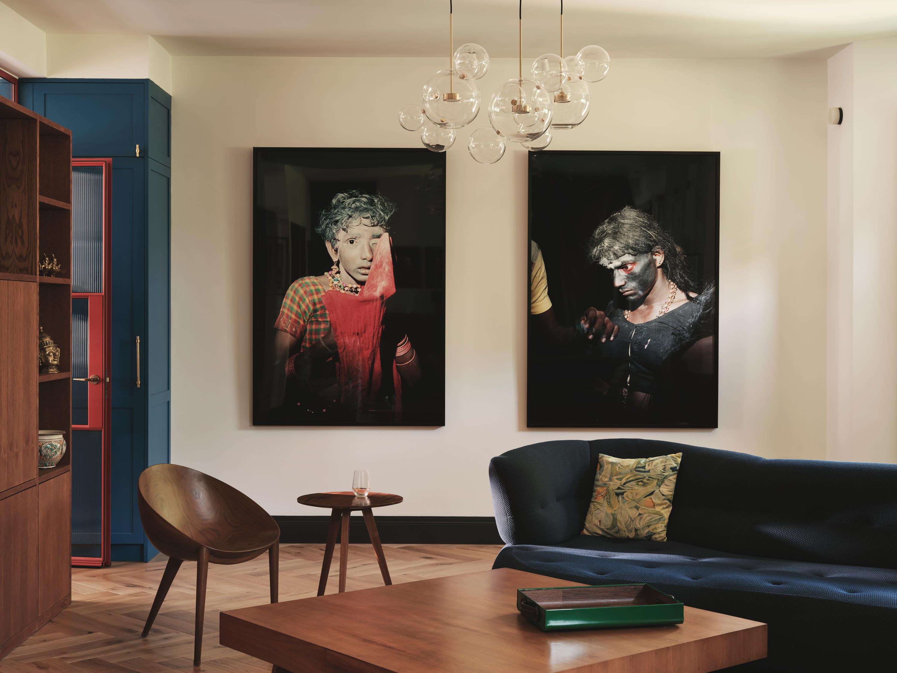
Vibrant art collection
Gautham and Sreeja’s art collection was one of the first things we noticed when we met them and entered their flat. Comprising vivid colours and a recurring vibrancy, the artwork illuminated their predominantly white, top-floor apartment. Their art reflects their time in India and their travels, with Gautham’s spontaneous connection to pieces he discovers.
Their art hails from Southern India, Seychelles, and Brazil, each presenting its unique, vibrant color palette, inspiring the design of various spaces within their home.
“From the moment you arrived, your genuine curiosity in our artwork and interior aesthetics stood out, defying my expectations of a sole focus on the building’s structure; your attention to detail, evidenced by capturing our artwork through photographs and presenting an incredible Mood Board inspired by the colours, left us truly amazed.” – Sreeja

Colours
“The first thing everyone mentions is the colours. They find it surprising that such combinations actually work well.” – Gautham
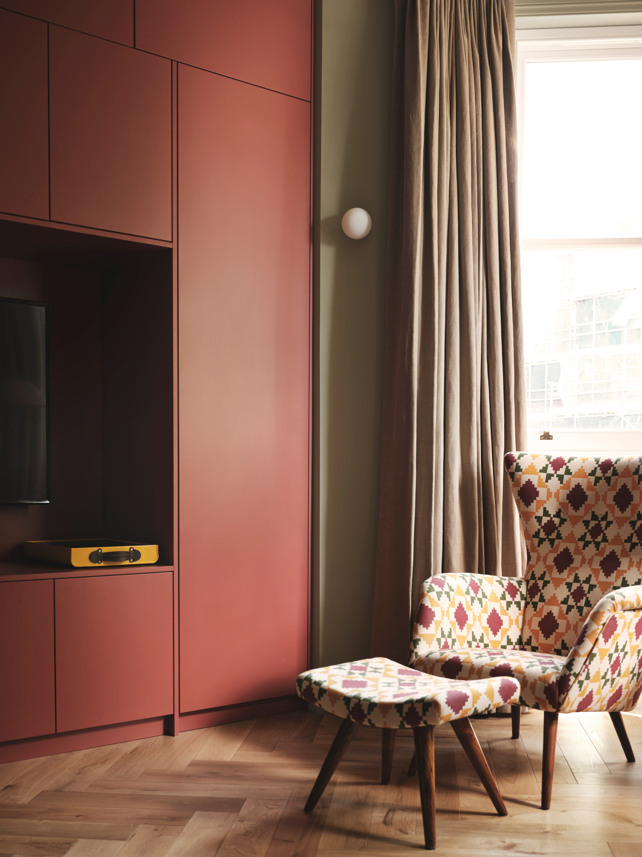
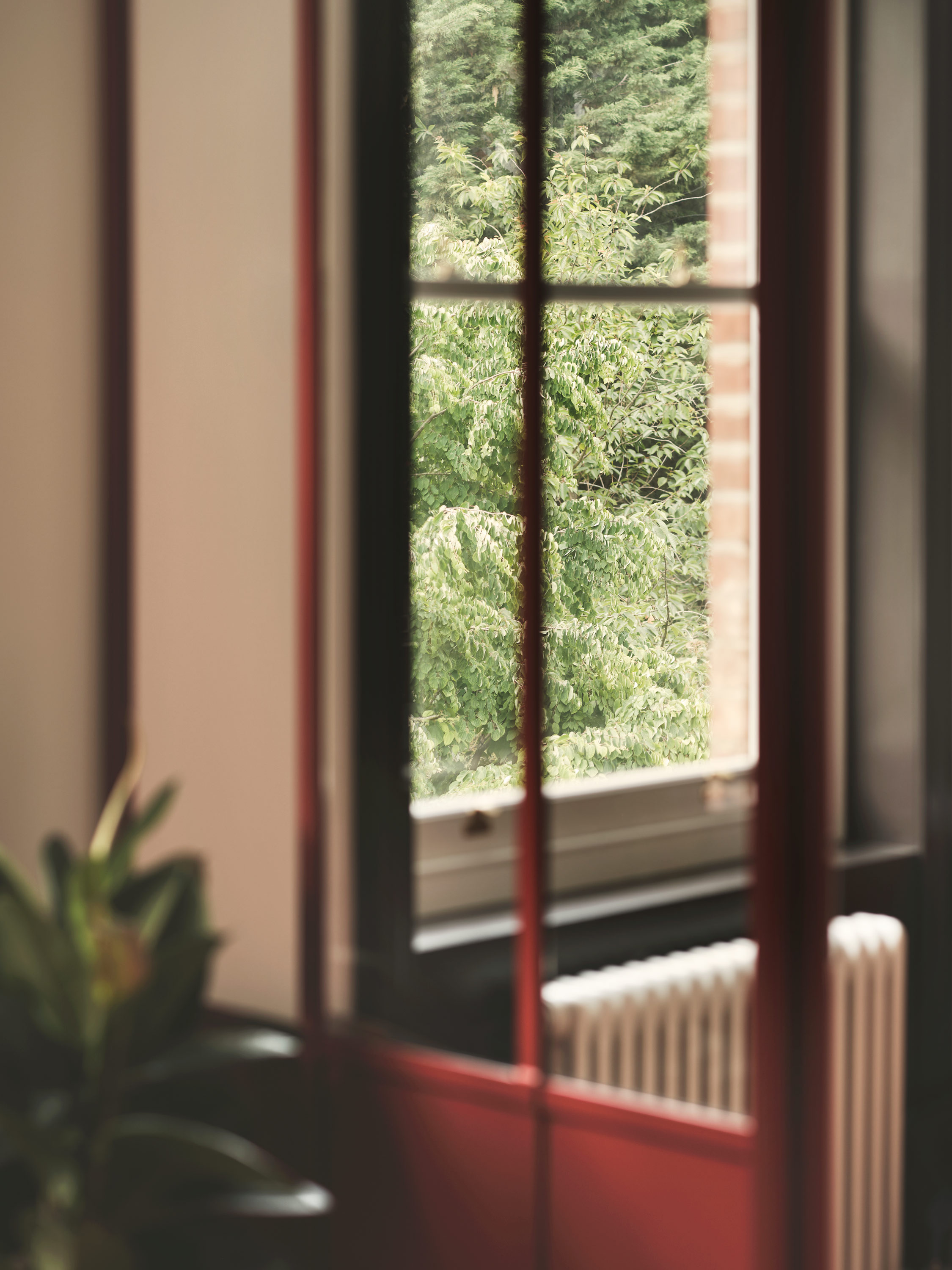
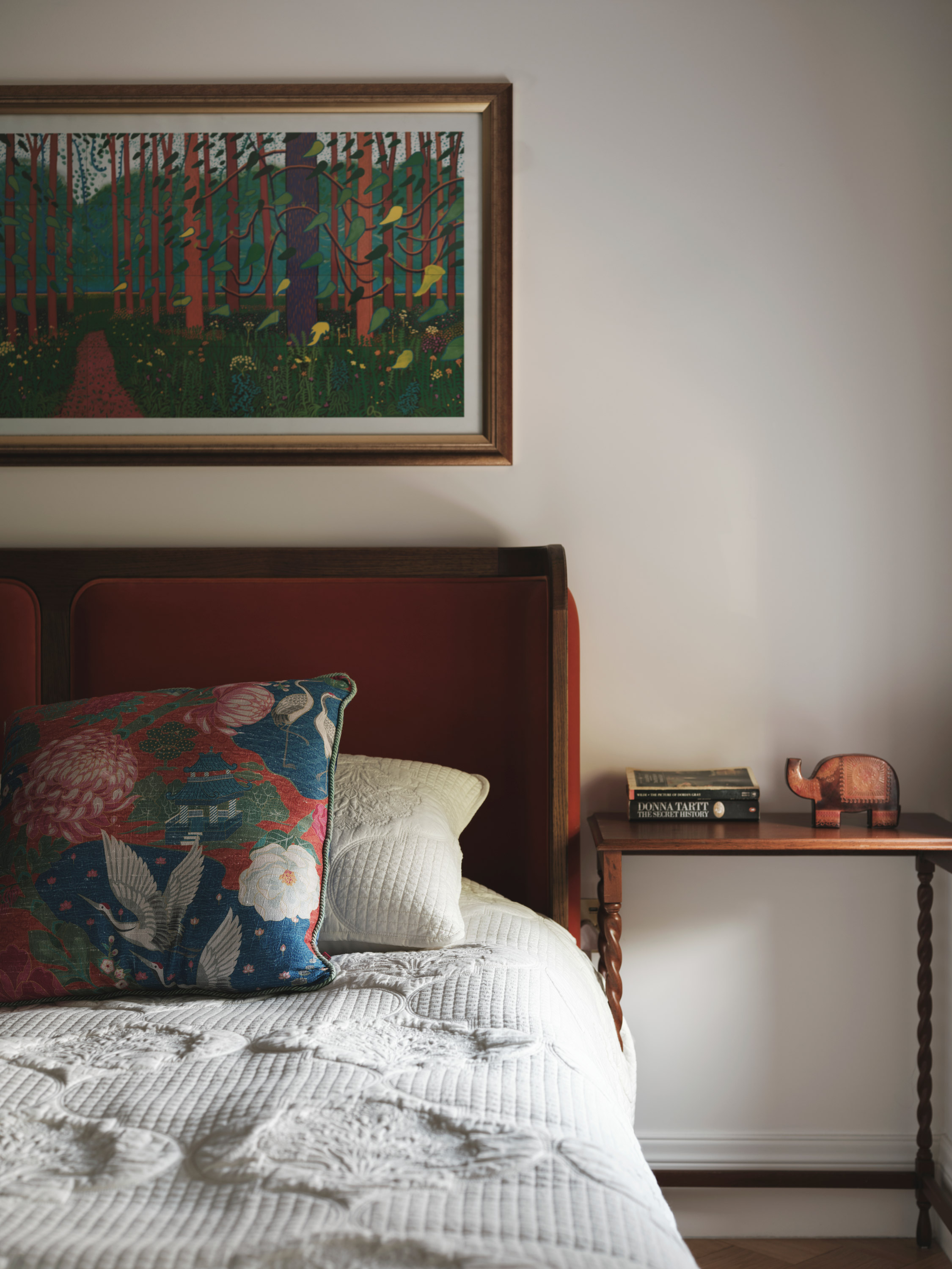
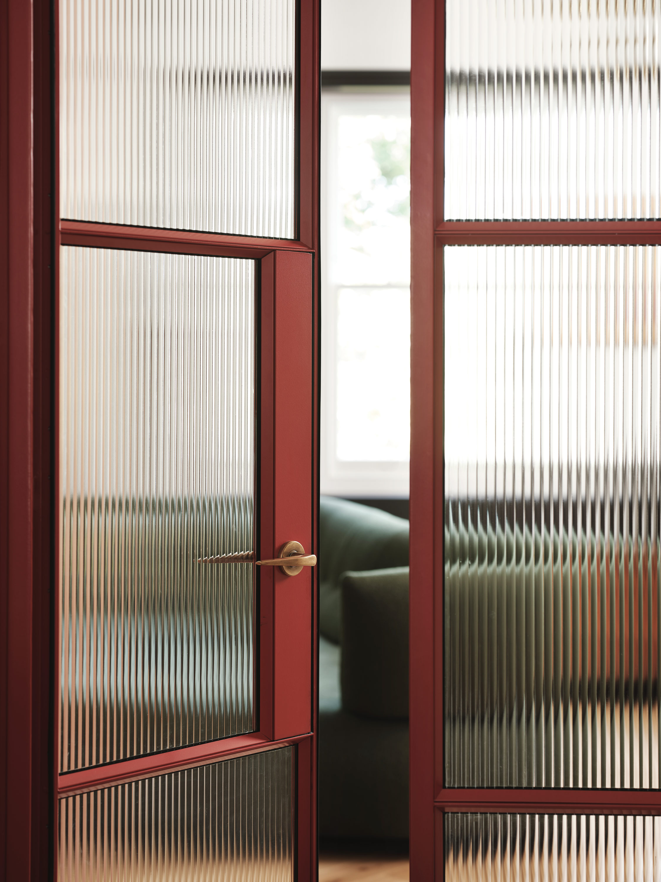
External walls are painted a warm tone to create a bright and light backdrop for art and colourful architectural joinery objects. Existing features like doors, windows, and skirtings are accentuated in a rich chocolate shade.
The entry is influenced by the work of Indian painter Thota Vaikuntum, featuring greens, reds, and earthy tones against a dark frame selected by Gautham and Sreeja. The space adopts a dark and moody atmosphere with natural green, accented by green and dark joinery, splashes of Blazer red, and bright blues in connecting areas.
Blues, greens, and reds, drawn from the work of artists Michael Adams from Seychelles and Murali Nagapuzha from Kerala, reappear throughout the property.
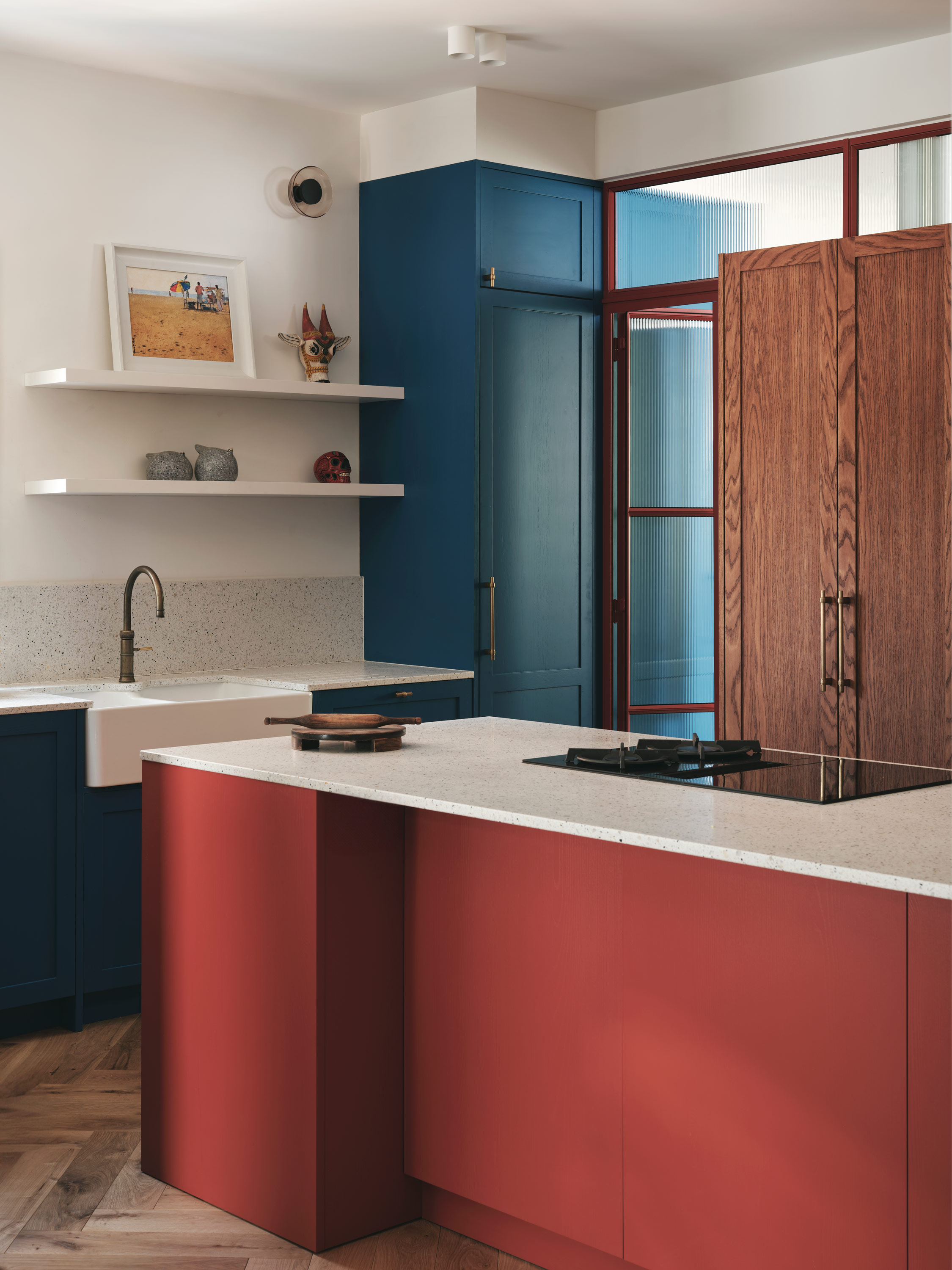
Bright and Playful Kitchen
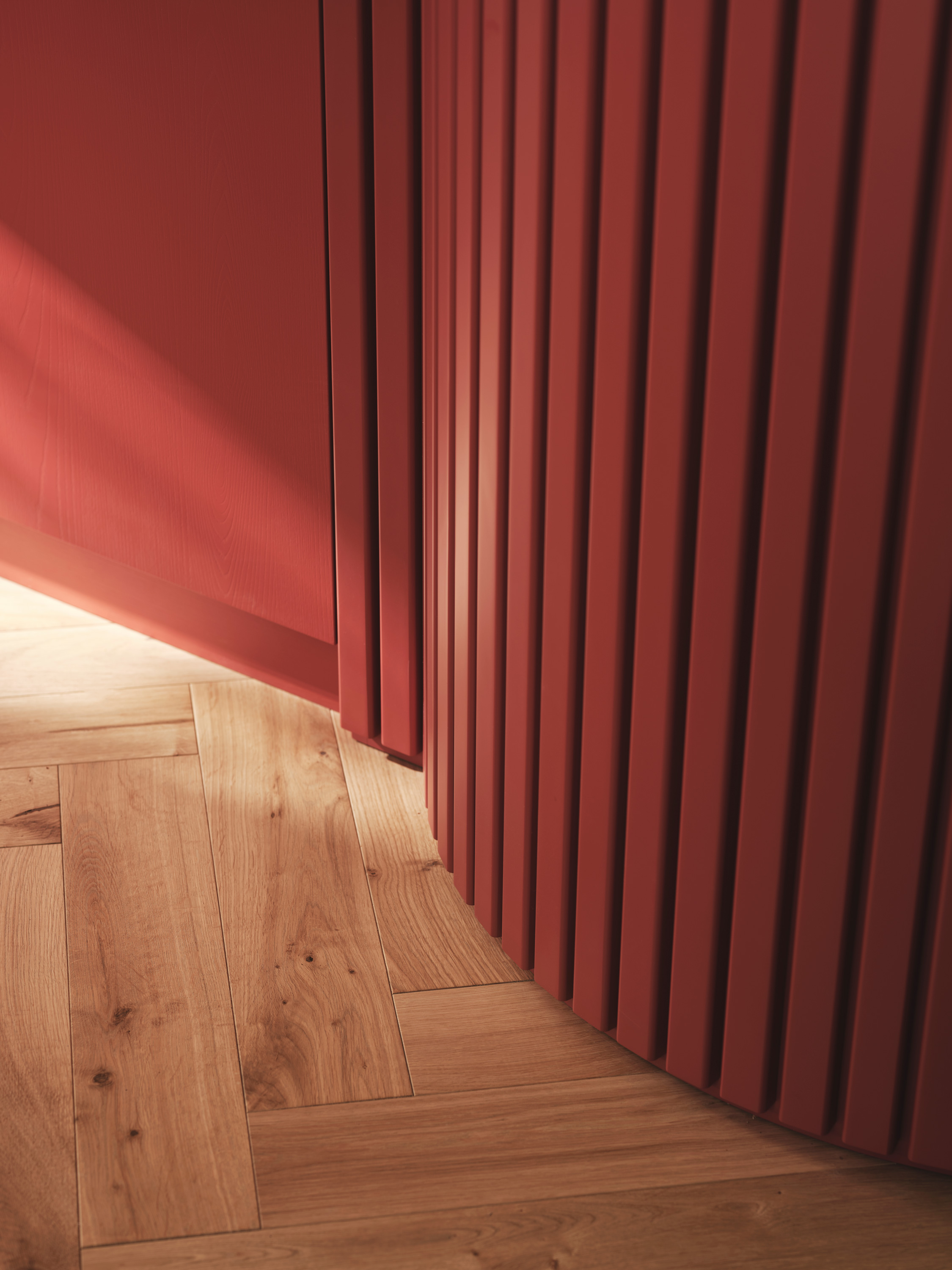
The south-facing kitchen and dining area embrace vibrant colour combinations. Blazer red highlights the curved central island and glazing details, while a bright Mazarine blue accents the rear kitchen joinery. Light and pastel exposed steels in Aquamarine green provide balance. Natural textured light and dark timbers complement a backdrop of warm white and deep brown details.
‘The kitchen is fantastic for working in. When I’m cooking, people gather around me to help out. It’s a communal experience, really.’ Gautham

Calm Living Space
The living area at the rear features a more subdued palette compared to the kitchen, with chocolate brown windows dominating the rear wall. Pops of Blazer red complement the glazing frames.
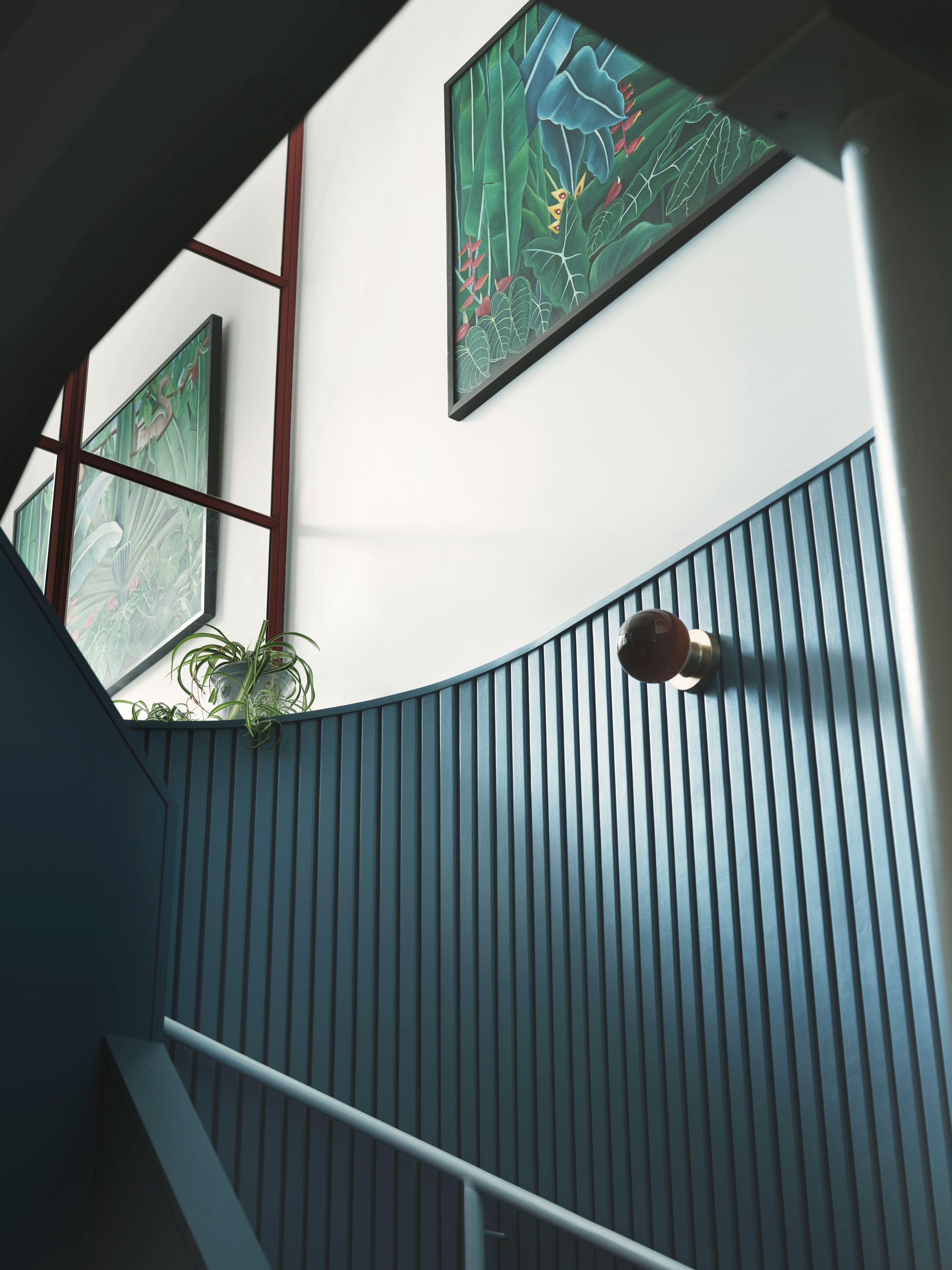
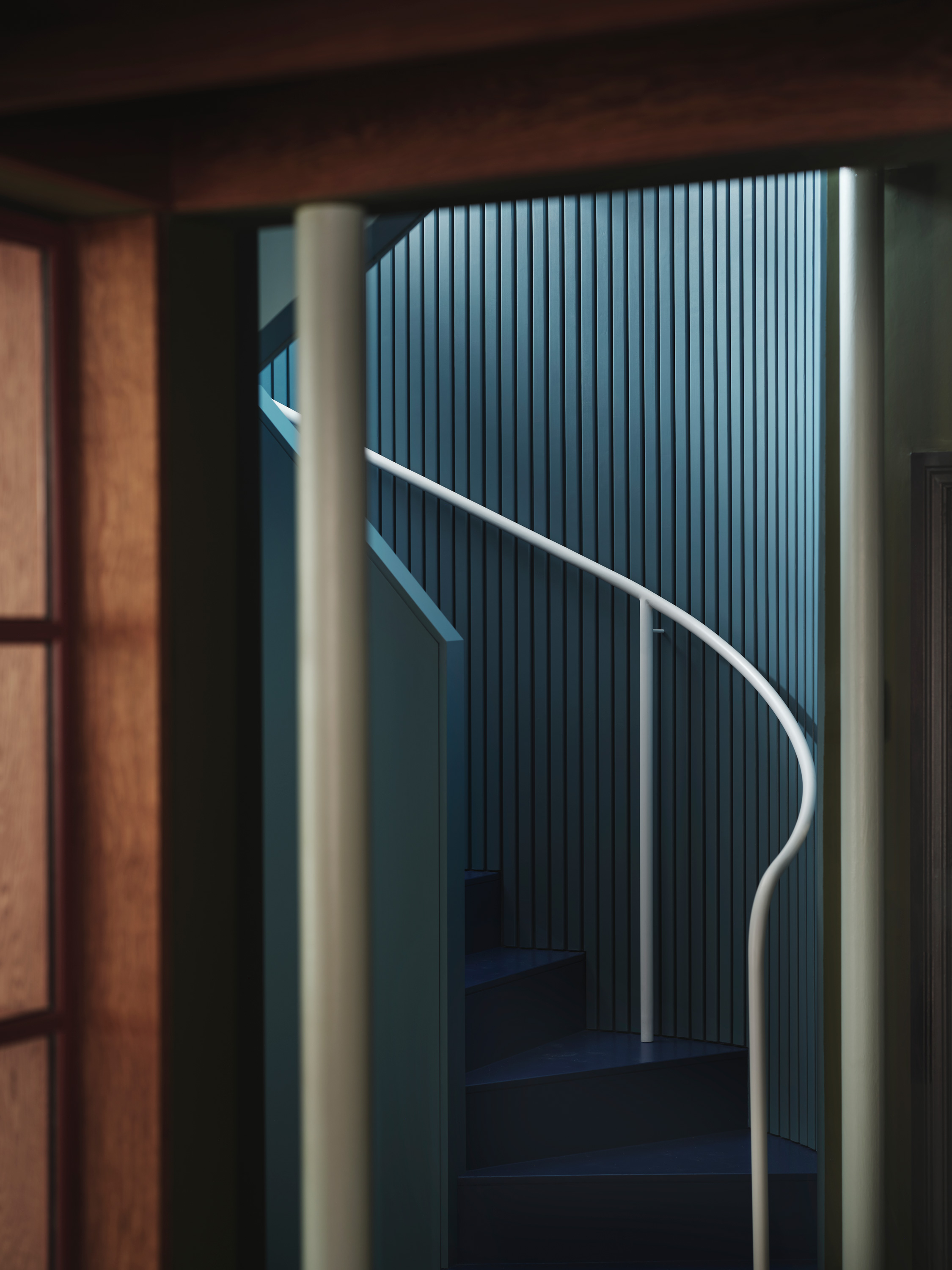
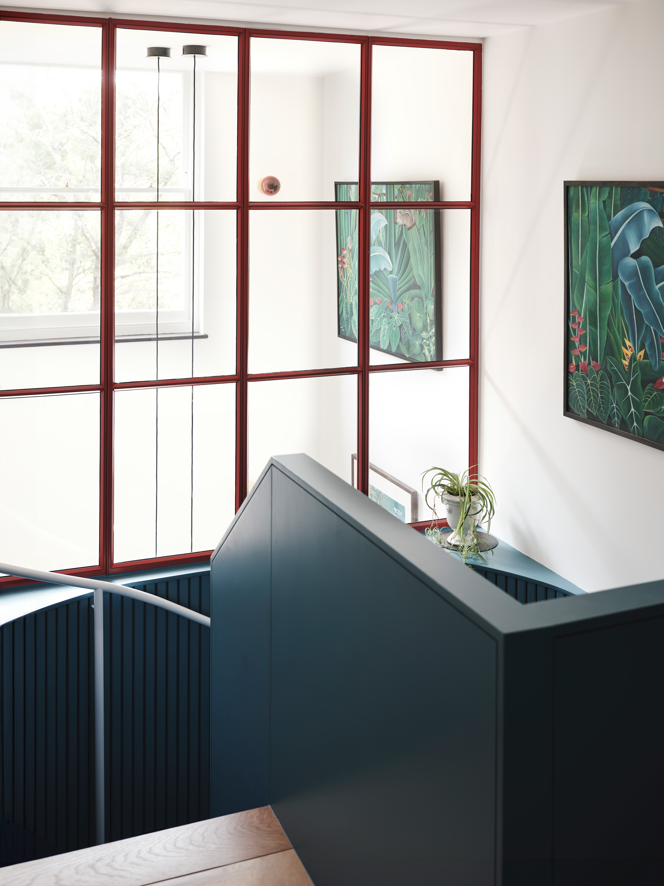
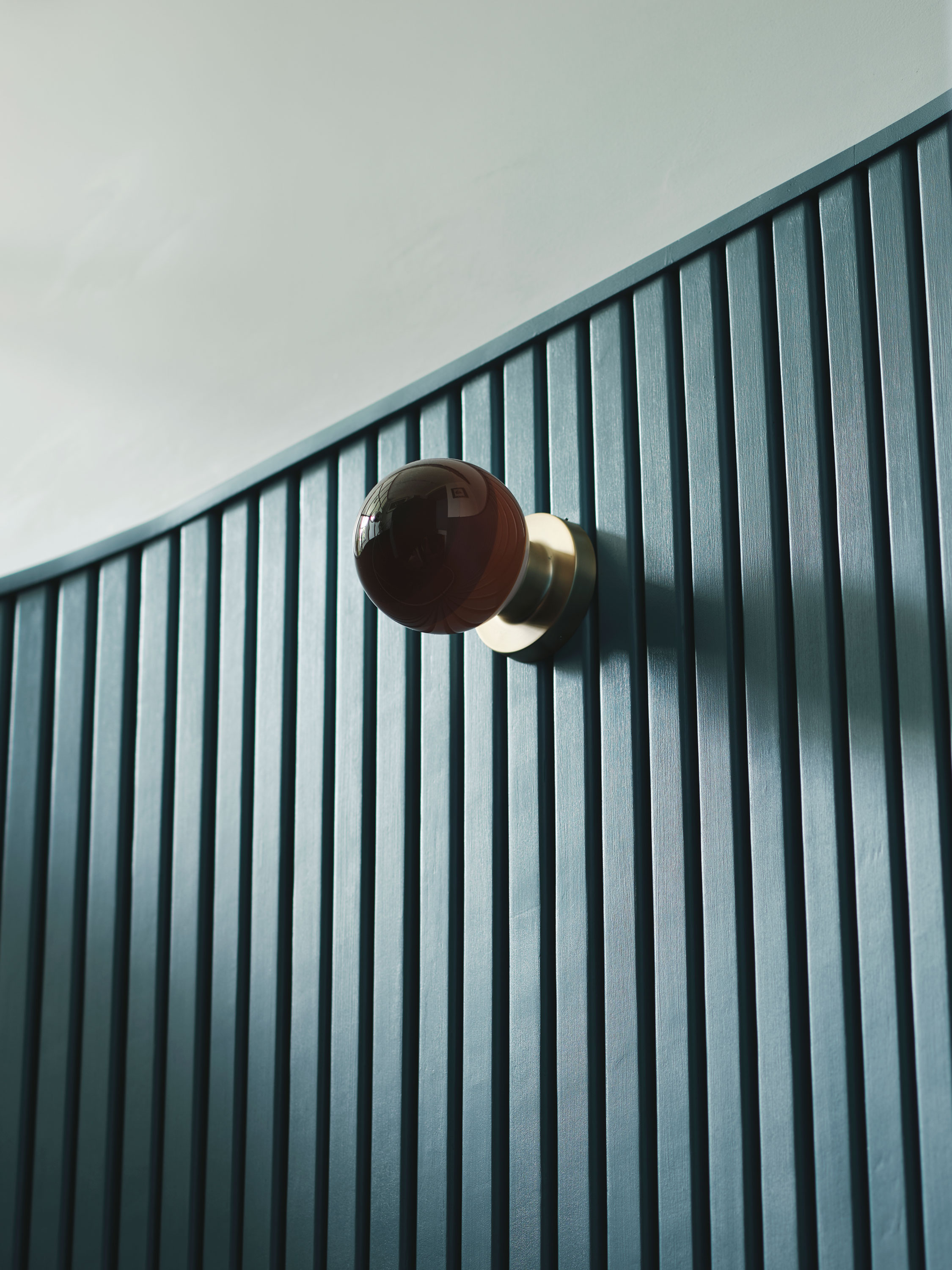
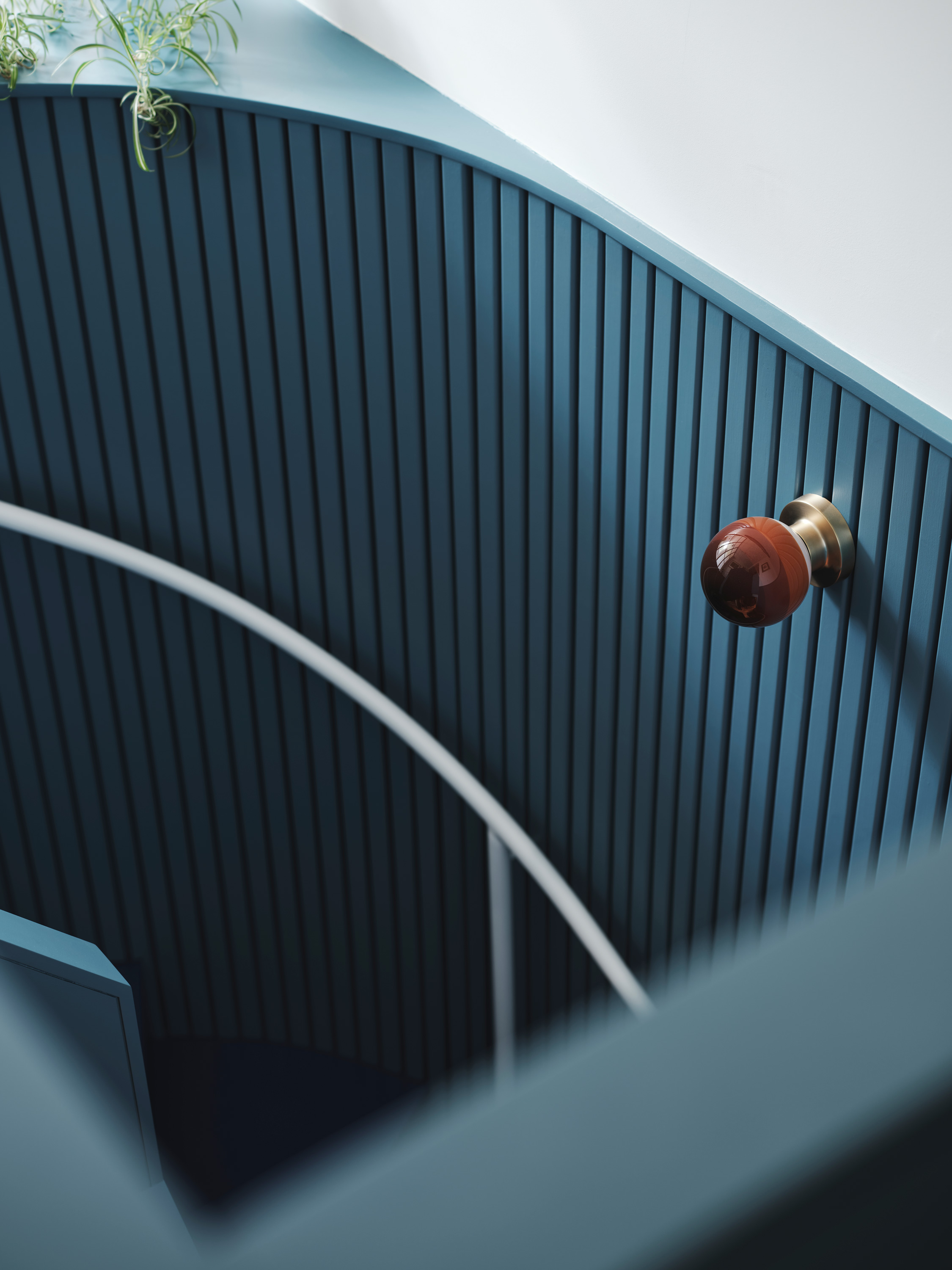
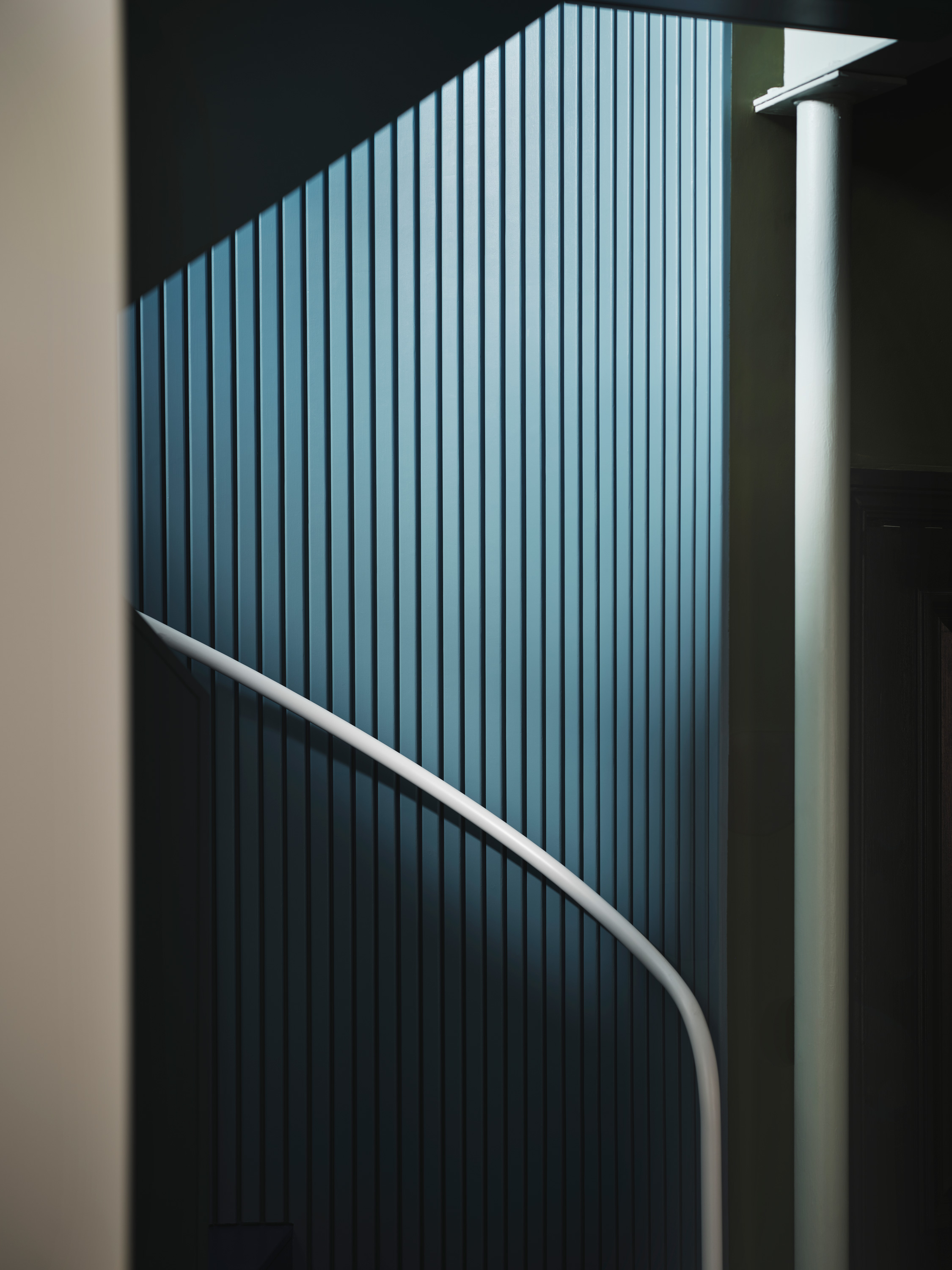
Bold Stair Design
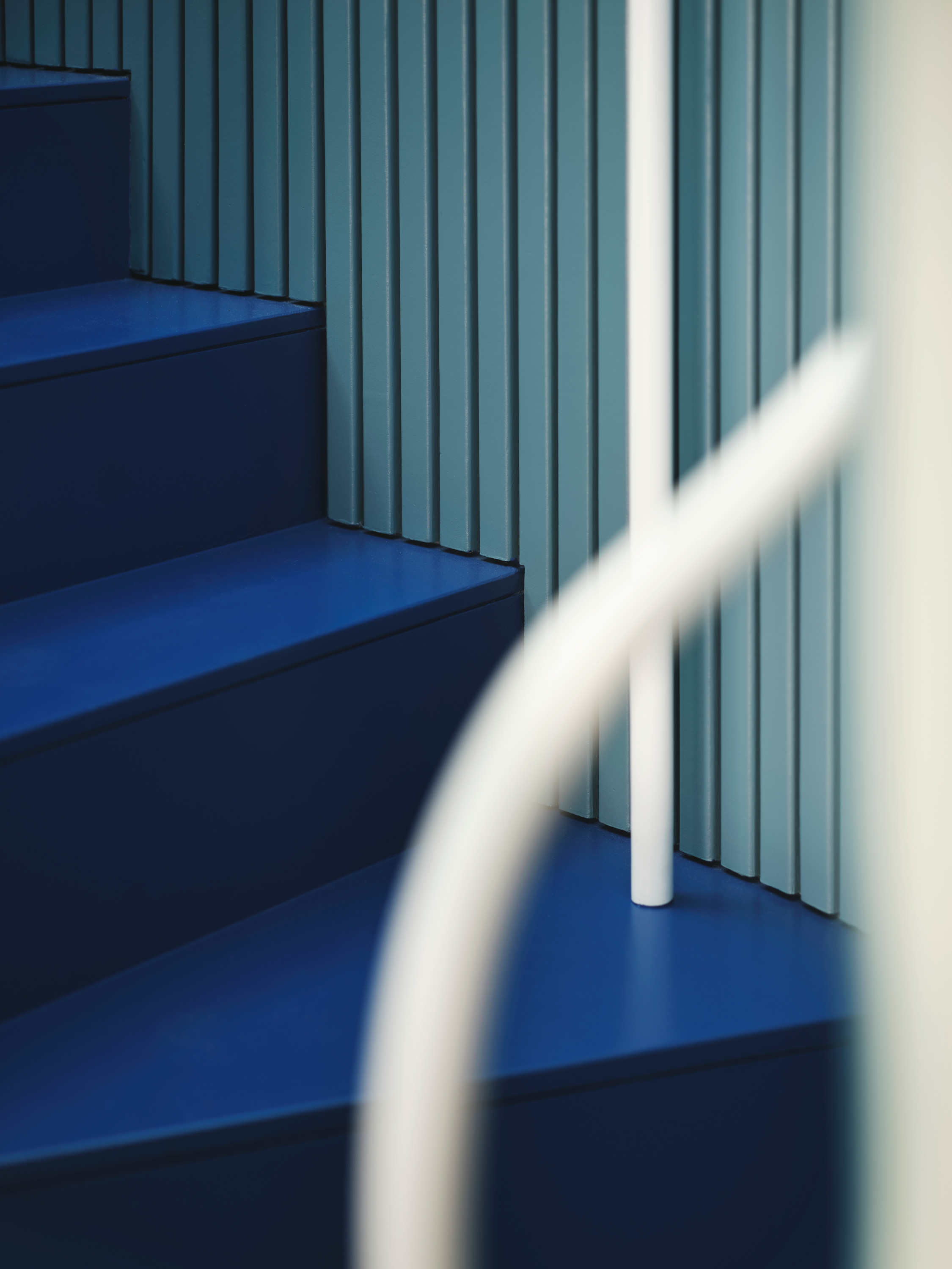
The stair boasts two blue shades, creating a smooth and striking geometric element. Smalt blue runs up the stair treads, while a lighter blue forms the balustrade and ‘wormhole’ edging. The upper storey transitions to white plaster and a Blazer red glazed screen that separates the stair from Sreeja’s double-height study. A simple, white smooth handrail contrasts with the blue hues.
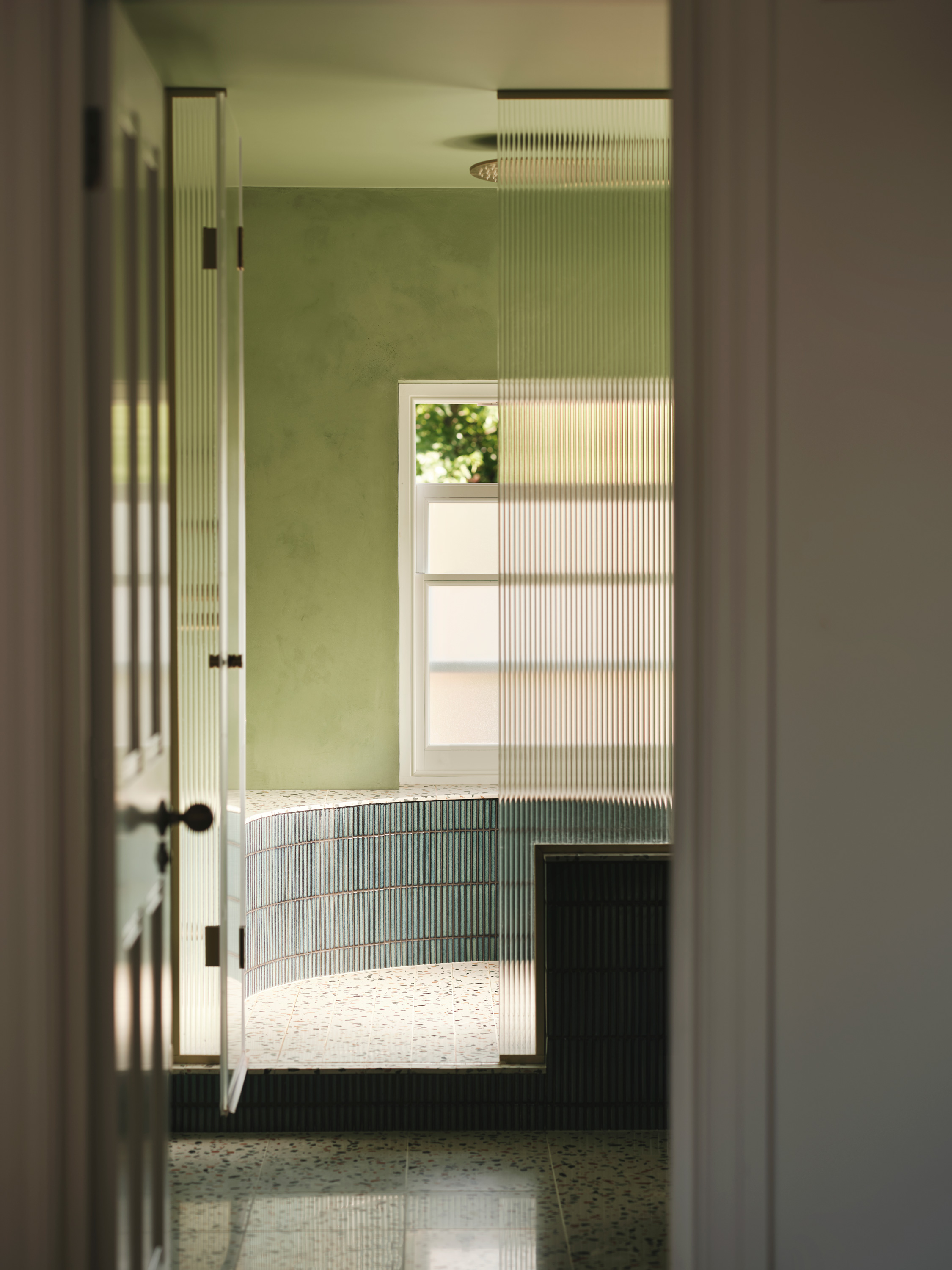
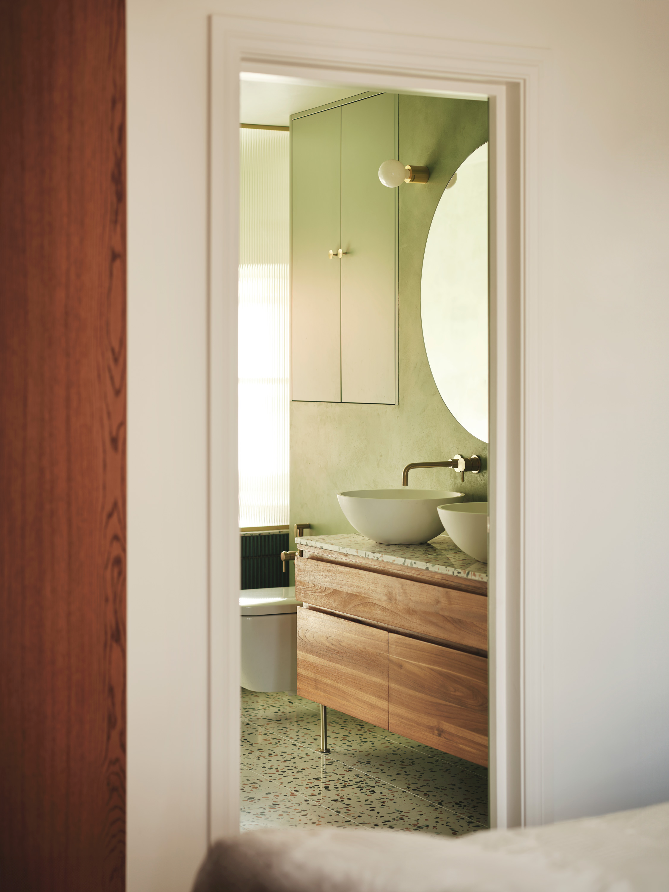
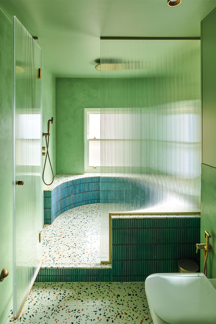
Unique Bathroom Palettes
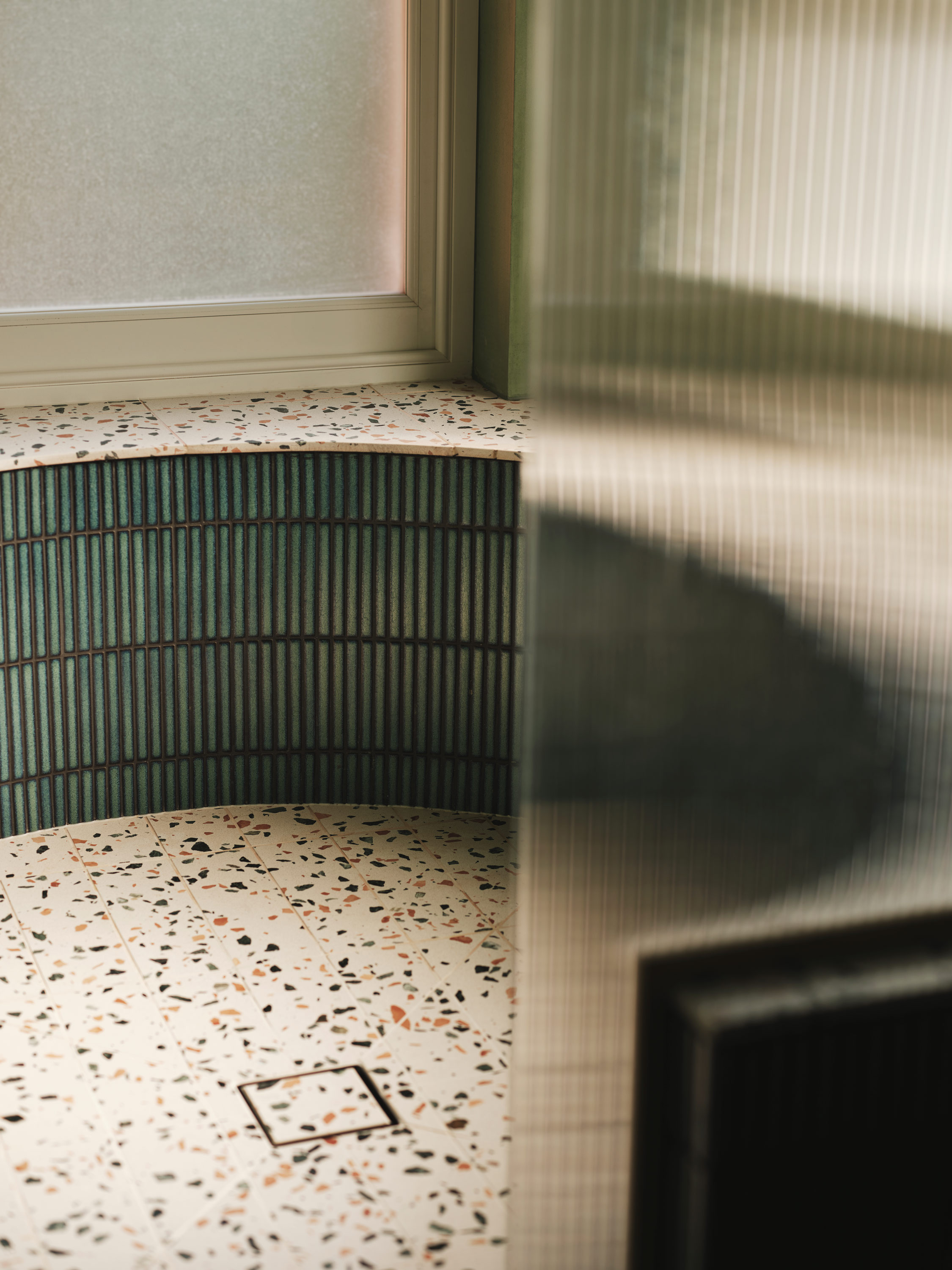
The bathrooms each incorporate different yet complementary colour combinations within the primary palette. The guest toilet on the lower floor features light grey and lilac walls, blue and white geometric tiles, and a bold emerald green sink. The main ensuite showcases a textured and enveloping Foggy Green leading into a large, curved shower set in the windows for a daylit start to the day.
‘It’s a cool sight to see the greenery around you while showering, as if you’re outside. The tropical vibe is just amazing.’ Sreeja

Natural Materials
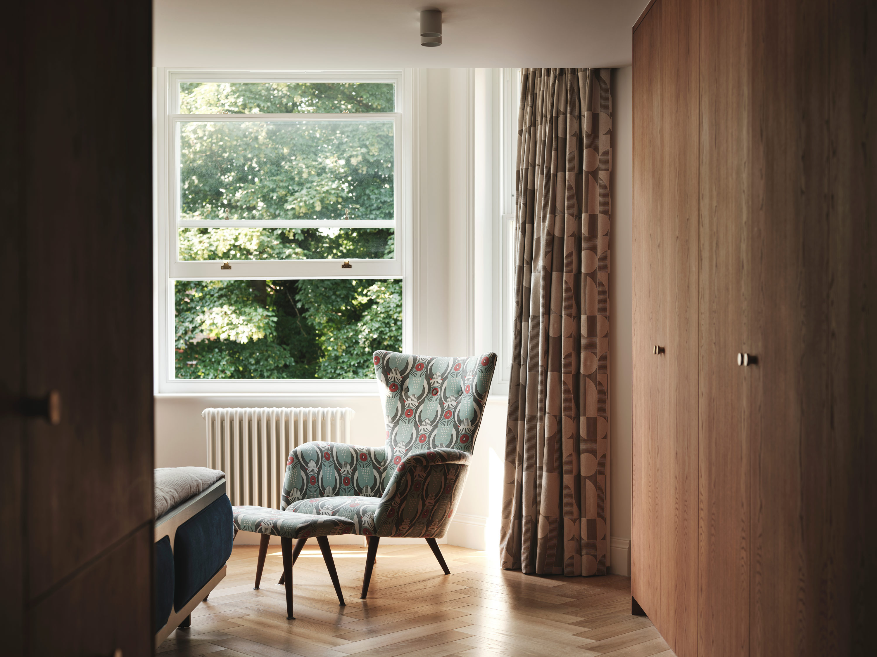
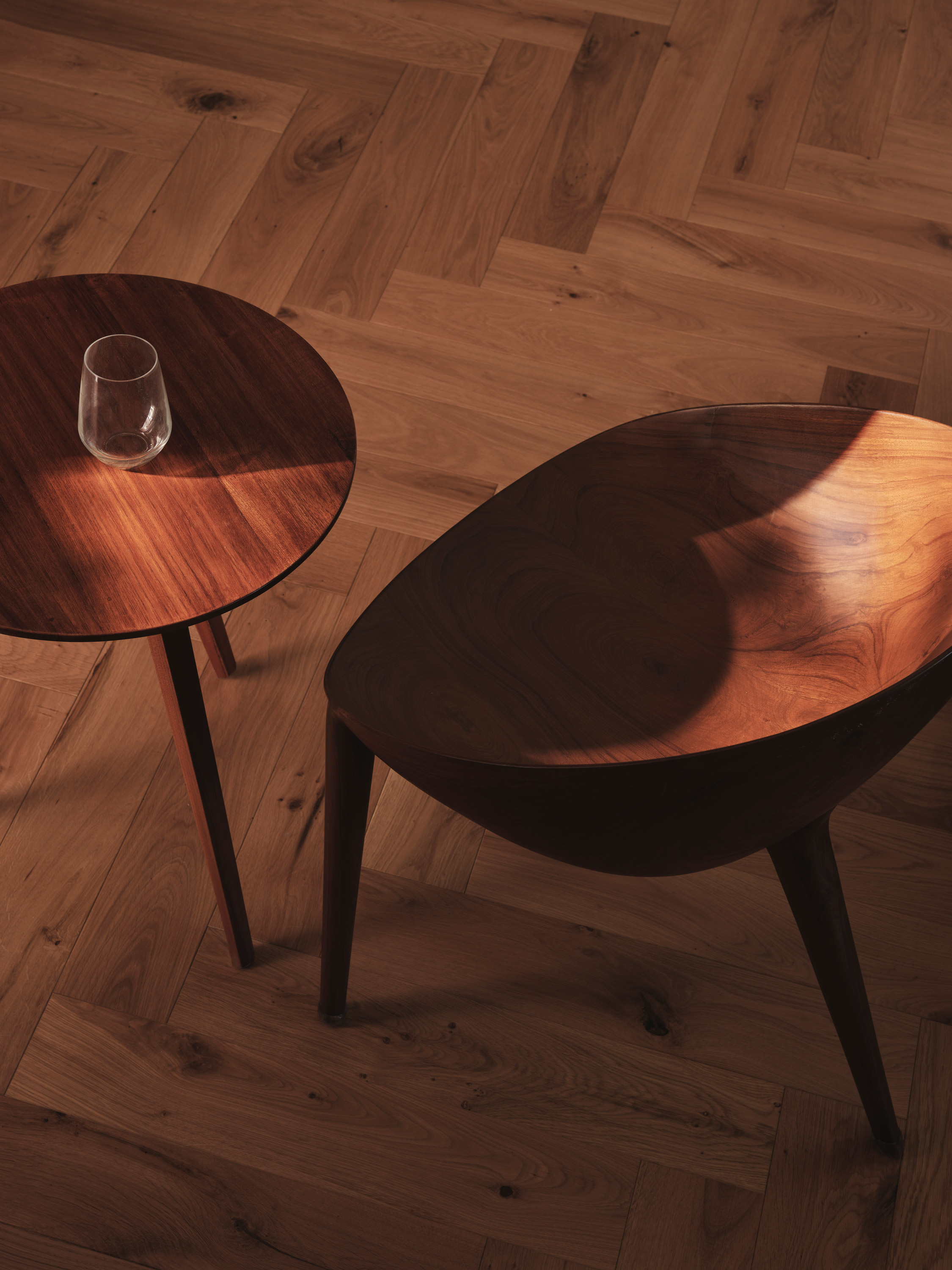
Natural timbers are a consistent element throughout the spaces, blending seamlessly with a varied colour palette. A natural oak herringbone floor serves as the grounding foundation at both levels, creating a continuous flow through the interconnected areas of living, bedrooms, and circulation spaces. Straight planks are strategically placed where internal walls were removed, effectively breaking up the spaces and paying homage to the previous layout.
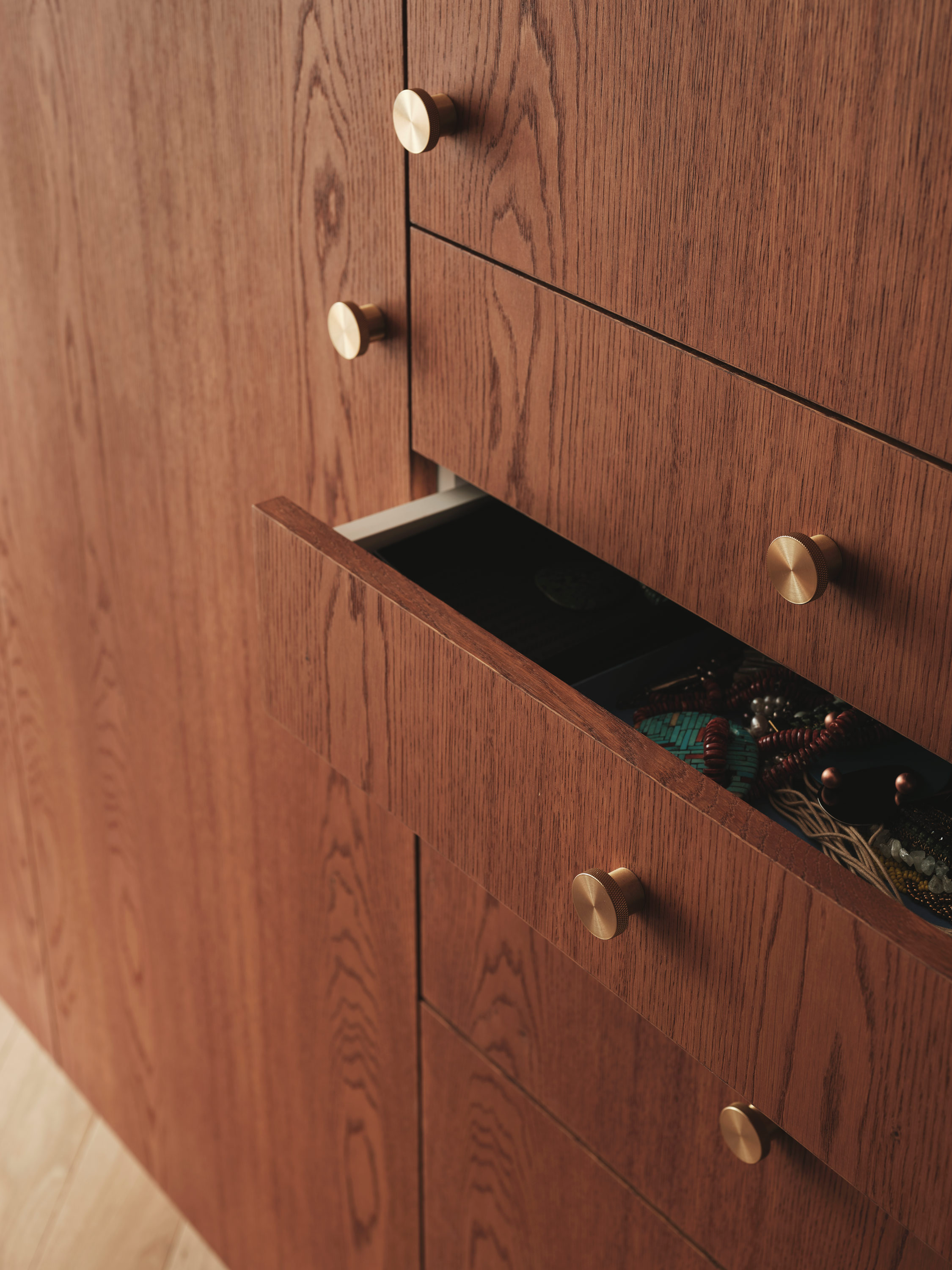
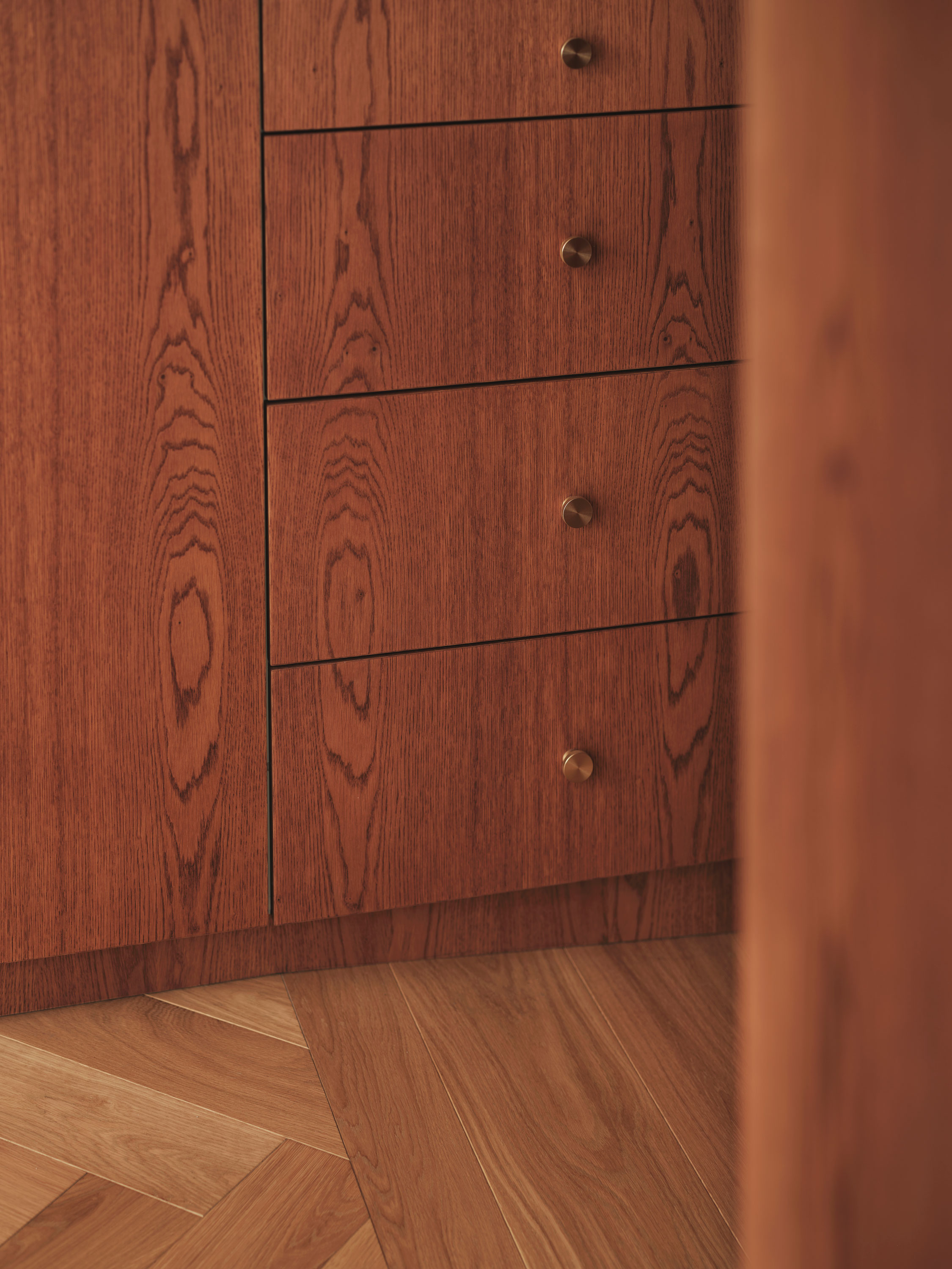
To create a striking contrast with the floor and introduce distinct ‘object’ divisions within the open-plan layout, a dark stained oak joinery was chosen. This finish not only imparts a furniture-like quality to these ‘objects’ but also complements Gautham and Sreeja’s exquisite furniture collection, characterized by dark woods and geometric shapes.
Natural Light
Light played a central role in Gautham and Sreeja’s project, focusing on optimizing the use of spaces to enhance the play of light and create distinct atmospheres.
The stairs presented a significant opportunity to illuminate both apartment levels by introducing a double-height space adjacent to the entry. This design allows a dramatic shaft of light to cascade from the upper floor into the lower main entry, infusing both levels with an engaging sense of moodiness.
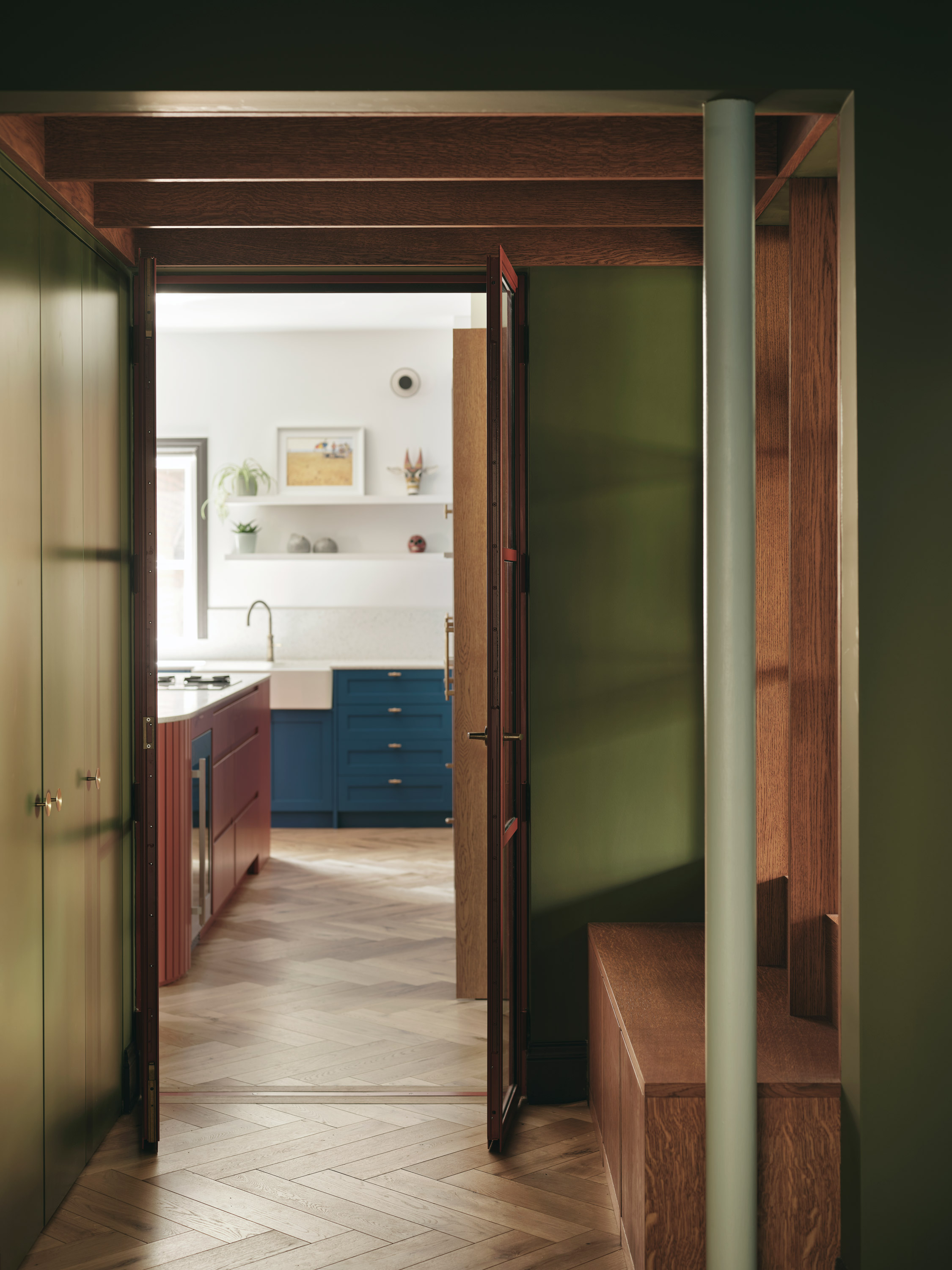
Surprisingly, the main entry space is designed to be more compact compared to the spacious living level of the apartment. It features deliberate darkening, achieved through dark, natural green walls and rich timber joinery and ceiling detailing. This moody, smaller space serves to accentuate the contrast as one proceeds into the more spacious, well-lit living areas. The entry teases the curiosity, offering glimpses of the bright and joyful kitchen straight ahead, the treetops visible from the living room, and the edge of the stair and the accompanying light shaft.
‘The entrance creates an impression of wanting to see more.’ Sreeja
Introducing unexpected sources of natural light was equally essential, a feature that had not been enjoyed in the previous apartment layouts. On the lower floor, this was achieved by opening up the kitchen and living space. The rear of the kitchen joinery, which also doubles as a bar and television cabinet, features glazed doors on both sides and above, effectively introducing cross light into the space.
Light Fittings
Artificial lighting, particularly on the living floor, became an art piece in itself. Carefully chosen colourful pendant lights extend from the ceiling over the dining area and within Sreeja’s study, with the fixtures taking inspiration from the surrounding joinery, structure, and glazing. In contrast, the living room pendants maintain a neutral tone, with combinations of brass and glass reflecting the more subdued colours in the overall palette.
‘It was about creating a beautiful room that happened to have a kitchen and dining area within it. It was a wow moment when we realised the balance between aesthetics and functionality.’ Sreeja
Thank you’s
Engineer – Constant
Contractor – Magic Projects
Photography – Felix Speller + Jim Stephenson + Benjamin Edwards
BVDS Project Lead – Jessica Williamson
Read the Elle Decoration feature for the project here – https://b-vds.co.uk/press/
Read our interview with the occupants here https://b-vds.co.uk/client-interview-belsize-park/
About us
Bradley Van Der Straeten is an award-winning architecture studio that believes creative design can improve everyday life. Established in 2010 by friends George Bradley and Ewald Van Der Straeten, the studio loves creating colourful, fun and liveable spaces for the emotionally invested. To find out more about our story click here.

‘exceptionally liveable spaces with an eclectic aesthetic’ The Modern House