George’s House
Stoke Newington, 2021
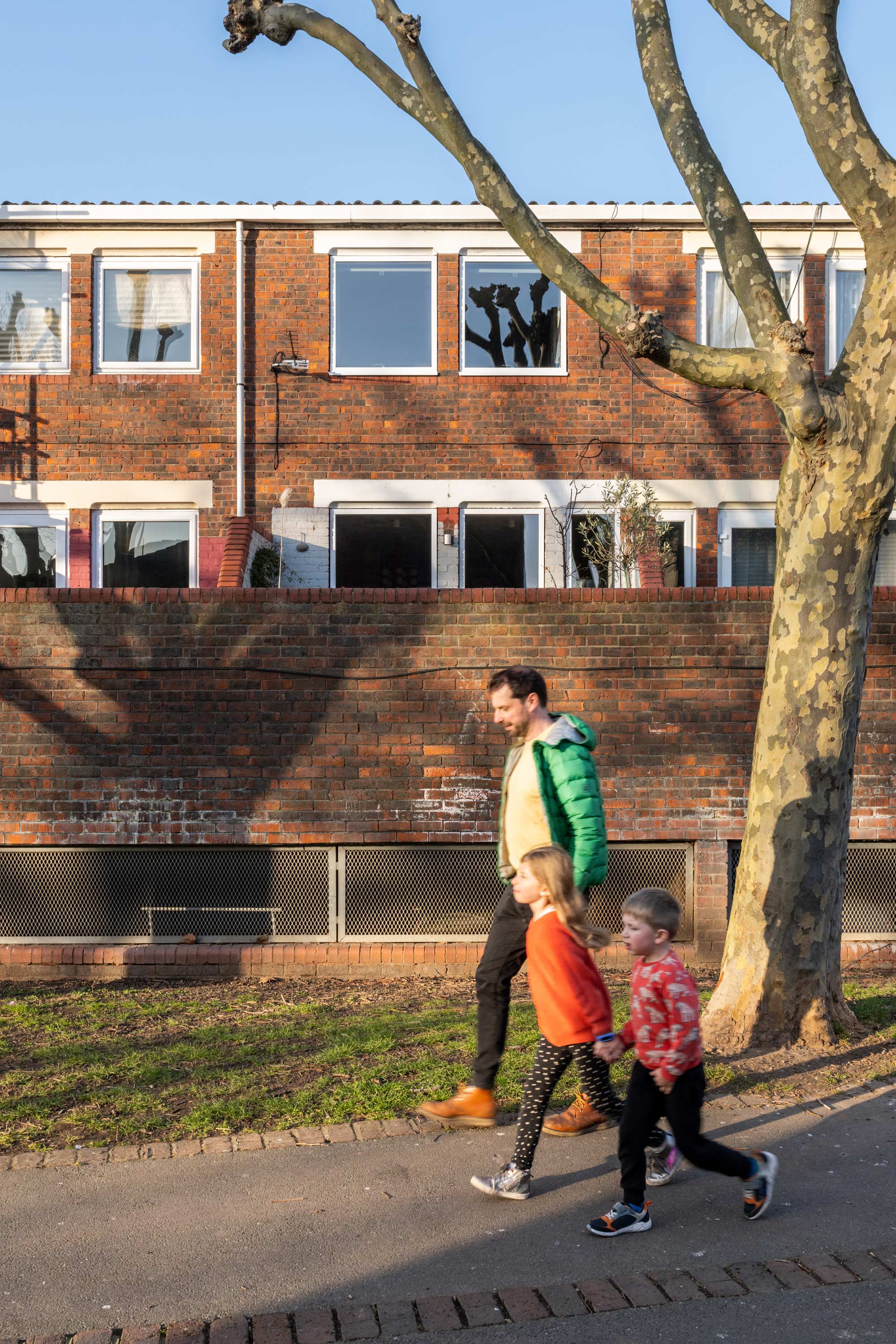
Join our director George on a tour of his newly refurbished home located in Stoke Newington. The house is a fun renovation of an existing two-storey home that was built in the 1980’s, situated on a green, low density housing estate. George lives there with his wife Helen and their two children.
The family moved to the property just over six years ago after having lived just down the road in the house that he and Ewald built together (The Studio). The project was completed in two stages. George tells a little about the house, how he found it and what ideas he and Helen applied to create their family home.
Finding The House
‘We lived down the road for nearly a decade, yet this estate had hardly caught our attention. It wasn’t until we were working with the clients of our Oldfield Road project, who were renting one of the properties on the estate during their construction, that we became aware of the unique houses on the estate. I remember attending a client meeting with them and loving the house, which they loved living in too.
A year or so later, when they had settled into the house, we had designed for them, they informed us of another house on the estate that had recently gone on the market. Funnily enough, we weren’t really looking for a move, but because the house provided us a unique opportunity to scale up and stay in an area we love, we booked a viewing straight away.’
The Existing House
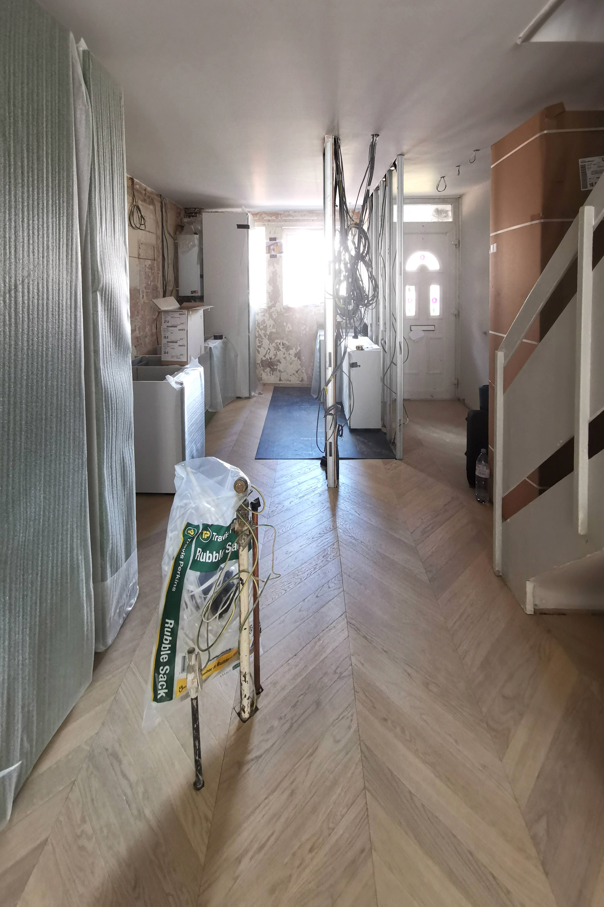
One of the great aspects of houses from this era is their solid construction and well-designed layout for both storage and natural light. It’s a long narrow house, but the stair is placed well in the middle of the plan, meaning the rooms get all the daylight at each end. The previous owner had lived in the house since it had been constructed and barely done anything to it, so a lot of the interior was the original fit out and in a bad state of repair. It was a great opportunity for a doer upper, but we also knew we would have to do the work in phases, so some of it we’d have to live with for a while.
We really loved the outside space, a large terrace that is slightly raised from ground level and overlooks the main pedestrian thorough fare through the estate, so you get the best of both worlds, lots of view (we can see our Two and a Half Storey House project from our garden), but also privacy. The garden is also directly south facing so it gets all day sun, and the deciduous trees do their job of keeping the house shaded from peak summer sun and allowing warm light to filter through in winter.
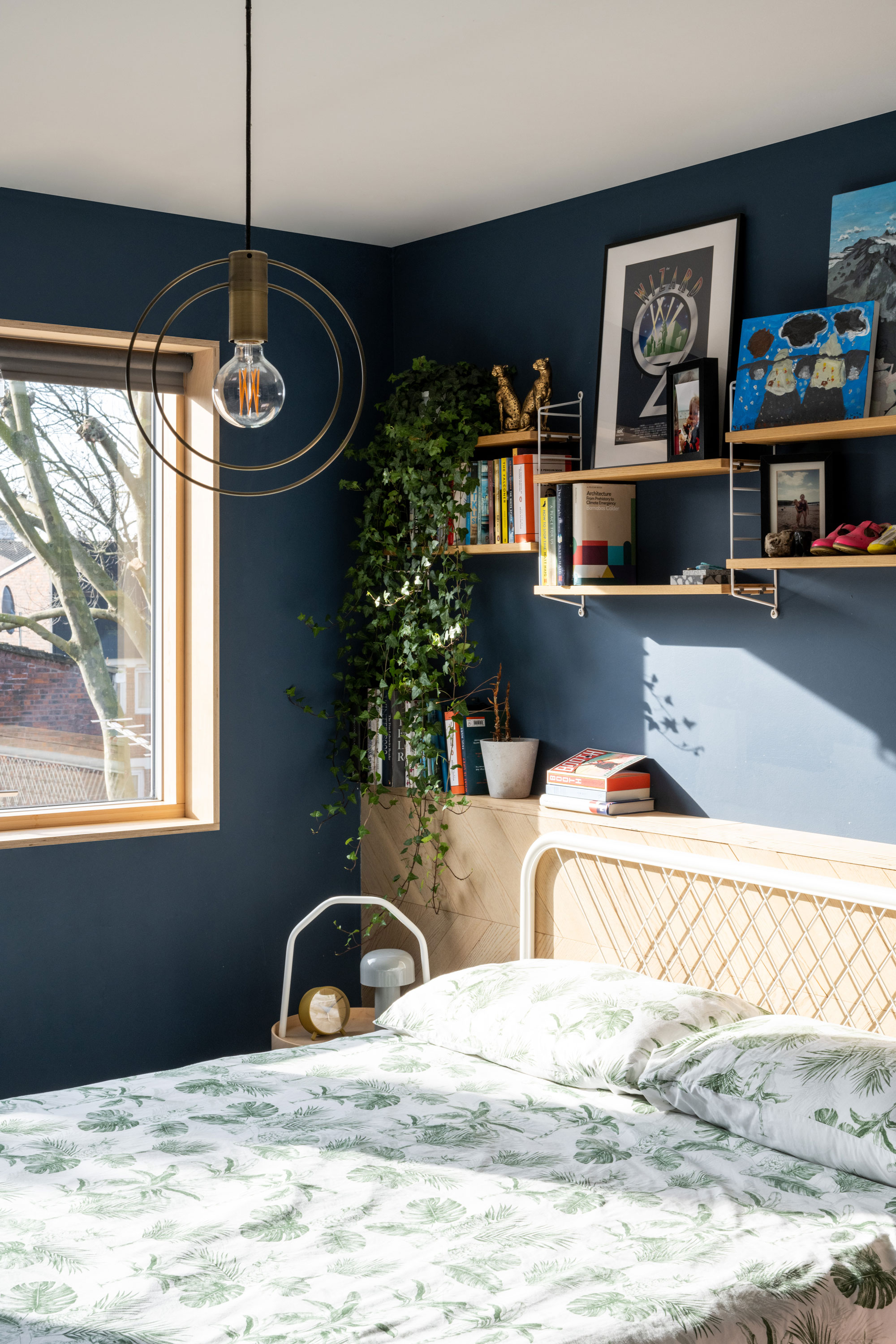
Main bedroom
For the first phase we decided to re-decorate the first-floor bedrooms and bathroom before moving in. A big first decision was the flooring, and we used the same flooring through-out the house (I bought enough for phase 2 and stored it in the loft). I love the light colour of the timber floor and the playful pattern; it works well with this era of property and helps unify both floors. (Suppliers for the project are listed at the bottom of the page).
In the main bedroom we also ran the flooring partly up the wall to create a bed head. The floor was one of the only parts I installed myself (with a little help from Ewald). Although I would have loved to do another self-build, time and children got in the way!
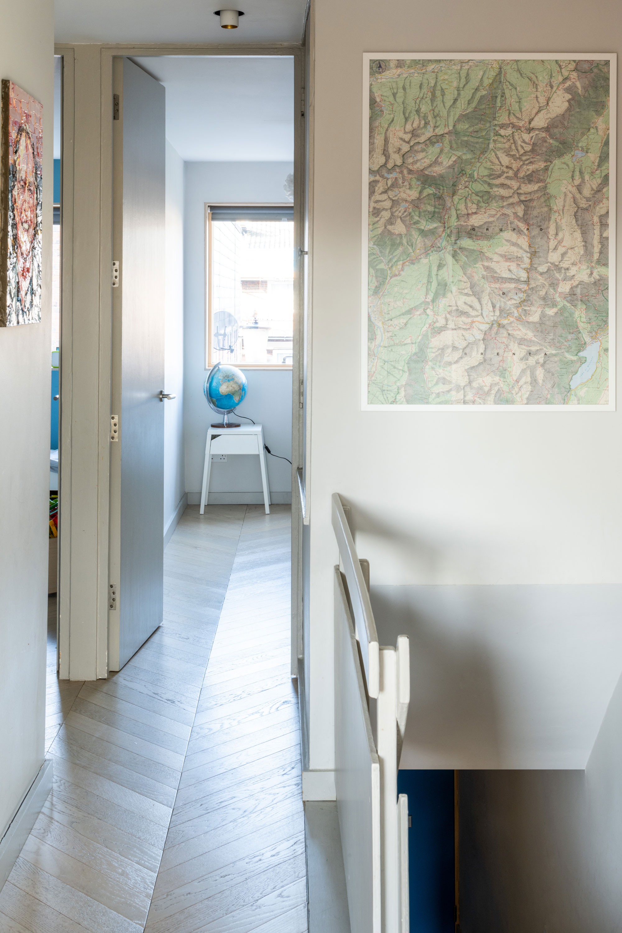
First floor landing
One of the simple changes that I think made the most impact on this level was to replace all of the doors to floor to ceiling. It has really opened up the first floor and improved the perception and flow of space. The original stair banister was a really nice design and solid, so we kept it and painted it in the same neutral grey as the other timber elements. The map on the wall is of the western Dolomites in Italy where we spend a lot of our family summer holidays. When I’m going down the stairs, I can plan the hiking routes I’m going to drag the kids on for our next trip.
Bathroom
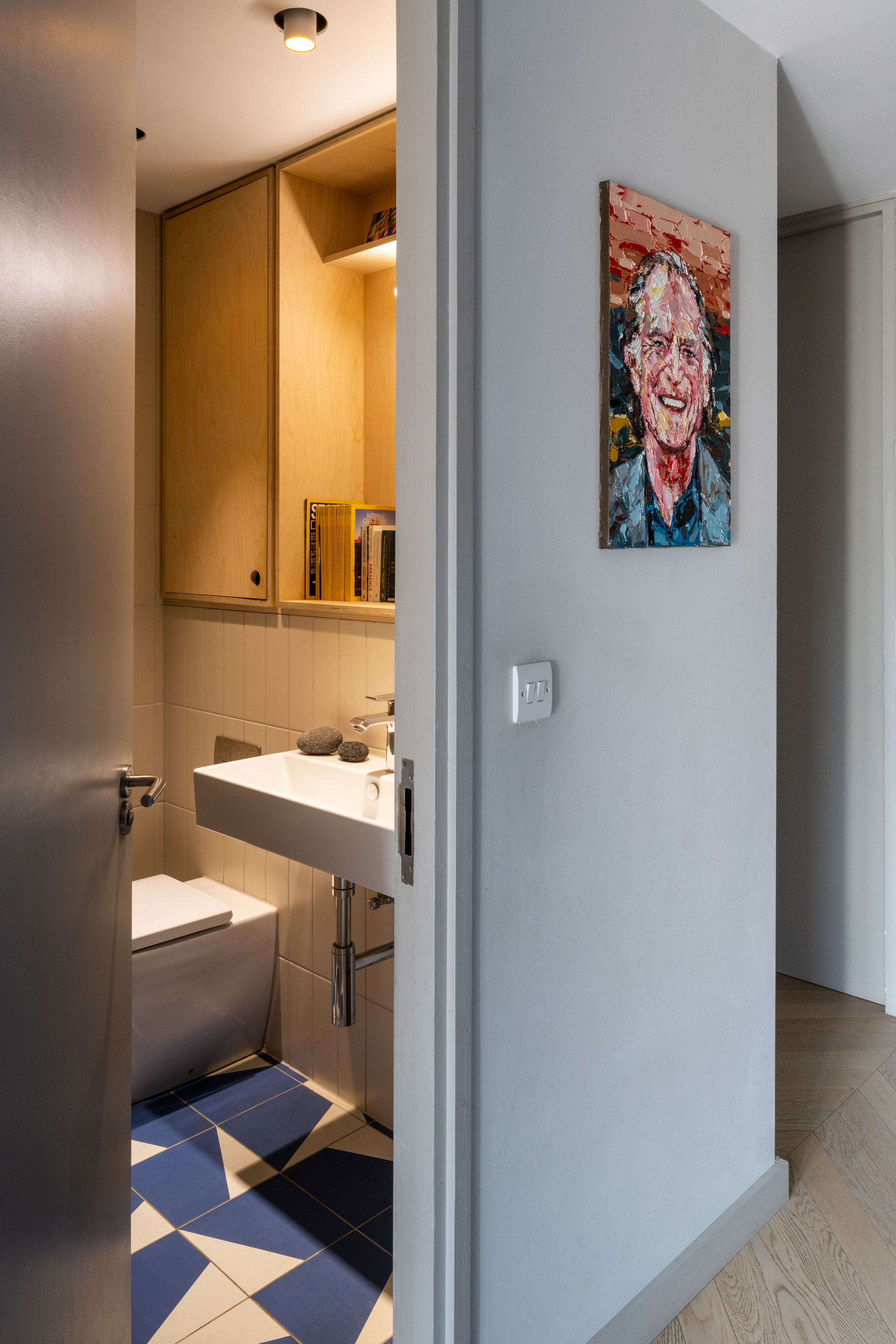
We knocked through the original separate wc and bathroom to make one space. We used Puzzle tiles designed by Barber and Osgerby to inject some colour and they go well with the white oak floors. We had lived with a lot of plywood at The Studio. It’s such a versatile, warm and (before covid) cost effective material that we used it again in this house, albeit on much smaller surfaces.
In the bathroom we created a nook for the mirror and some storage behind the toilet. The bathrooms in these houses are in the middle of the plan so they don’t get natural daylight. In its own way, the plywood kind of brings a yellow sunny glow to the room and is designed to look a bit like a window. The sink is the same one we used at our Hamsptead Apartment project, which I really liked.
The kids’ rooms
At the opposite end of the house to the main bedroom are two smaller rooms for our children. Our son wasn’t born when we first moved here, so this room was originally designed for our daughter. The design for the wall mural was done by Helen, which was great, because whenever the painter looked fed up with having to paint the lines, I had someone else to blame. Our daughter later got upgraded to the slightly larger room next door so this one has now been taken over by our sons dinosaurs and whales.

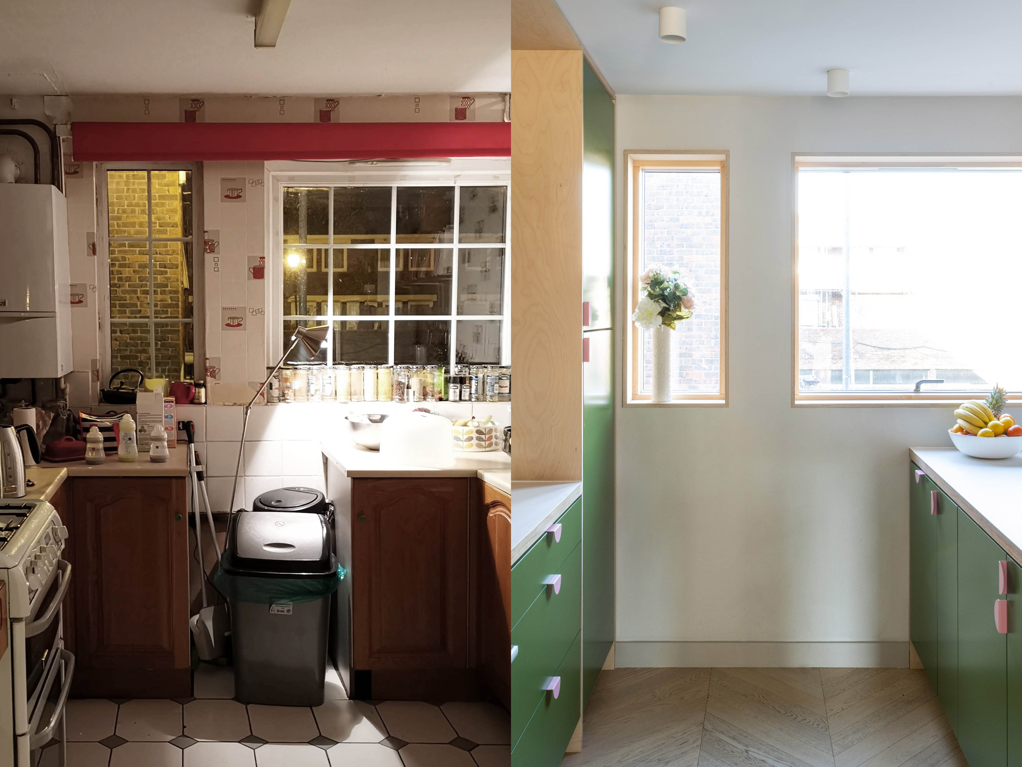
Before and After (above)
The before image is not a professionally taken shot, but you get the gist.
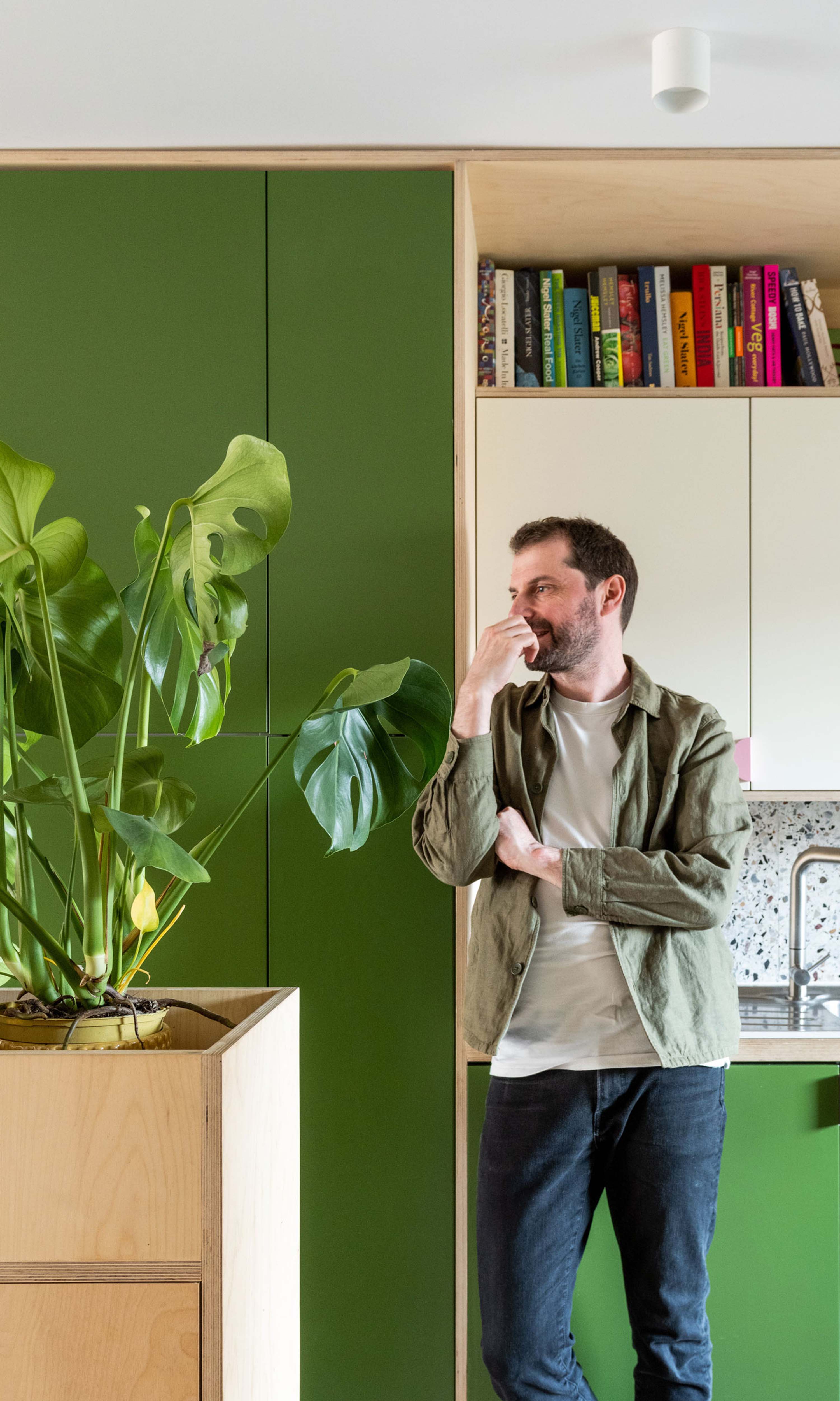
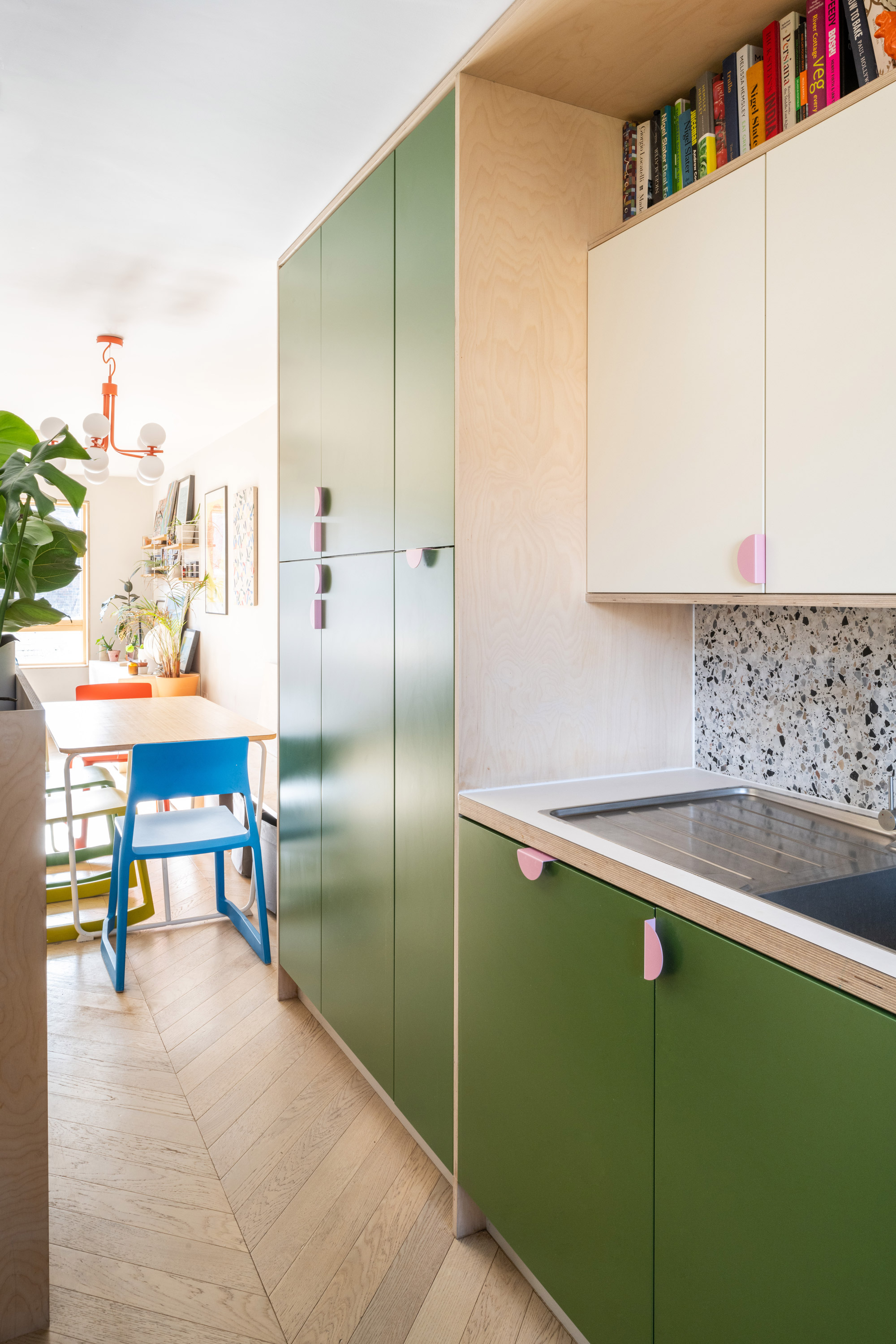
Kitchen
The kitchen is at the front of the house and designed as a galley layout. I wanted the ground floor to feel as open and spacious as possible, so the kitchen is designed as an object that has been dropped into the space. We used standard carcasses and fronts to construct it, but got the builders to line key edges and details bespoke with plywood.
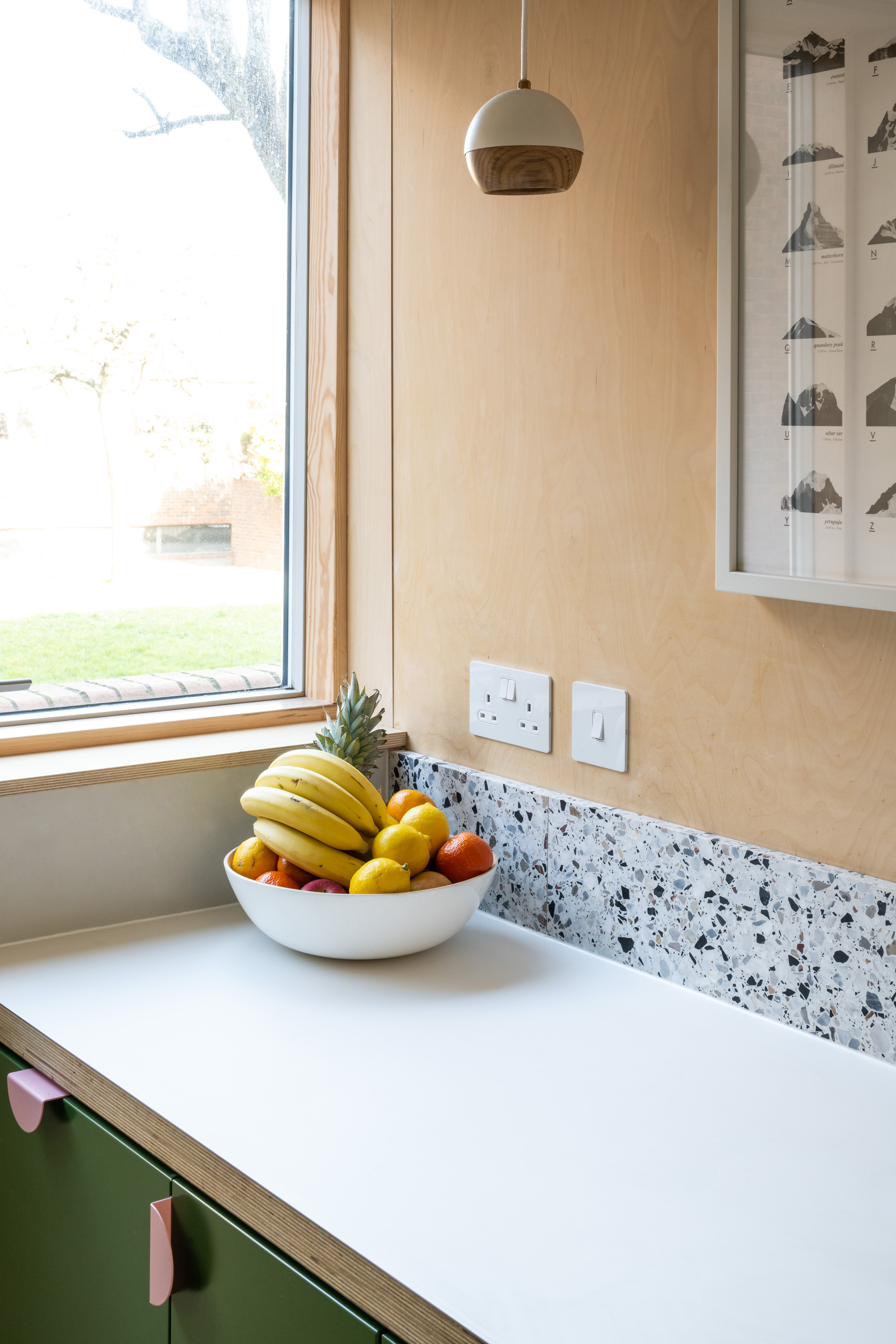
The colour was one of the easiest choices in the house to make, both me and Helen were keen on the idea of a vibrant green as the main colour for the fronts. The splashback is made using offcuts of terrazzo kindly given to me by our clients from Leytonstone House and from Lagom House. I absolutely love the combo of the solid green, speckled terrazzo, and warm plywood, the textures and colours make it really uplifting kitchen to be in.
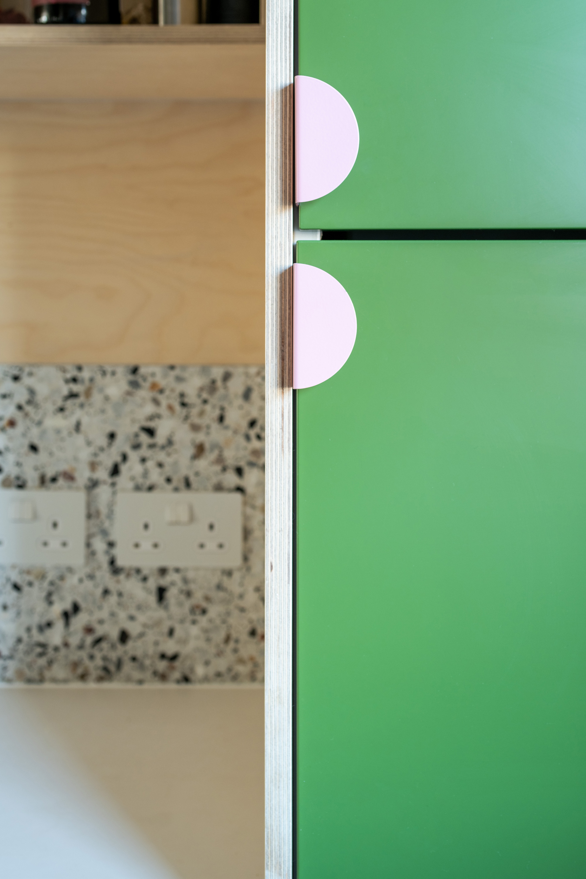
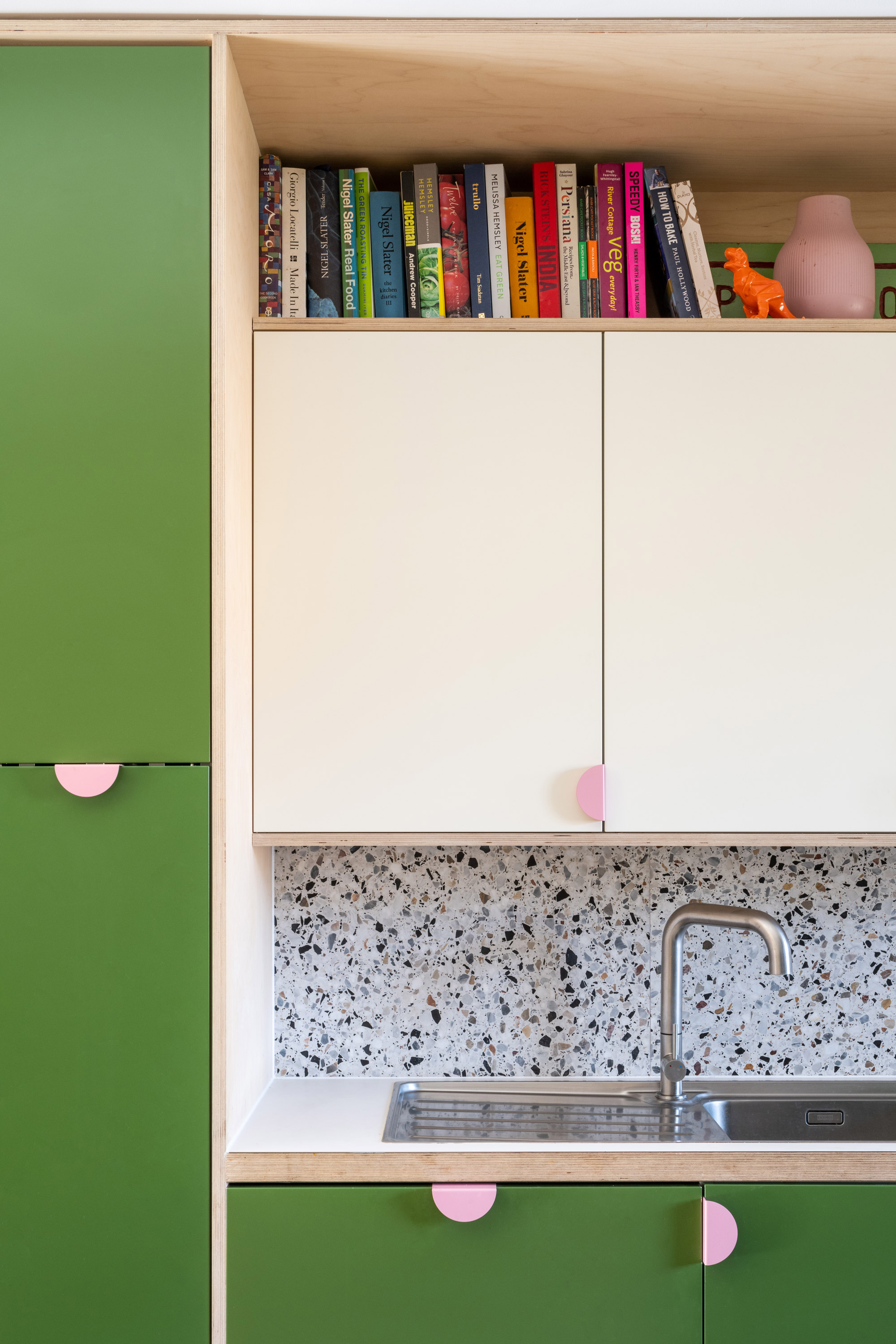
In our design studio we are always looking at ways of using everyday off the shelf items to cleverly create bespoke kitchens. For this design I really liked the idea of creating a cooking books shelf above the units, which were set out to the millimetre to make sure there was enough space. You can just about see the original green wooden sign that me and Helen made for the food stall we used to run called Pomodori, part of my brief interlude from architecture before establishing the studio. Most of the materials used in this kitchen were a test bed for what we later used in Tonal Terrace; same carcasses, fronts, handles and worktop, but different colours.
Colour Scheme
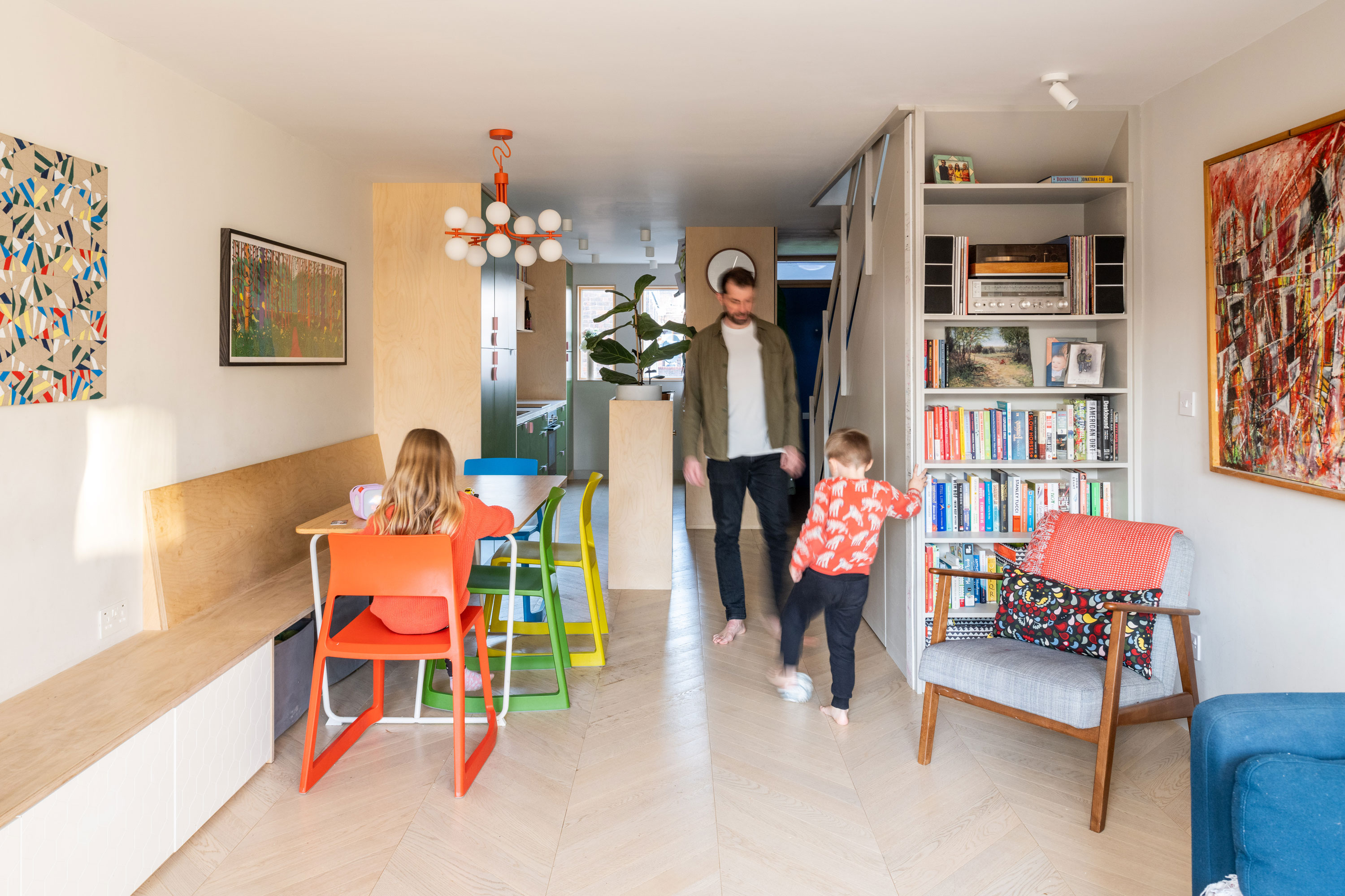
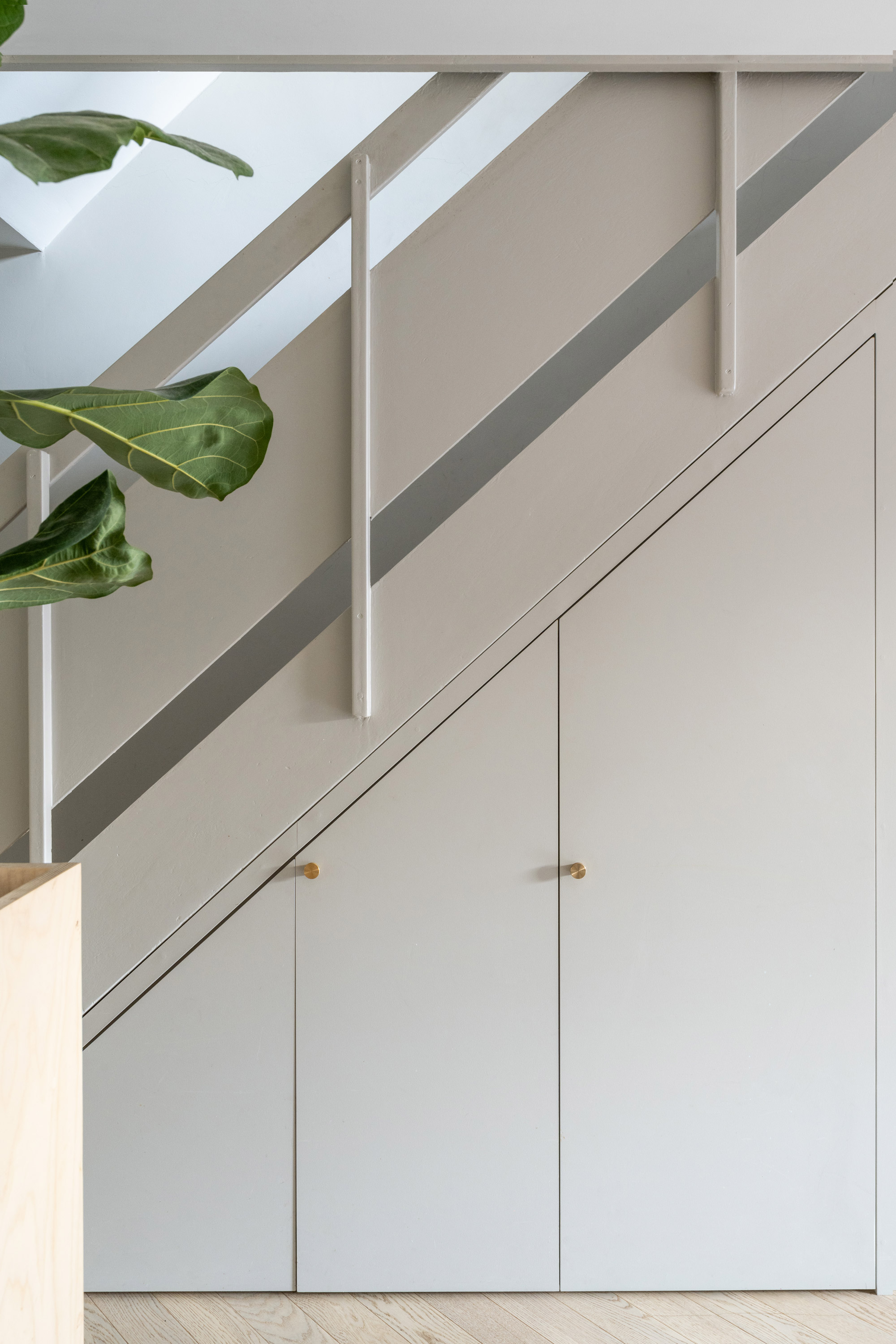
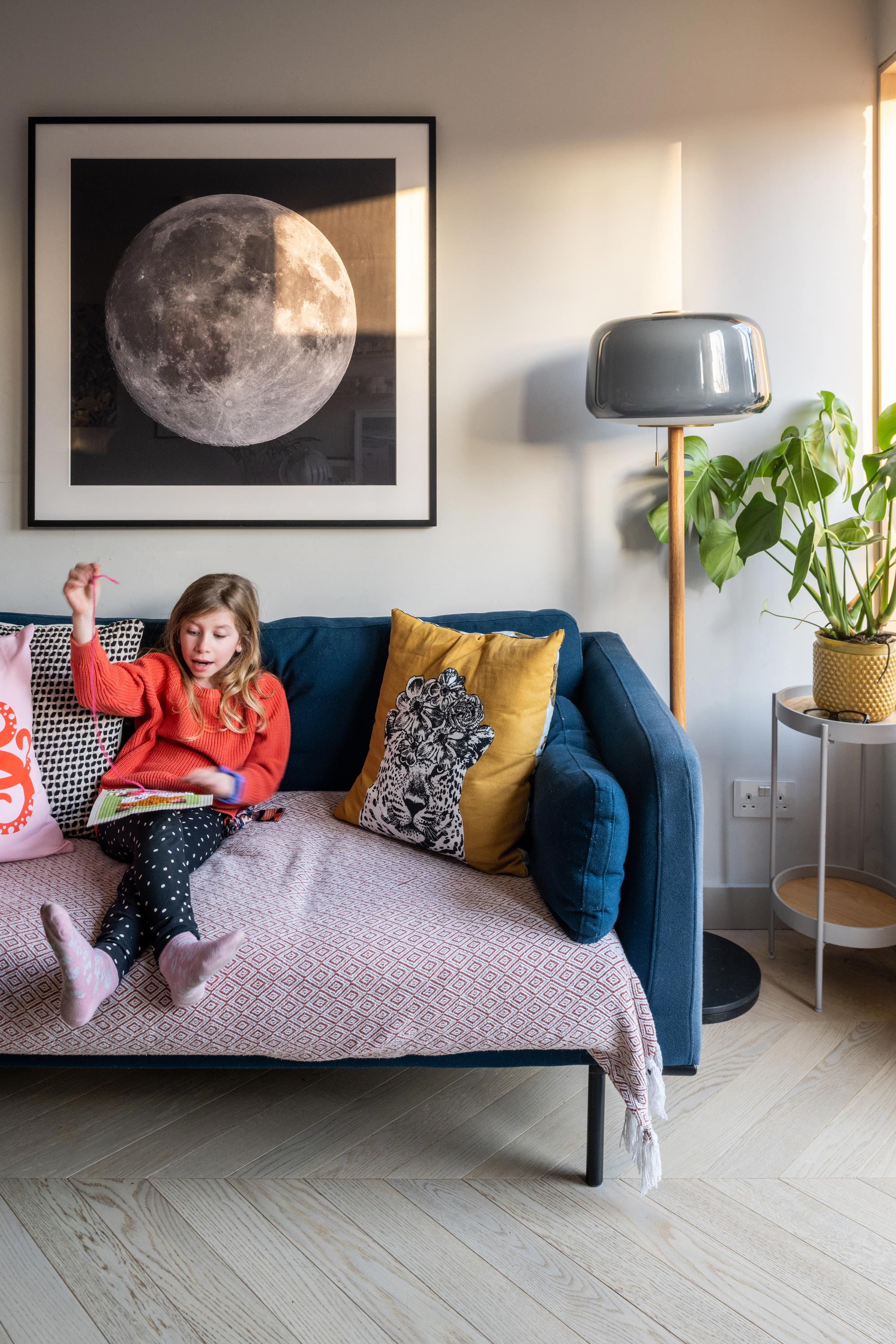
For a lot of the colours, I worked with the Farrow and Balls neutrals range, to create slightly different tones between walls, joinery, and ceiling. In most of the spaces of the house I like how the neutrals work as a backdrop to the stronger colours; the ply window surrounds, the colourful chairs, artwork, kitchen. Although the stair balustrade is an original feature, I like how it ties in with the new cupboard doors below. The under-stairs is great storage for all the everyday stuff, kids scooter, shoes, Helen’s massive coats.
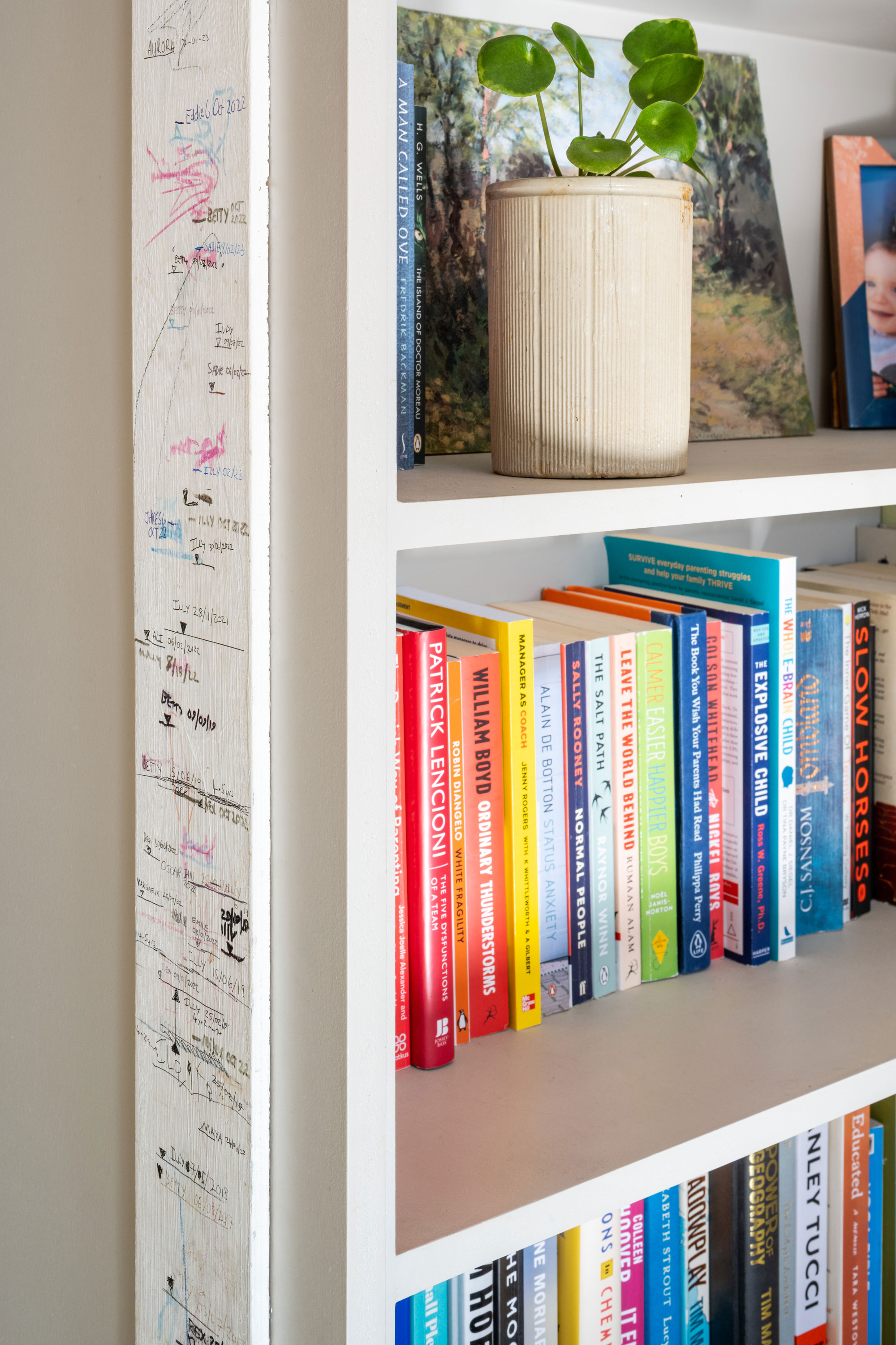
Reusable Height Chart
Our height chart is a removable piece of timber I had originally use to cover an exposed bit of blockwork wall. When we first moved in, I was impatient for open plan so knocked one wall through myself as a temporary measure, which we ended up living with for about four years. I thought it was quite nice to keep the piece of timber and put it back on the wall of the renovation. The nice thing is we can now take it with us if we move on again, rather than a new owner coming in and painting over it!
Dining bench
The dining area is in the middle of the kitchen and the lounge. I liked the idea of having storage units run the full length of the living spaces, and double as a dining bench. The bench is overlong so that it also works well as a play surface for the kids. We like our colourful dining chairs from Barber Osgerby so much that a lot of the colour palette for the rest of the house was inspired by them.
Same size, but bigger, windows
Because the house is leasehold, we could make any changes to the exterior door and window openings, so we had to work with what we had. We replaced all the original UPVC windows with slim aluminium clad windows, this had two advantages; the slim frames mean there is so much more glass than the old windows, so we get much more light coming in and more view looking out. Being aluminium clad means, we get the best of both worlds, durable and weatherproof on the outside (aluminium) and warm and cosy on the inside (pine).
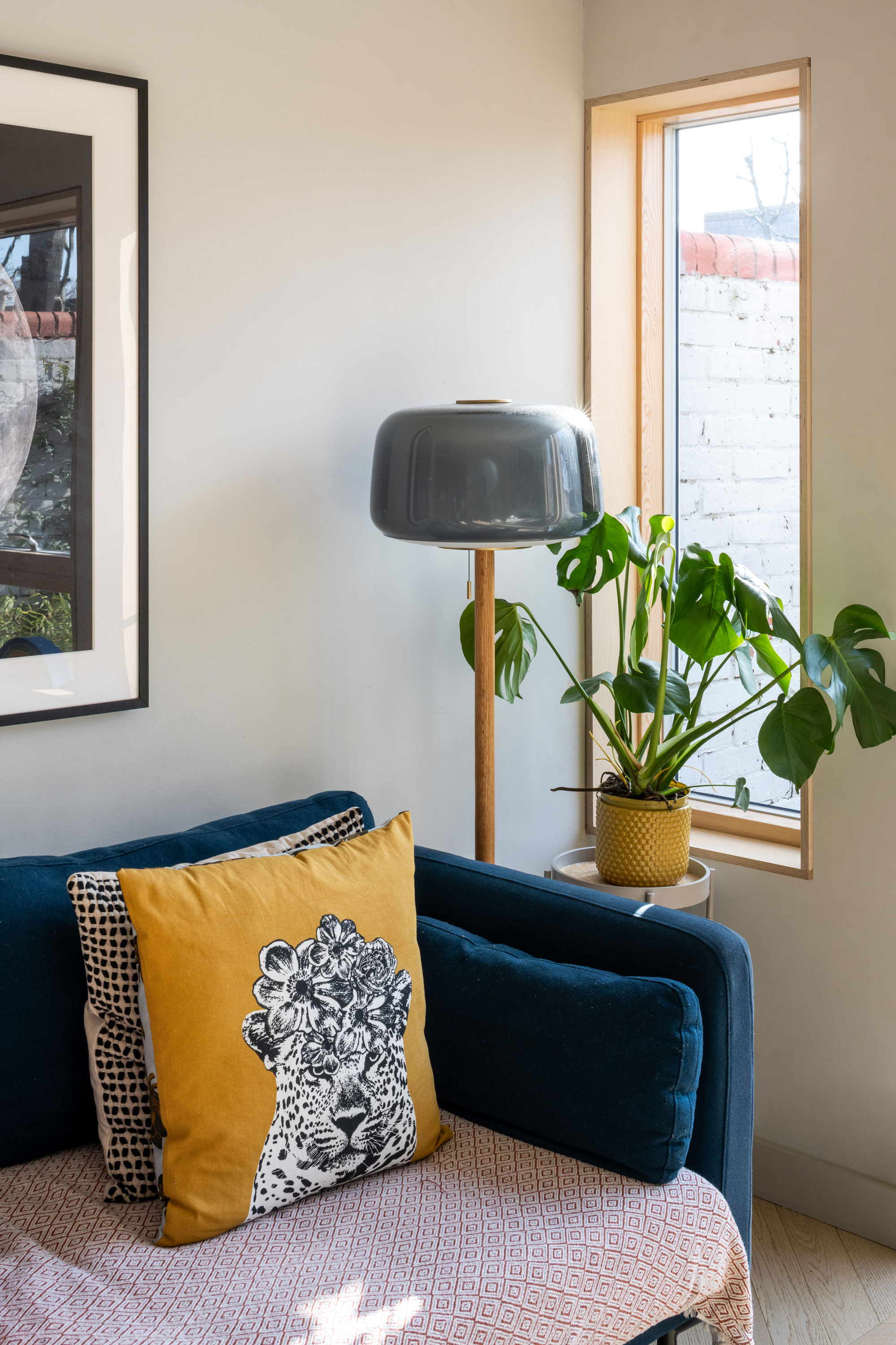
Framing the view
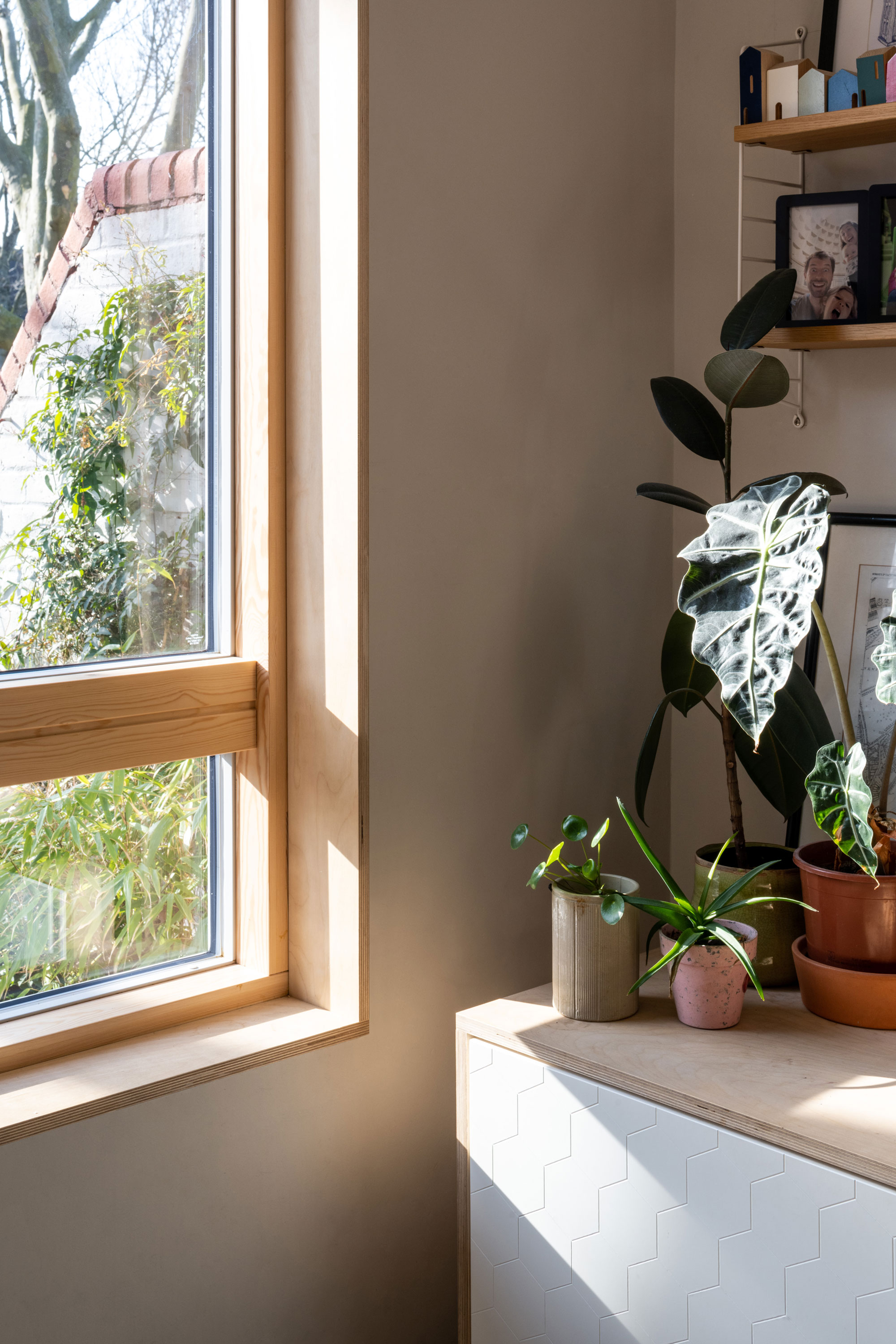
One of the other big changes we made to the windows is that we lined them internally (cill, jamb and head) with plywood, this gives the light coming in something warm and textured to bounce off and from the inside, the lovely views we have of the trees on the estate are framed.
Hawthorn House Planting
The garden/balcony is relatively small. I was really inspired by working with Gareth and Richard on Hawthorn House and how clever they were with the planting of their garden. I basically copied them and went to buy mostly the same species of wildflowers and plants they had used, focusing on ones with nice aromas and that look good all year round. They are planted in a wooden planter that runs the length of one side of the garden, meaning a lot of the plants come right up to the window.
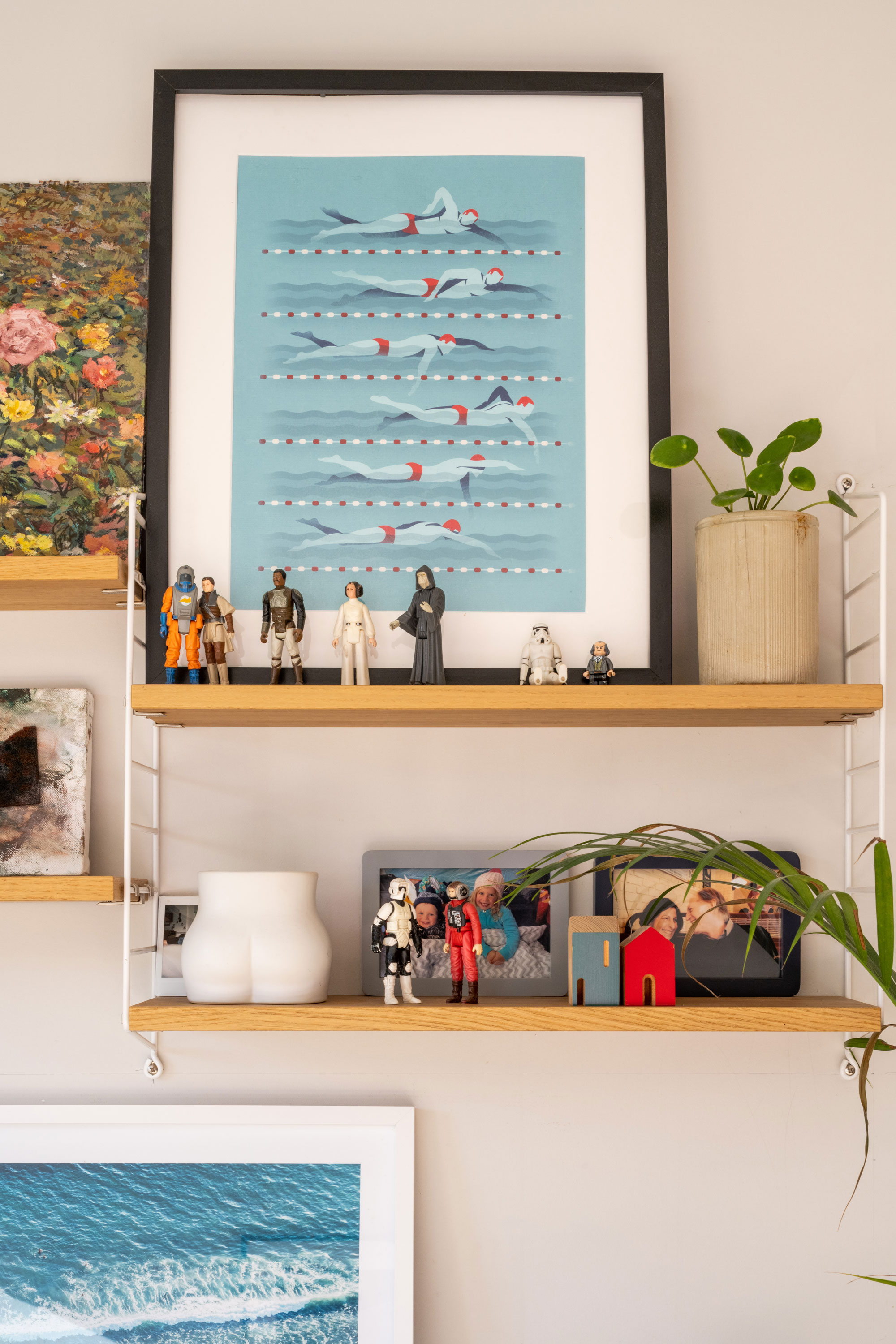
String Shelves
The modular String shelving system has been used in a few of the rooms. I really like how simple they are, but also feel slightly playful. I had seen them at an architect friends house of mine (where else do you think architects get all their ideas!) and loved how easily demountable but also durable they are, so they can move around with you house to house.
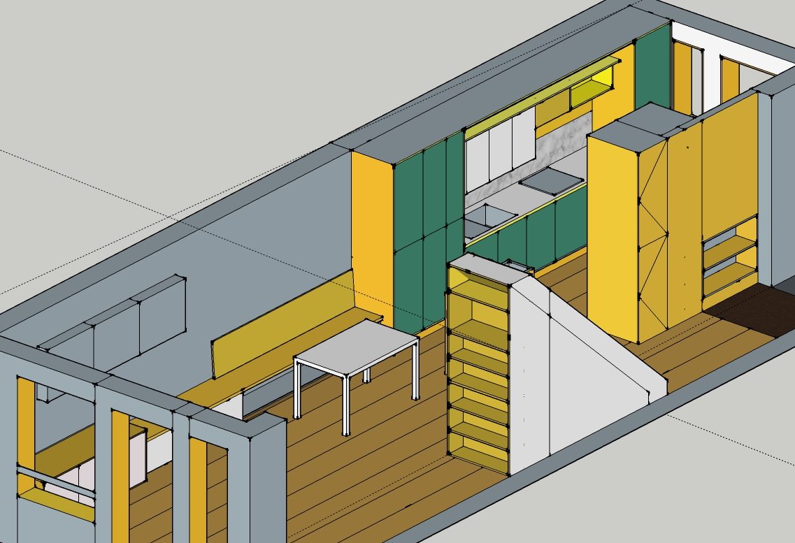
3D Model
This is an overview of the working model I used for the design and to brief the builders. In the hallway (to the right) you can see how the new plywood hallway wall (in yellow) has Jack and Jill cupboards to make the best use of the space. The shoe shelves tuck under the kitchen counter that is on the other side of the wall (the kitchen cabinets on the other side are 20cm shallower to allow the space). The cloaks cupboard on the end has a cork notice board on the other side facing the kitchen and Jack and Jills with the fridge freezer.
Suppliers List For The Project
Wildflower planting, The Gardening Club, Crews Hills, London
Planter box, Woodblox
Windows and doors, Velfac
Cabinetry and wardrobes, Ikea
Chevron wood flooring, Havwoods
Dining chairs, Barber Osgerby
Kitchen carcasses, DIY Kitchens
Kitchen worktop, Fenix via Plykea
Kitchen handles, Dowsing & Reynolds
Kitchen sink, Franke
Kitchen tap, Crosswater
Bath, Bette
Bath fittings, Hans Grohe
Basin, Catalano
Bathroom floor tiles, Barber Osgerby
Paints, Farrow and Ball
Ceiling lights, Delt Light, Habitat,
Wall shelving, String
Sockets and switches, MK and Schneider
Under floor heating, Nu Heat
Thanks Yous!
Contractor – Optimal
Engineer – Constant SD
Building Control – Ball and Berry
Architect – really?
Photographer – French and Tye
About us
Bradley Van Der Straeten is an award winning architecture studio that specialises in refurbishing, extending and building homes for private clients. Established in 2010 by friends George Bradley and Ewald Van Der Straeten, the studio loves creating colourful, fun and liveable spaces. To find out more about our story click here.
‘exceptionally liveable spaces with an eclectic aesthetic’ (The Modern House)

Ewald’s House
See how our co-founder Ewald transformed his own family home.
A personal, lived-in project: a 20th-century semi in Cheshunt reimagined around everyday life, family routines, and thoughtful upgrades that make the house comfortable, adaptable, and full of light.
Read more by clicking here.