Mica
Islington, 2026
What happens when one person wants open, flowing space, and the other just wants somewhere to curl up?
This Islington flat began as a stark, white shell. It’s now a home of colour, texture and quiet complexity, where openness and intimacy sit comfortably side by side. Instead of relying on walls, layered screens, joinery and light shape the space into a sequence of distinct but connected places to live.
Designed around two very different ways of inhabiting a home, the project finds its balance not through compromise, but through careful composition: spaces that feel generous without being vague, and intimate without ever closing down. There are places to gather, places to retreat, and moments in between, each with its own character, but all part of a coherent whole.
“We didn’t want something minimal or sterile. We wanted something that reflected us — not a one-size-fits-all solution.” Peter
The Client
Peter had lived in the flat for over ten years before the renovation began. When he first moved in, he liked its clean, white, open feel, “it was quite stark and lacking in colour” but it suited him at the time. Over the years though, the space began to feel a bit too stripped back. Things wore out, the layout felt less connected, and what once felt open started to feel unresolved rather than freeing.
Melanie came into the picture not long after Peter moved in. Where he saw openness and flexibility, she saw something quite different: “extremely austere… I didn’t feel any of the spaces were places I really wanted to hang out or live in.” For her, the flat was missing places to pause — somewhere to sit, settle, and feel at ease. It was spacious, but not especially liveable. As she put it, there was “a lot of movement and transition, but no… corners or areas which responded to my needs.”
This contrast between them became the project’s defining tension—and ultimately, its opportunity. Peter self proclaiming that he’s “not a fan of walls,” while Melanie sought cosiness, enclosure and atmosphere. What united them was a shared ambition for warmth, colour and a home that felt unmistakably theirs.
The Original Property
The flat occupies the ground floor of a former industrial building in Islington, converted in the mid-1990s.The bones were good: generous proportions, large openings, and remarkable daylight for a ground-floor property, with dual aspect light filtering in from both North and South. These were qualities both Peter and Melanie immediately recognised and valued.
But the interior – white, minimal, very much a depiction of the 90s – made the flat feel more like a blank shell than a home. Peter noted in his very first email musing about the 70 downlights that gridded the existing ceiling, giving a uniform, almost clinical light. In early conversations, Peter half-joked that it felt like an airport departure lounge, not somewhere that felt naturally homely.
Spatially, the plan lacked an obvious hierarchy. Furniture felt floating rather than anchoring spaces and rooms bled into one another without definition. “You could put the bed almost anywhere… which means it didn’t actually go in any particular place,” Peter reflected.
The entrance sequence was similarly underwhelming, cutting off views and daylight rather than drawing you into the home. The kitchen felt squeezed and disconnected from the rest of the plan, while the main bedroom, placed prominently at the front, suffered from street noise and underused the building’s quieter rear.
Despite all this, the potential was clear; the quality of light and the scale of the space were a strong base for reinvention.
The Brief
The brief was about reconciliation: between openness and enclosure, between minimalism and warmth, between two different ways of living.
Peter and Melanie were aligned in their desire to move away from the starkness of the existing interior. Colour became central to the conversation early on but was approached with care. Melanie was clear about avoiding anything too cold or serious—“because of the climate and the light here… I really wanted to make sure we used the right sort of warm, homely colours.” Peter, meanwhile, described the process as a learning curve: “I had quite a limited sense of colour… I learnt a phenomenal amount.”
Equally important was the organisation of space. The flat needed clearer destinations, places to sit, cook, work and relax, without sacrificing its inherent openness. The kitchen was to become a central, sociable hub, reflecting the couple’s love of cooking and hosting. Storage was essential, not only for practical reasons but to properly house and display Peter’s extensive collections of books and artefacts, which until then had been scattered and under-celebrated.
Above all, Melanie articulated a simple but powerful ambition: to arrive home and feel as such. “I wanted to open the front door and think, oh, I’m here… this is nice.”
Design Process
The early design stages explored a range of strategies, from minimal intervention to more radical reorganisation. These options tested the fundamental question of how to distribute the primary functions—living, cooking, sleeping—across the plan while respecting existing services and constraints.
For Peter, the process was both exciting and daunting. Without prior experience of design, the leap from drawings to lived space required a degree of trust. “It never occurred to me that I would be in a position to take everything out and then come back to brickwork,” he reflected.
Melanie, with her background in landscape architecture, felt more at ease with this kind of process, helping to make sense of ideas and try them out as they developed. It became a very collaborative effort—sometimes lively—but always focused on creating something more thoughtful and personal.
A key moment for the project came when as a client duo, they decided to take a more ambitious approach to reworking the layout. Instead of just tweaking what already existed, they chose to rethink it from the ground up—“if you’re going to do this, you might as well bite the bullet and do it all,” as Peter put it. This came combined with a decision to make the best of the historic fabric by reinsulating with breathable wall insulation and retrofitting an MVHR system to enable fresh air to move through the property without the need for always opening the windows to the street noise.

The Design Solution
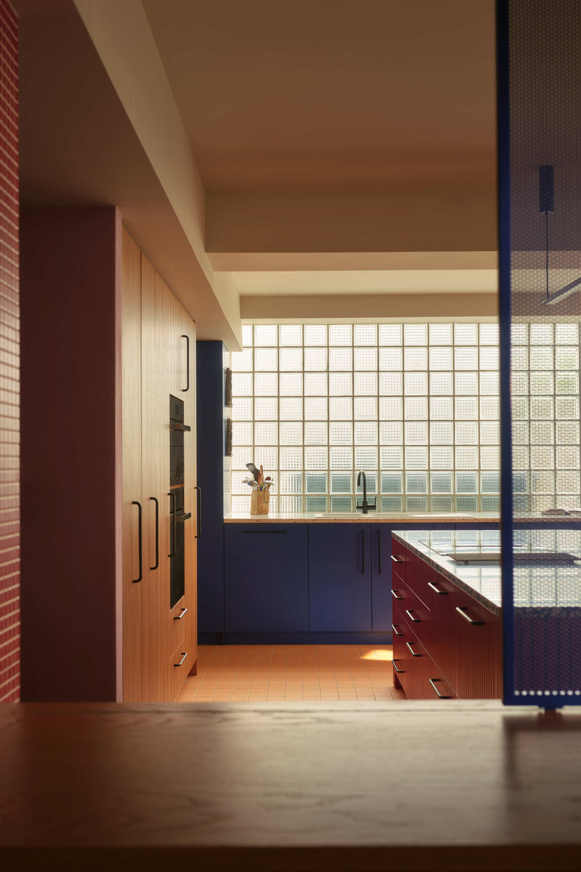
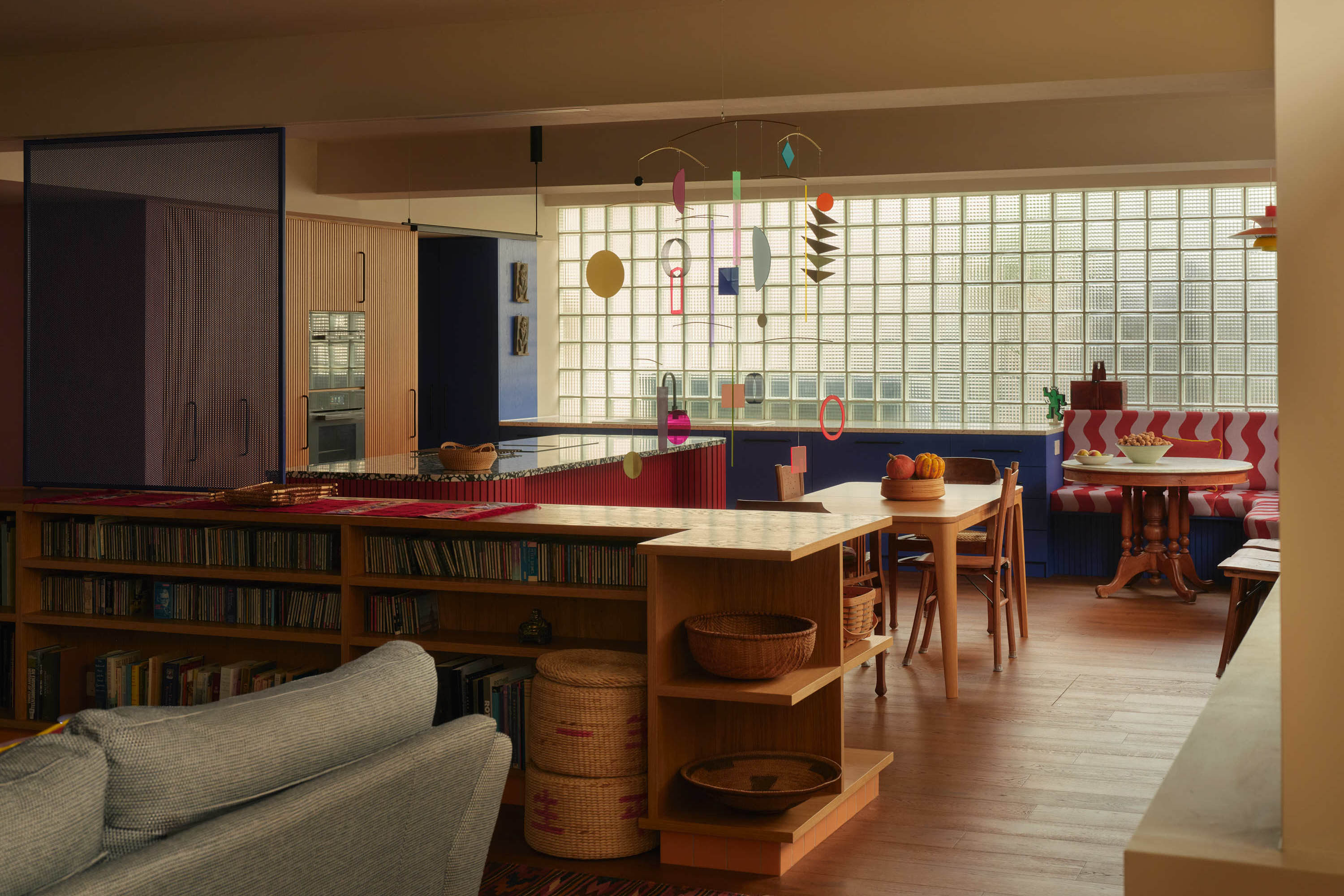
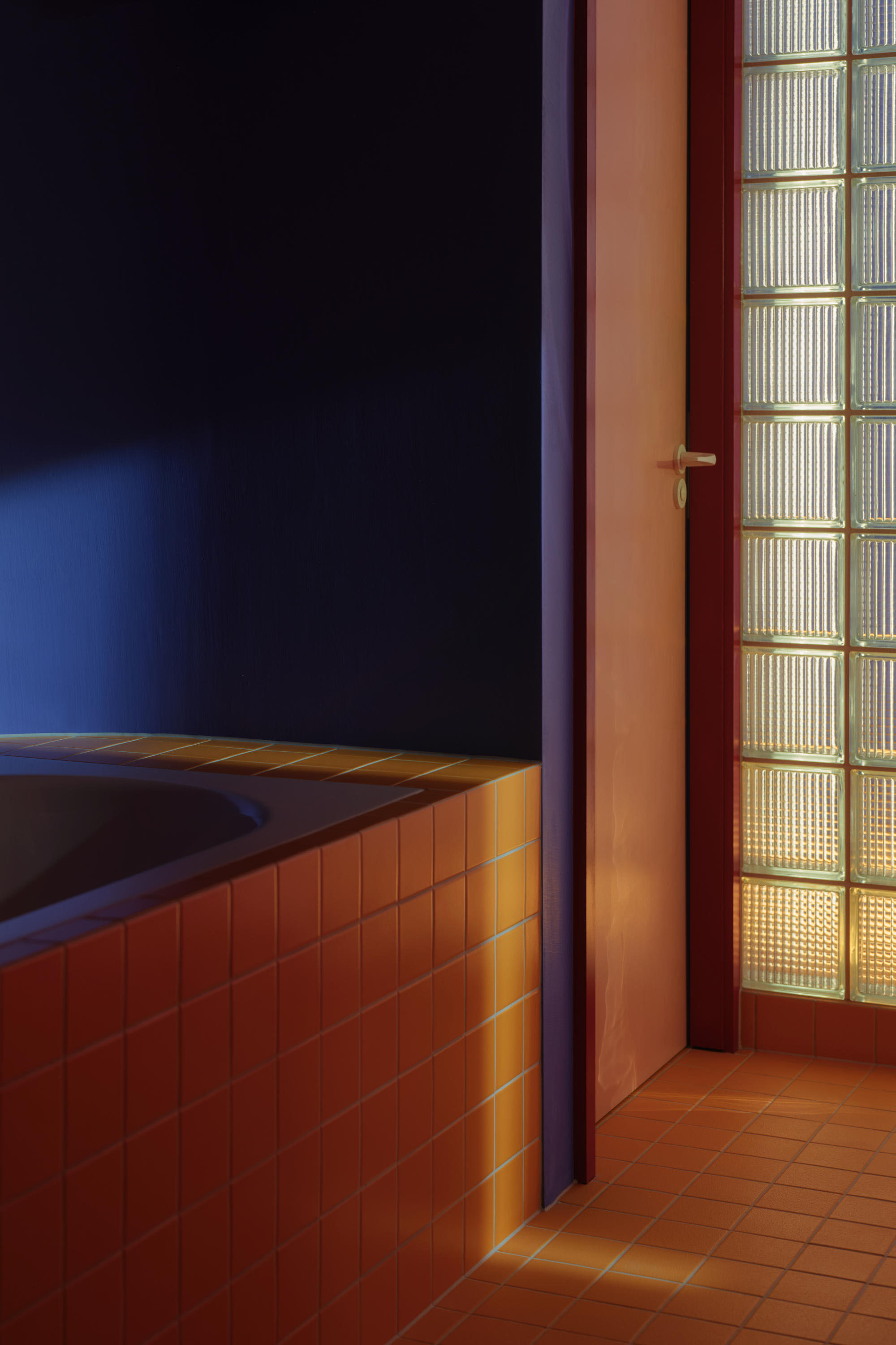
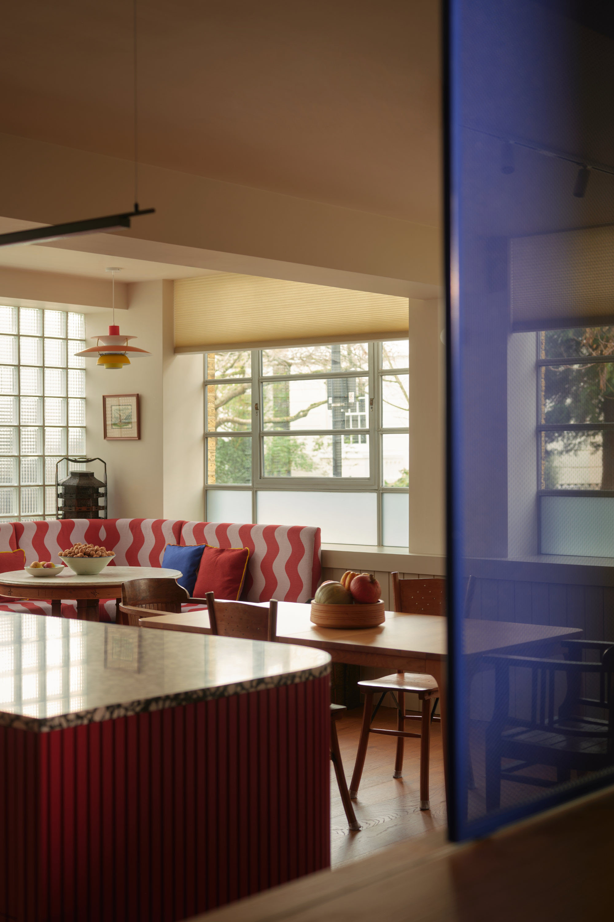
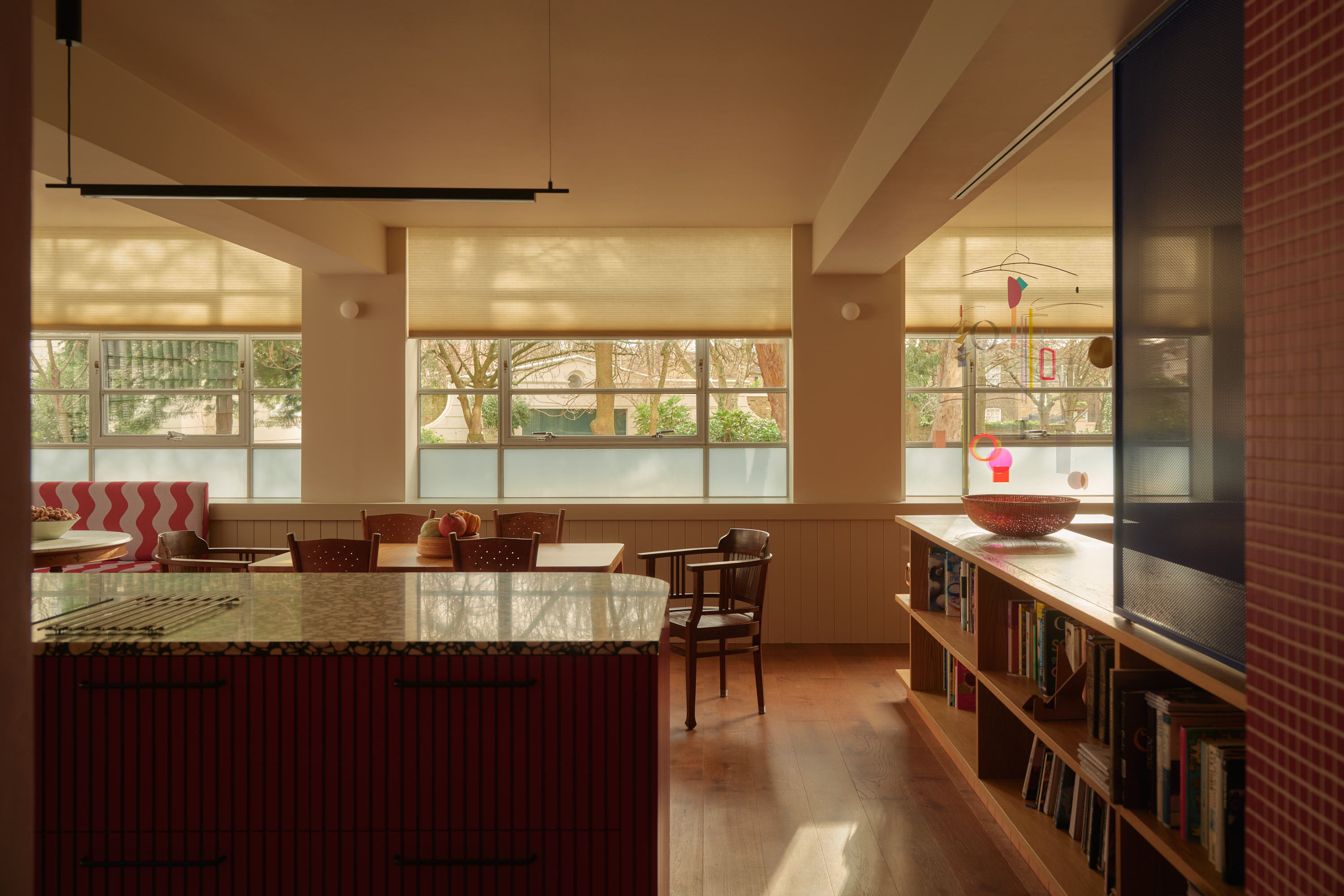
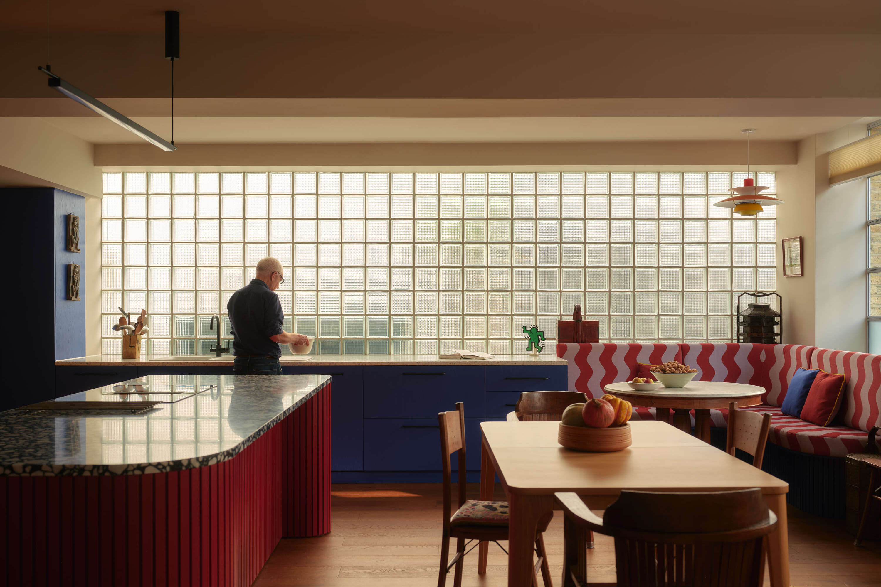
The final proposal repositions the home’s primary living spaces to occupy the brighter, more dynamic corner of the plan, where the South-facing frontage meets an existing glass block wall in the side elevation. By relocating the kitchen to this point and removing non-structural divisions, the design draws daylight deep into the space and establishes a clear, assigned heart to the flat.
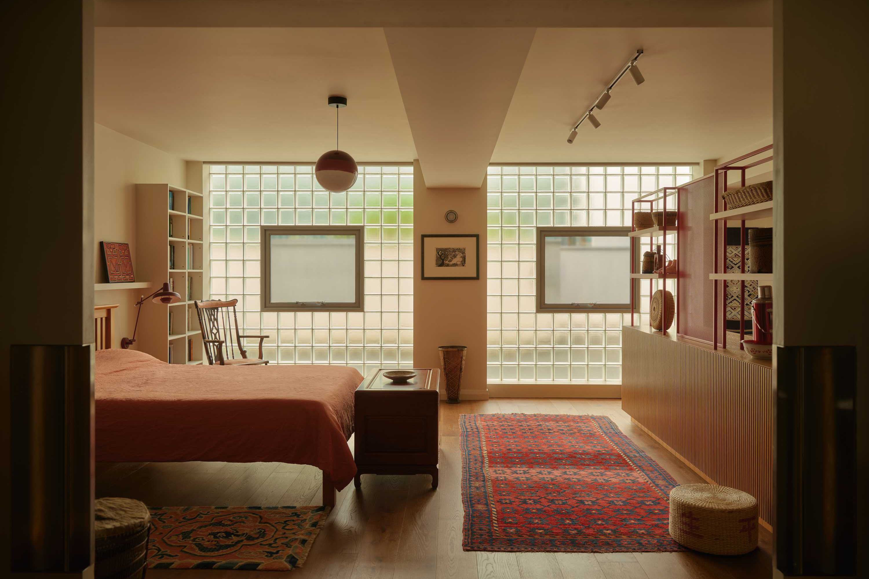
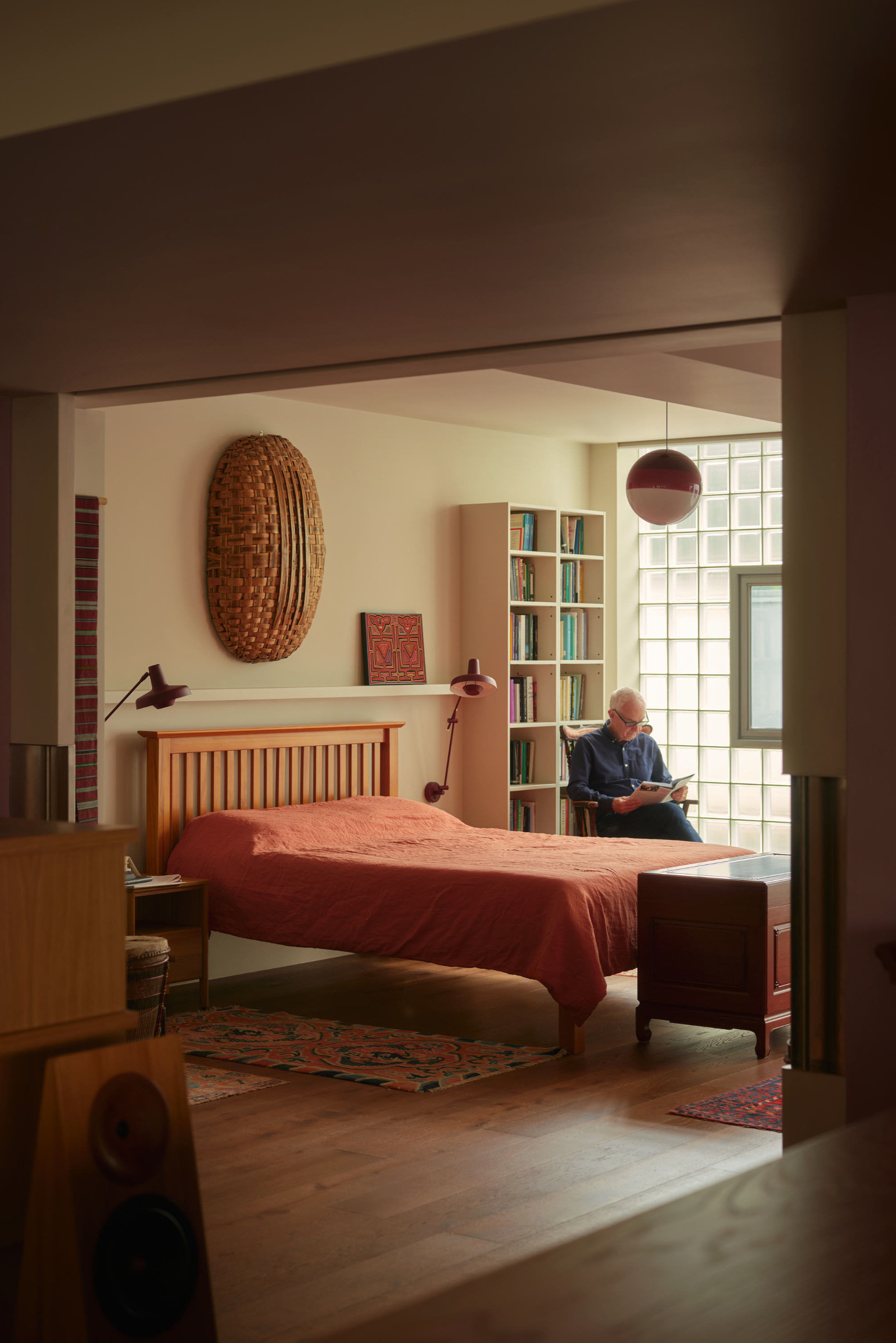
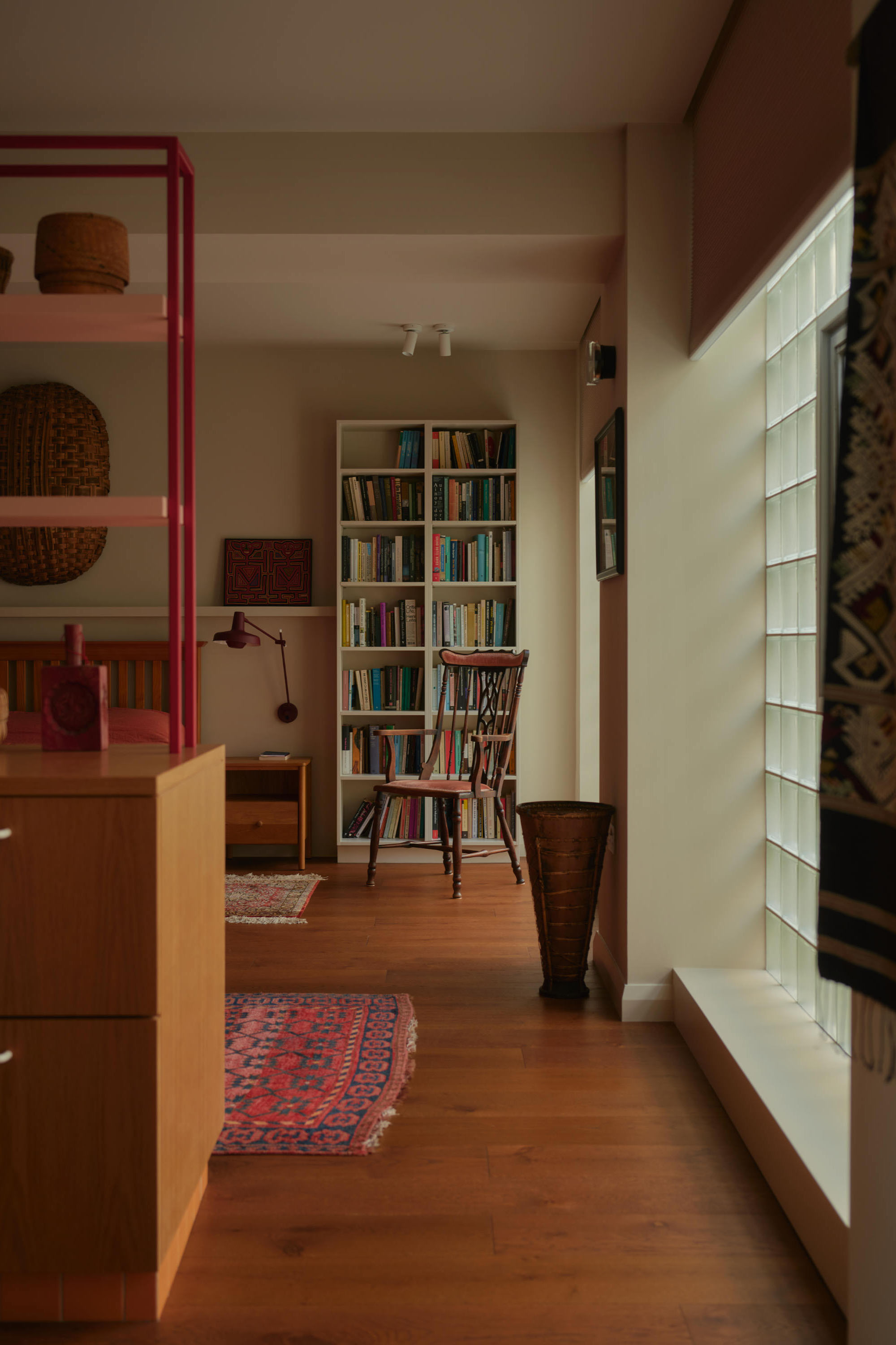
The bedroom was moved to the quieter rear, prioritising calm over direct sunlight—an inversion of the original logic that better aligns with how the spaces are used throughout a day.
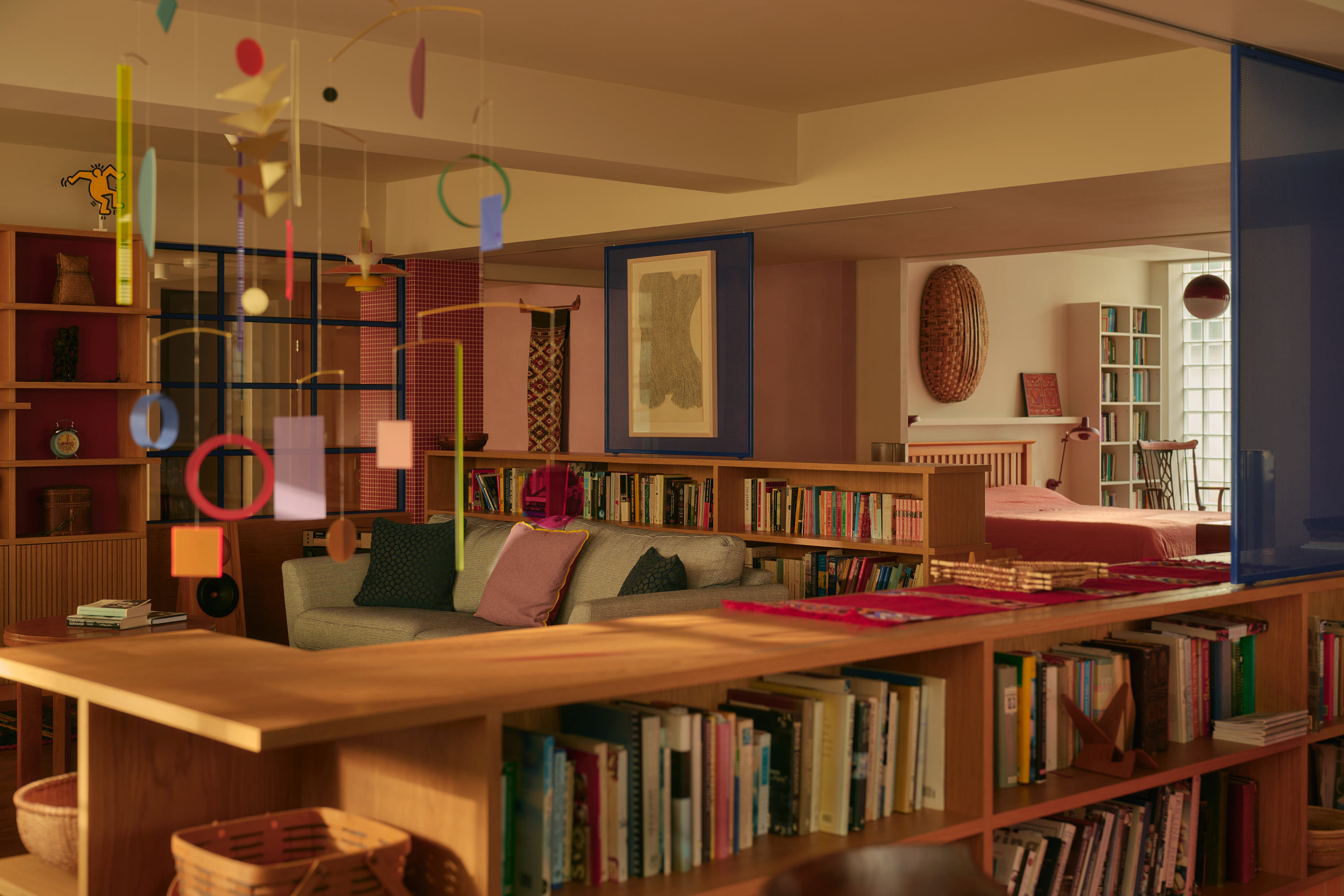
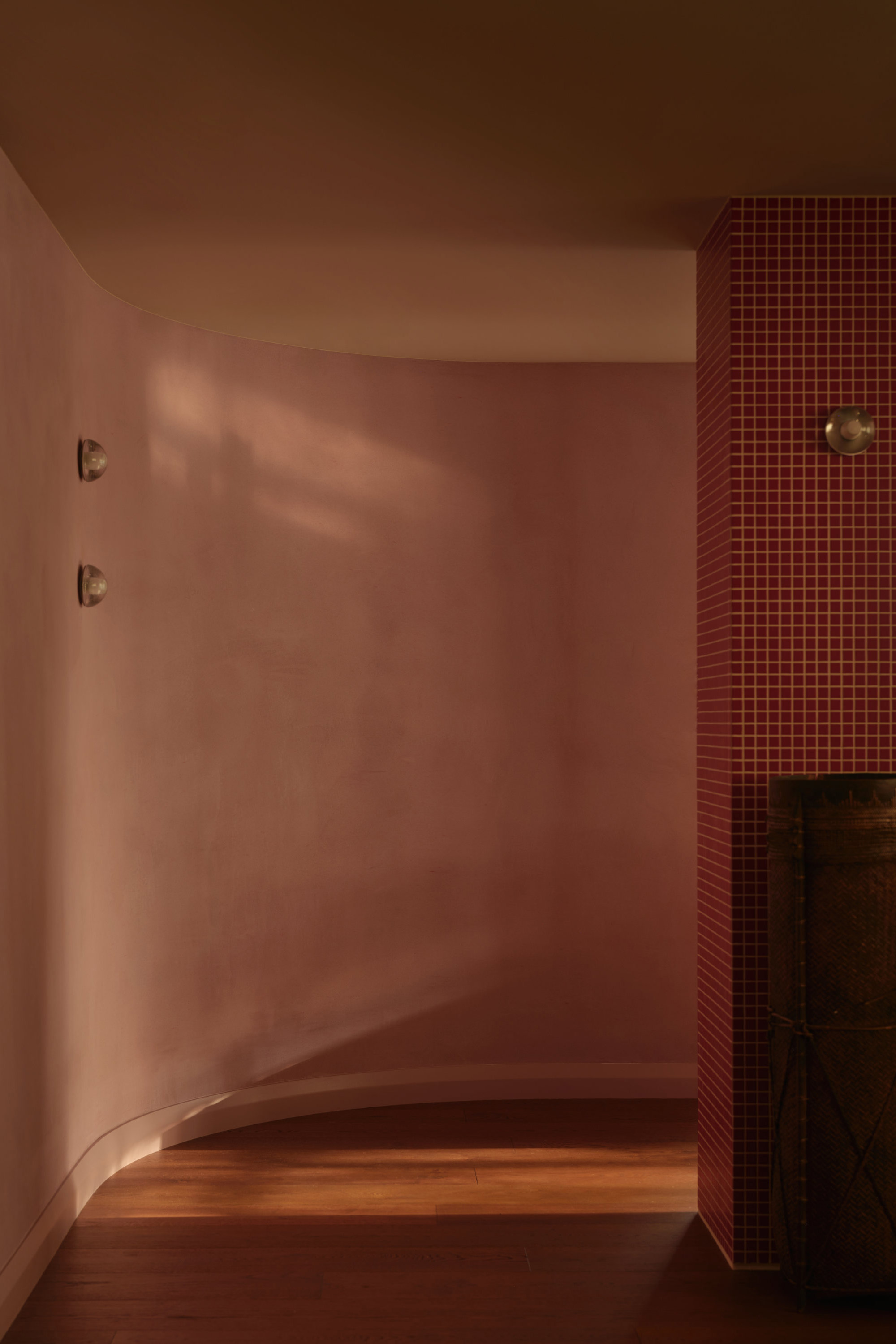
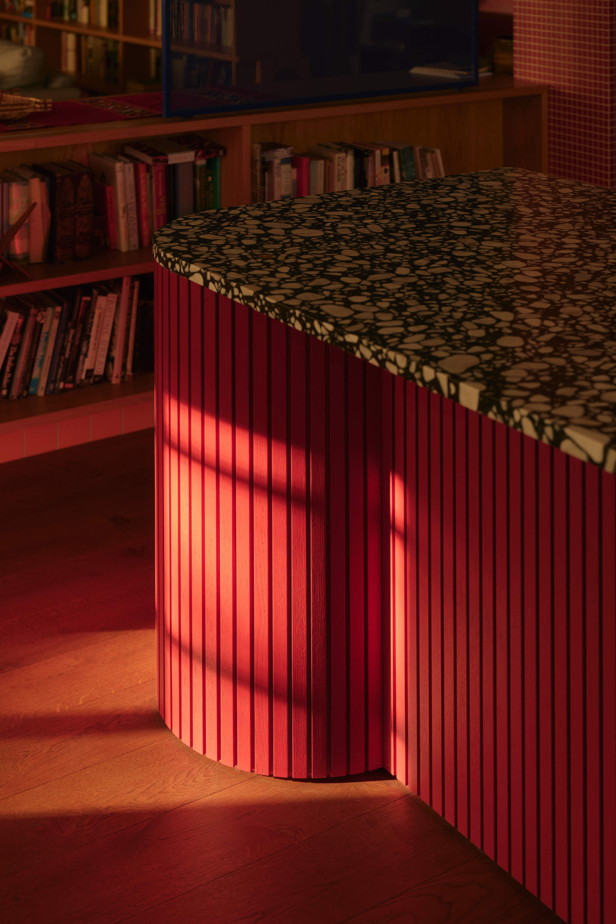
Within the open plan, zoning was achieved not through walls, but through a layered composition of joinery, lighting and material shifts. Raised ceiling zones emphasise the feeling of volume in the living spaces, while a lower central spine accommodates services and subtly compresses circulation areas and bathrooms. This contrast creates a rhythm of expansion and compression, which helps to exaggerate both.
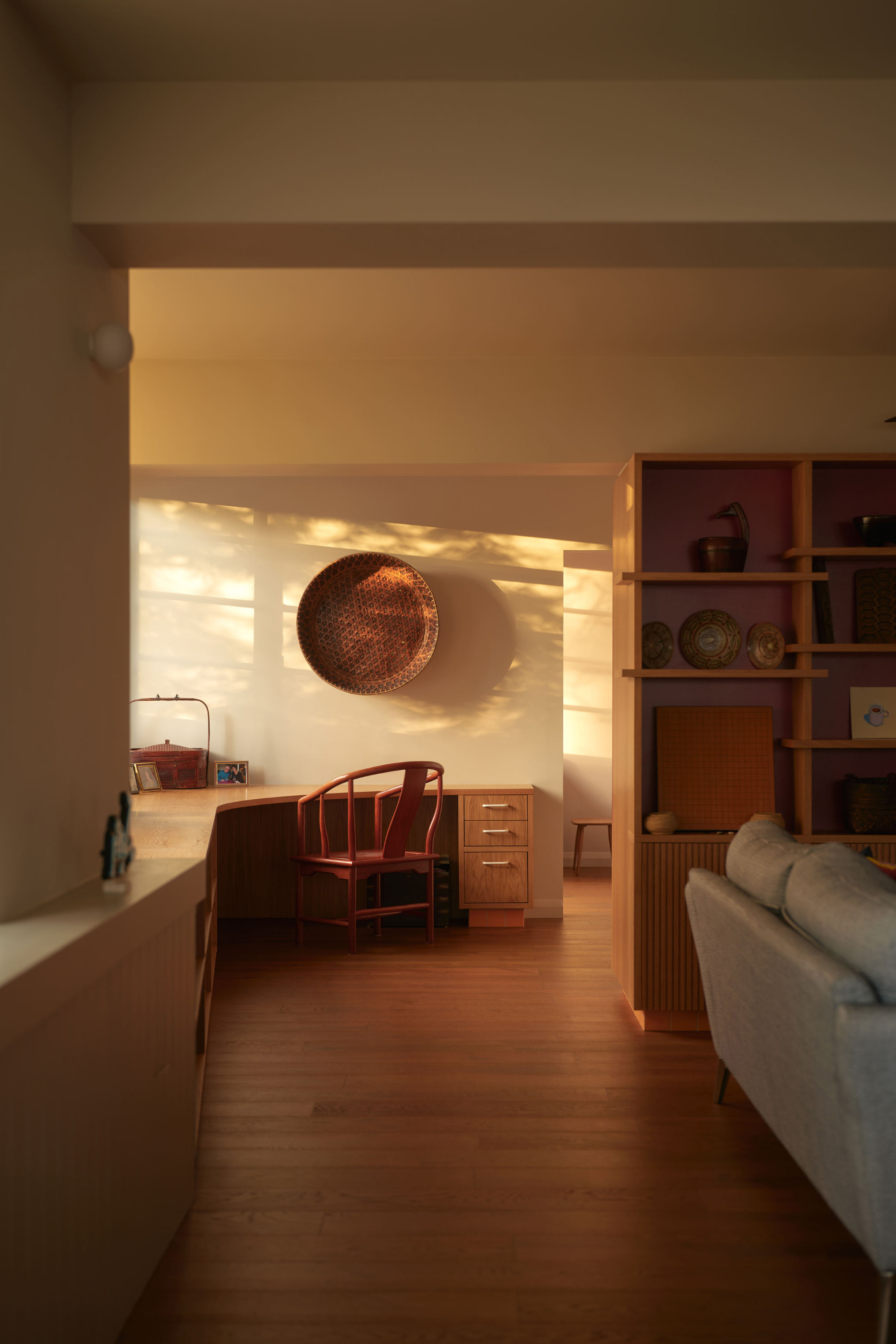
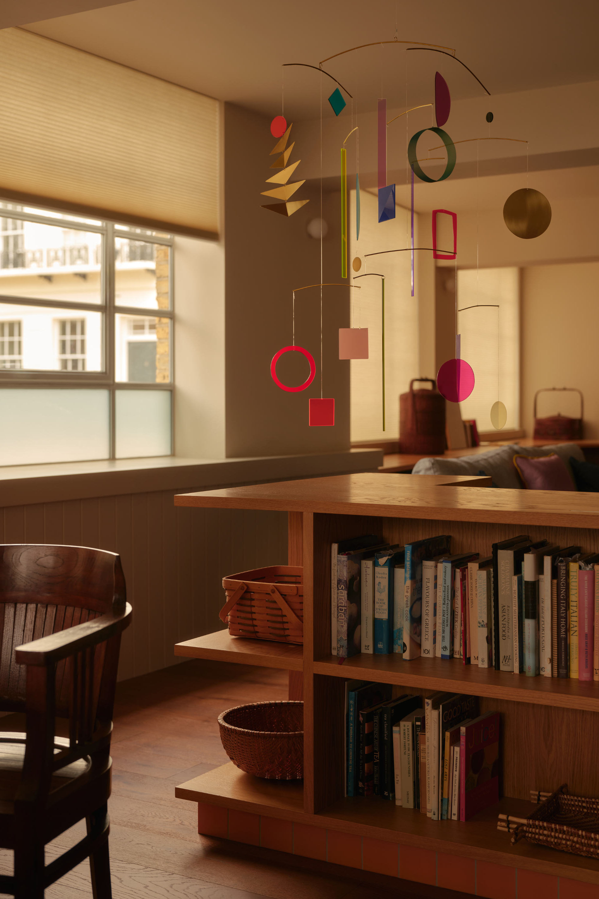
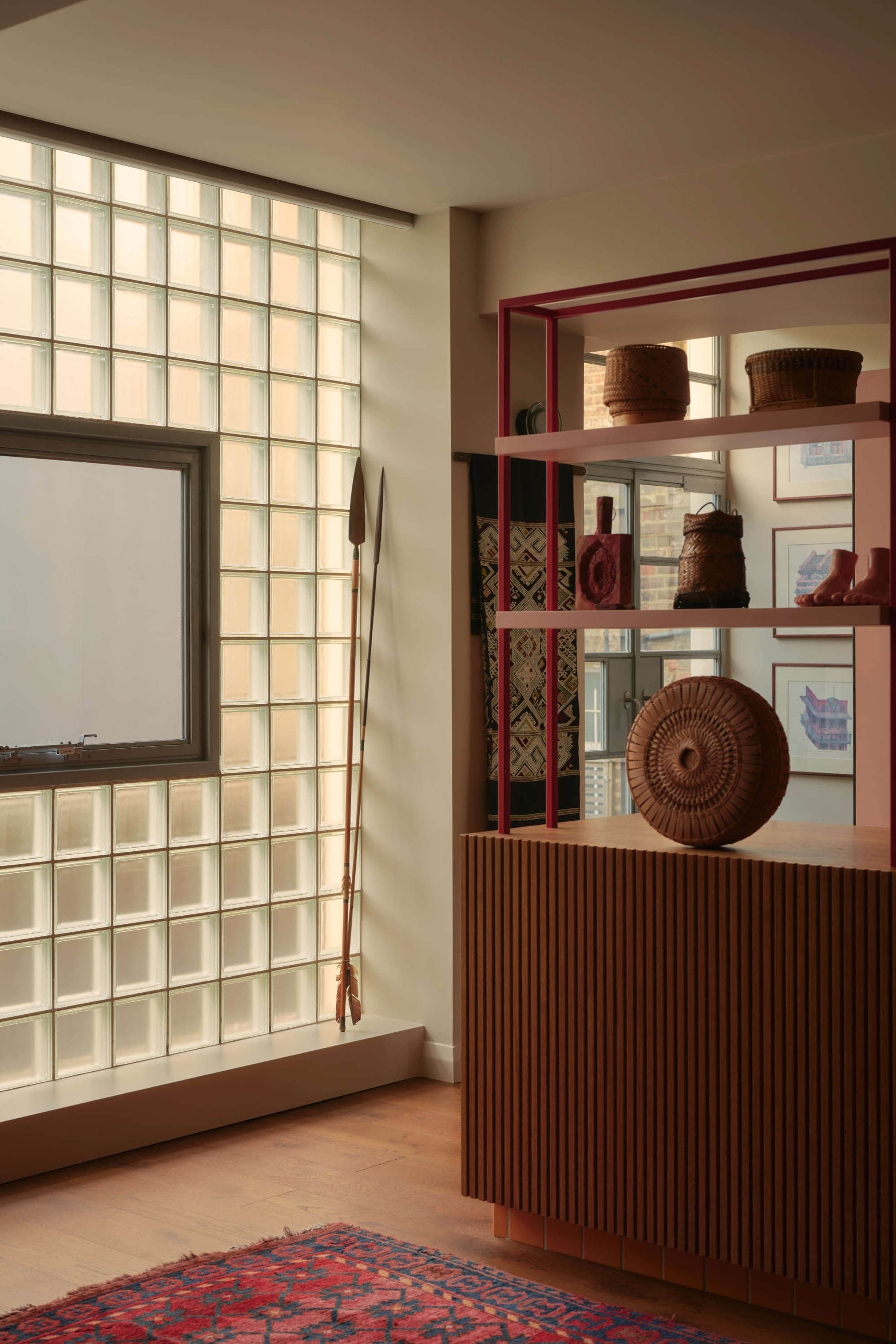
Joinery plays a critical role, acting as both storage and spatial organiser. Bookcases, display units and low partitions define edges and create “corners” within the larger volume—an approach that allows the space to feel simultaneously open and discrete. As Peter observed, “the space is actually bigger… and yet it feels more discrete.”
A new varied lighting proposal replaces the previous uniform grid with a flexible, layered array—creating lower light levels with highlights of light and shade that introduces points of focus rather than consistency. The result is a more atmospheric, responsive environment that shifts throughout the day.
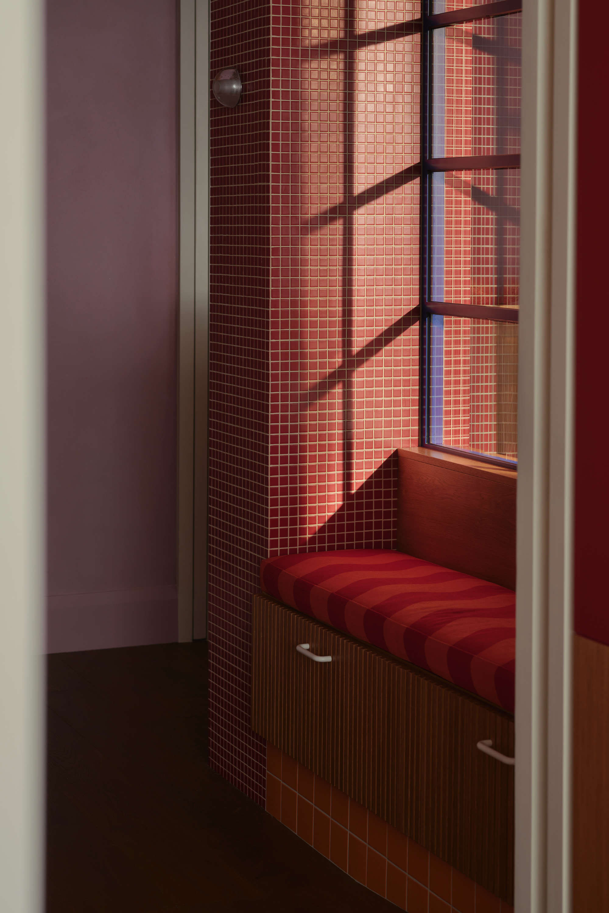
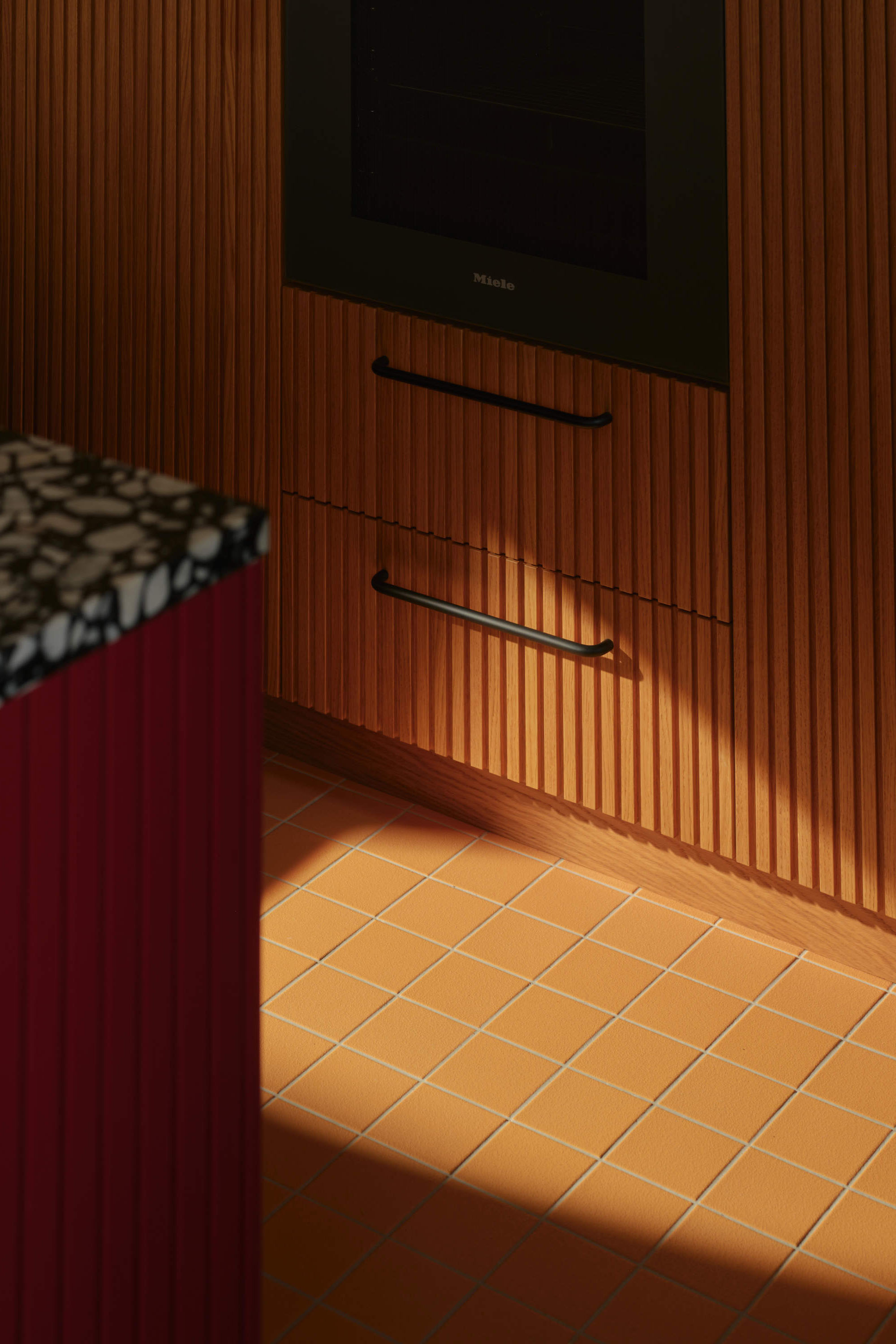
Materially, a warm neutral base of darker timber floors, warm base tones and oak joinery provide a backdrop for a carefully orchestrated palette of colour. This then opened up the project for colour to run through. The strategy for Peter and Melanie was quite primary with punchy reds, bold blues and sunny yellows – all paired with one softening pastel of lilac via the curved, textured wall that runs through the middle of the space.
Within the larger spaces there are areas of amplified fun. The kitchen and its existing glass block wall is viewed from the entry and living through a perforated ultramarine screen, it’s a play of layered pattern and colour.
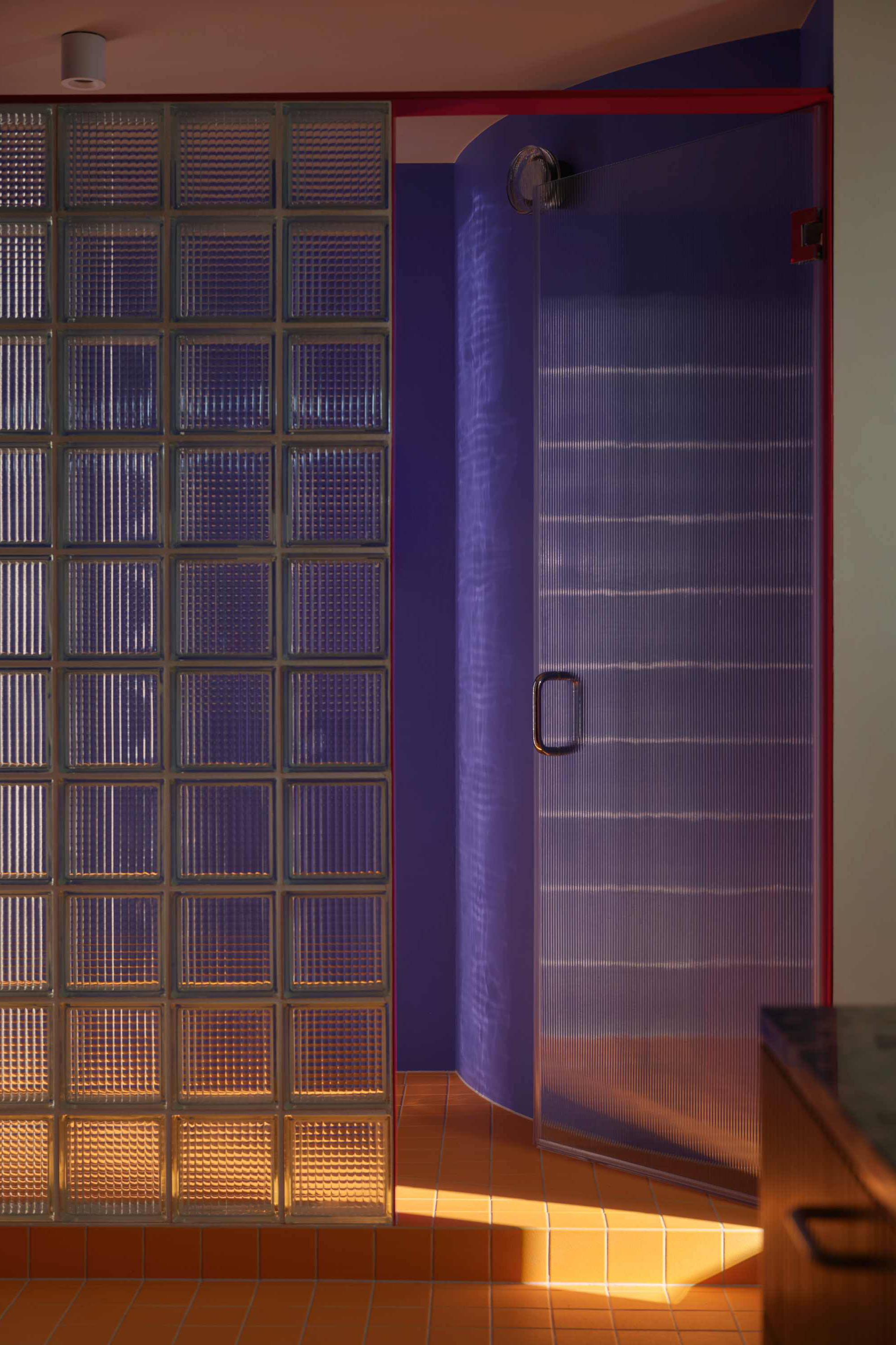
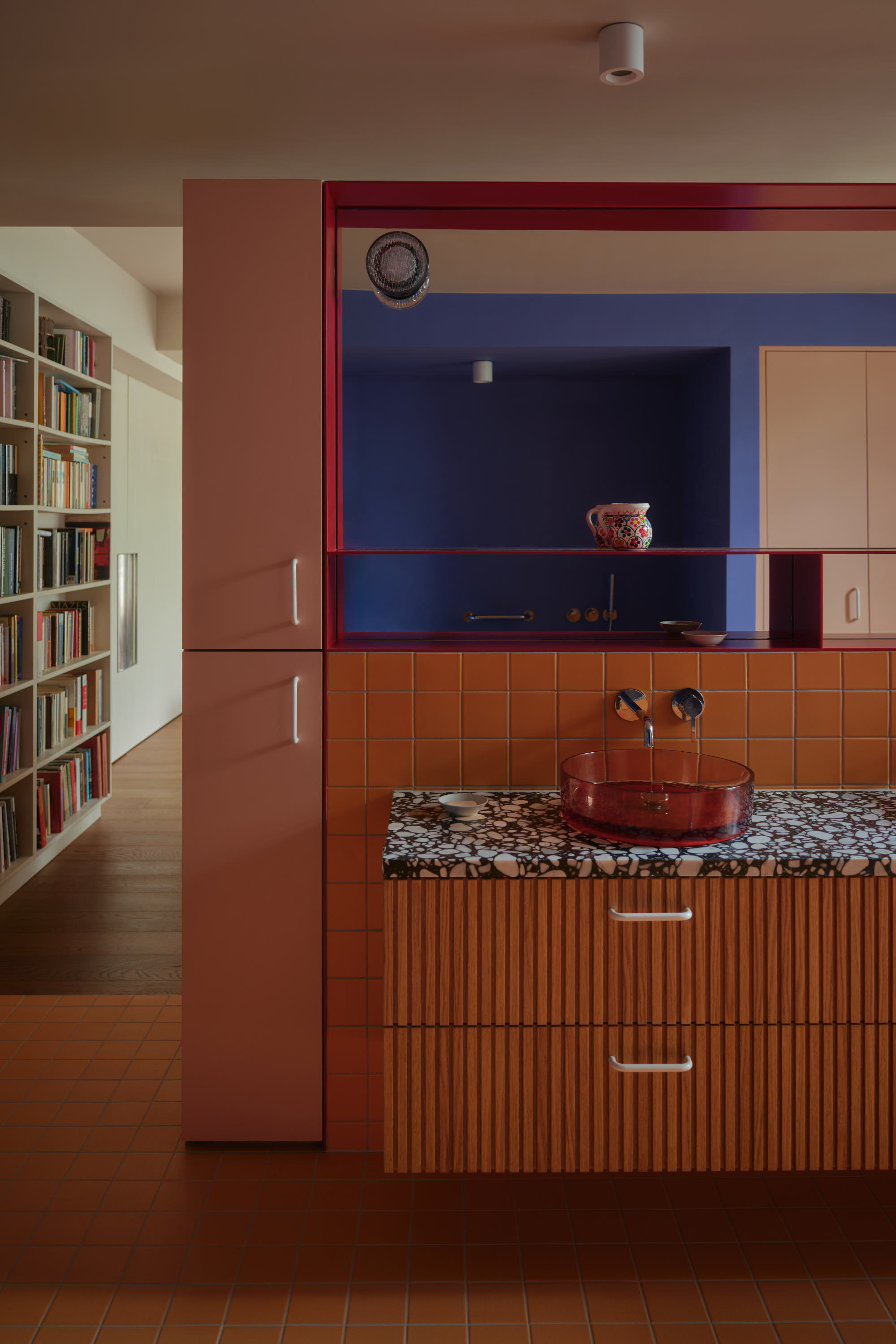
The open ensuite is another such area, using a palette extrapolated from elsewhere in the project. New glass blocks form privacy for the shower and allow daylight into the private toilet while providing continuity with the existing exterior detailing. Orange glass basins and a nougat worktop pair with red metal details and a textured blue backdrop to create an open, fun space with private corners.
“It’s almost miraculous. The space is actually bigger, and yet it feels more defined — more intimate. I still look around and think, how has this happened?” Peter
Collections and Character
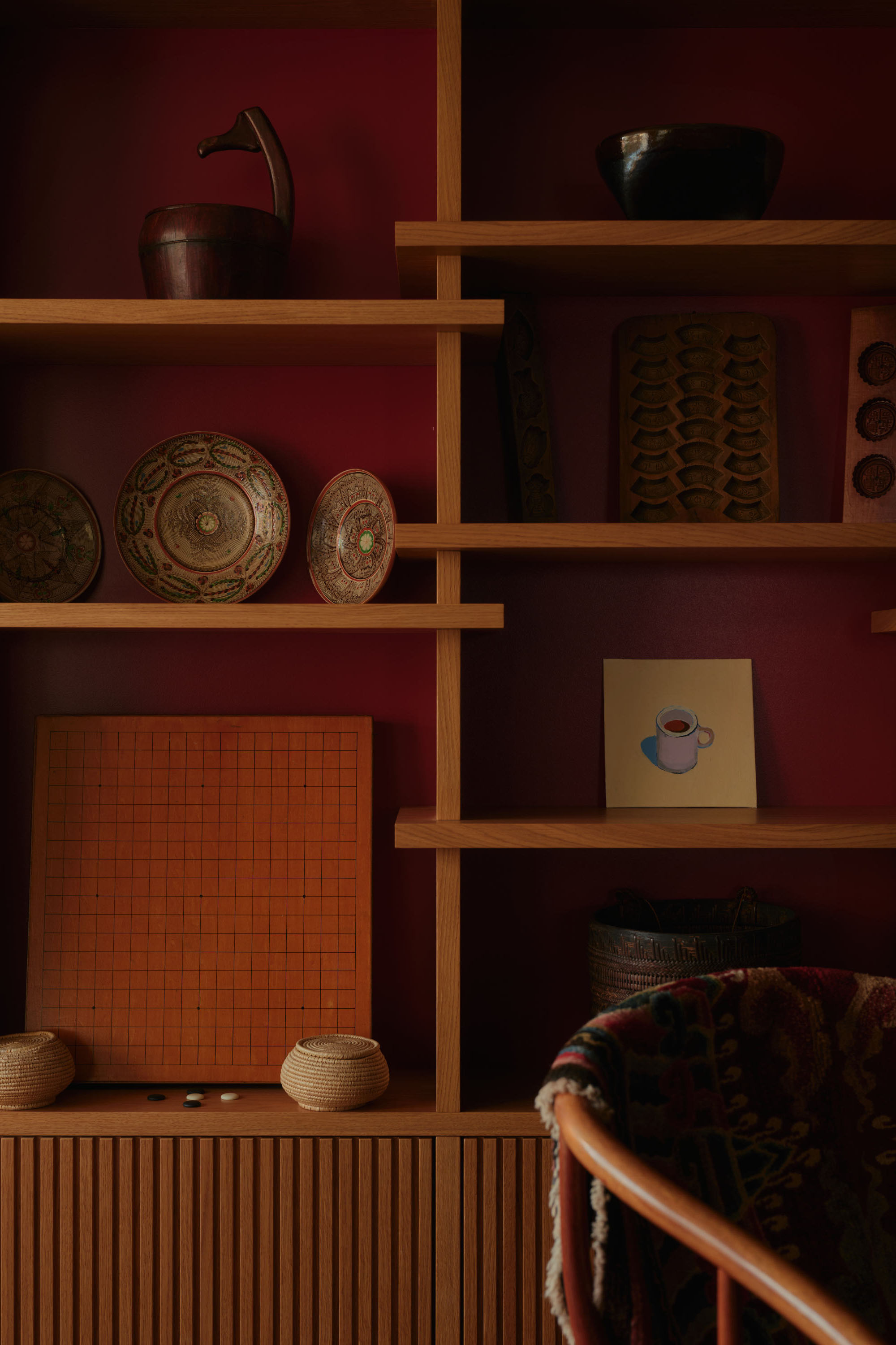
Central to the project is the integration of Peter’s collections—books, baskets and objects gathered over decades. Previously these items were visually lost within the flat, they are now celebrated and given space to be seen, organised and appreciated. Friends visiting have queried the ‘new’ collections, having never noticed them before despite many dinners at the flat in its previous form!
“They didn’t have a home before… now they’re displayed,” Melanie noted. The joinery lets these objects “speak” to each other, creating a sense of layers and connections across the space.
Importantly, this is not a static display. The design encourages movement and change—objects are rearranged, shelves reconfigured, screens repositioned. The home becomes a dynamic environment, reflecting the evolving lives of its occupants.
“Everything has a place now. Nothing feels wasted, but nothing feels overdone either — it all just works.” Melanie
The Result
“It feels like a completely different place to live in. I move through it differently, I use it differently — it’s changed my relationship with the space.”
The transformation is both spatial and emotional. What was once an almost neutral container has become a home with atmosphere, identity and presence.
Melanie describes it simply: “a complete transformation… it transformed my life… I like coming here.” For Peter, the shift is more visceral. The word he returns to is “sensual”—a space that engages the senses and changes the way it is experienced day to day.
“I remember the first morning waking up, looking through into the space and thinking, ‘wow, this is extraordinary.’ And I still feel that.”
The project shows something quite basic about homes: that openness on its own doesn’t create a sense of freedom, and that intimacy doesn’t have to come from being enclosed. Instead, it’s the careful balance of light, materials, colour and form—and the way different ways of living are worked through—that makes a space feel both open and grounded.
Or, as Peter and Melanie discovered, somewhere you don’t just pass through, but somewhere you genuinely want to be.
Thank yous
Contractor – Hirsen Limited
Sustainability Consultant – Ben Allwood
Photography – Felix Speller
Project Architect – Jessica Williamson
About us
Bradley Van Der Straeten is an award-winning architecture studio that believes thoughtful, creative design can improve everyday life. Since 2010, founders George Bradley and Ewald Van Der Straeten have been making colourful, fun, and liveable homes for people who are emotionally invested in their space. Read more about how we work by clicking here.
If you’re starting a project and want a team that brings ideas, clarity, and experience, while keeping the process collaborative, enjoyable, and a little unexpected, we’d love to hear from you. Get in touch to start a conversation.